-
A
-
TP Tsurara
EL
四季フォントプロジェクト第三弾はTPつらら 冬の冷たい空気が生み出す氷柱をイメージしたシャープな書体 The unique Fujiwara no Teika handwriting is arranged in a modern style.
-
TP Tsurara
L
四季フォントプロジェクト第三弾はTPつらら 冬の冷たい空気が生み出す氷柱をイメージしたシャープな書体 The unique Fujiwara no Teika handwriting is arranged in a modern style.
-
TP Tsurara
R
四季フォントプロジェクト第三弾はTPつらら 冬の冷たい空気が生み出す氷柱をイメージしたシャープな書体 The unique Fujiwara no Teika handwriting is arranged in a modern style.
-
TP Tsurara
M
四季フォントプロジェクト第三弾はTPつらら 冬の冷たい空気が生み出す氷柱をイメージしたシャープな書体 The unique Fujiwara no Teika handwriting is arranged in a modern style.
-
TP Tsurara
B
四季フォントプロジェクト第三弾はTPつらら 冬の冷たい空気が生み出す氷柱をイメージしたシャープな書体 The unique Fujiwara no Teika handwriting is arranged in a modern style.
-
TP Tsurara
H
四季フォントプロジェクト第三弾はTPつらら 冬の冷たい空気が生み出す氷柱をイメージしたシャープな書体 The unique Fujiwara no Teika handwriting is arranged in a modern style.
About Product
Overview
Following the second release of the Seasonal Font Project – TP Meigetsu, in which the unique Fujiwara no Teika handwriting is arranged in a modern style, the third release is TP Tsurara, a font with the image of icicles, modeled around the handwriting of Fujiwara no Toshinari as the Kana character design. Fujiwara no Teika’s real father, Toshinari was a master of tankas in the late Heian dynasty (A.D. 794 to 1185), and “*Korai Futeisho” written by him, influenced later Japanese culture significantly. Features of the characters of Toshinari are the sharp beginning and ending of brushstrokes, and turning parts; combined with the strong peculiarity of the character shape, the characters of Toshinari form his own calligraphic style.
*Korai Futeisho
This is a book on the study of waka poems formed in the early Kamakura period (A. D. 1185 to 1333). It is believed that Fujiwara no Toshinari wrote this book upon request by Imperial Princess Shikishi. It is the only study of waka poems by Toshinari as a collection. Examples of poems were selected from various collection of poems, and short comments were added.
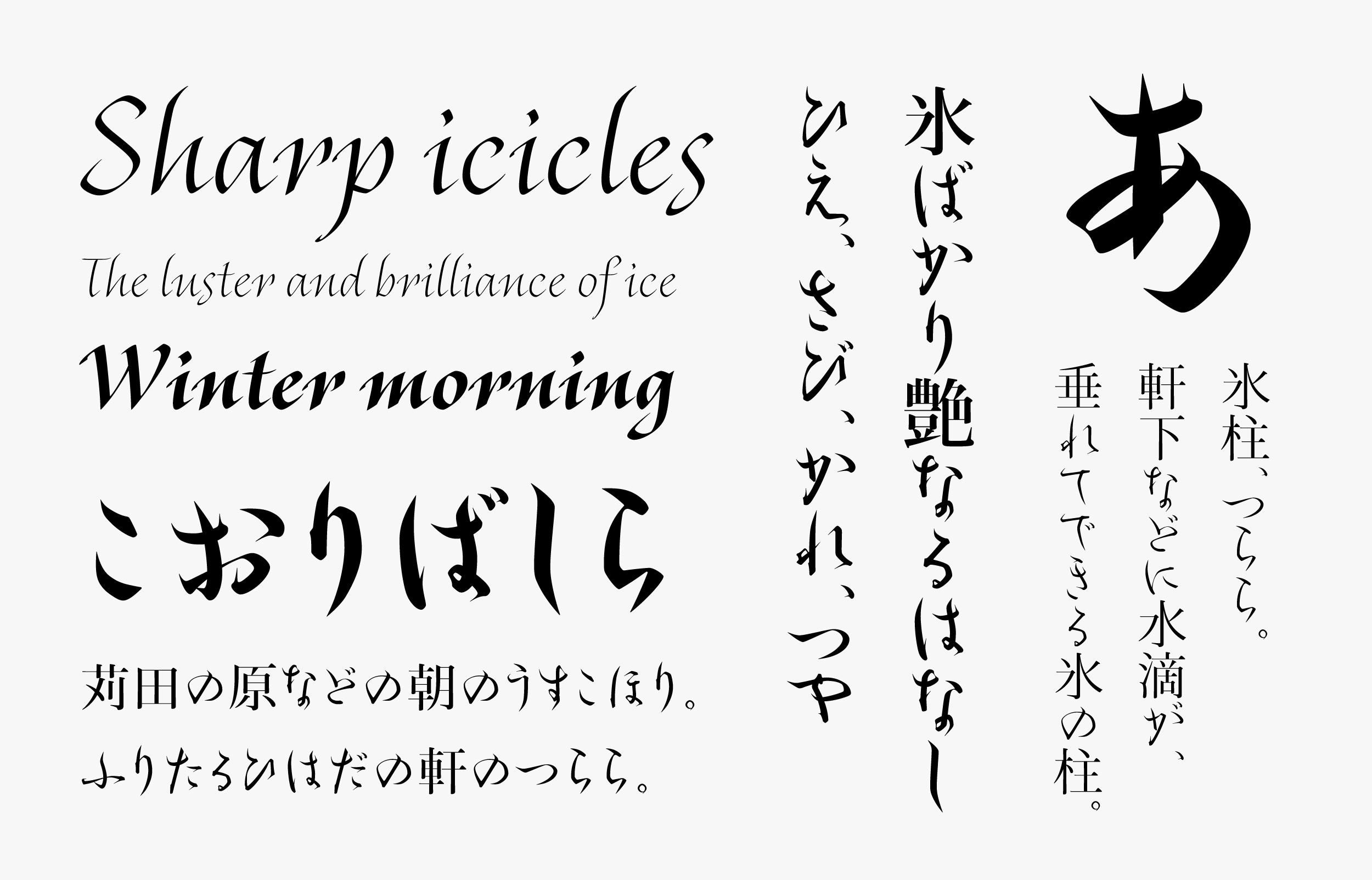
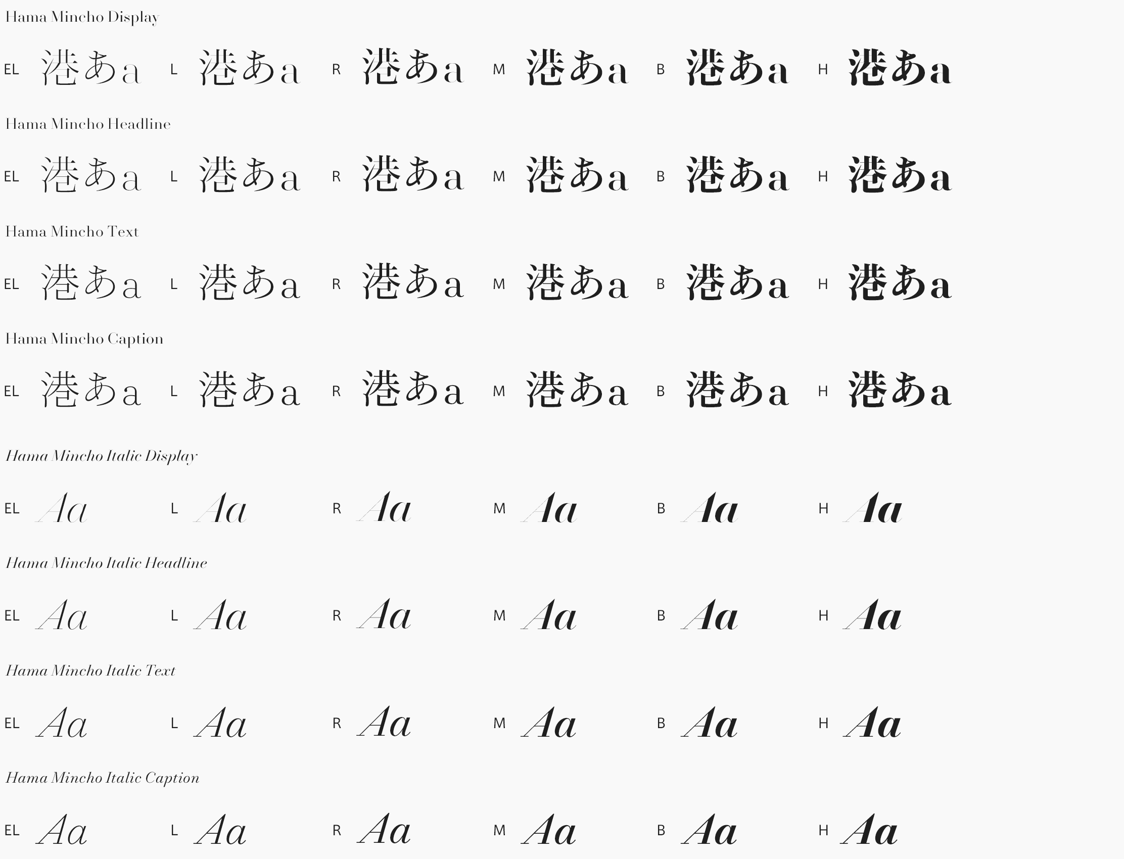
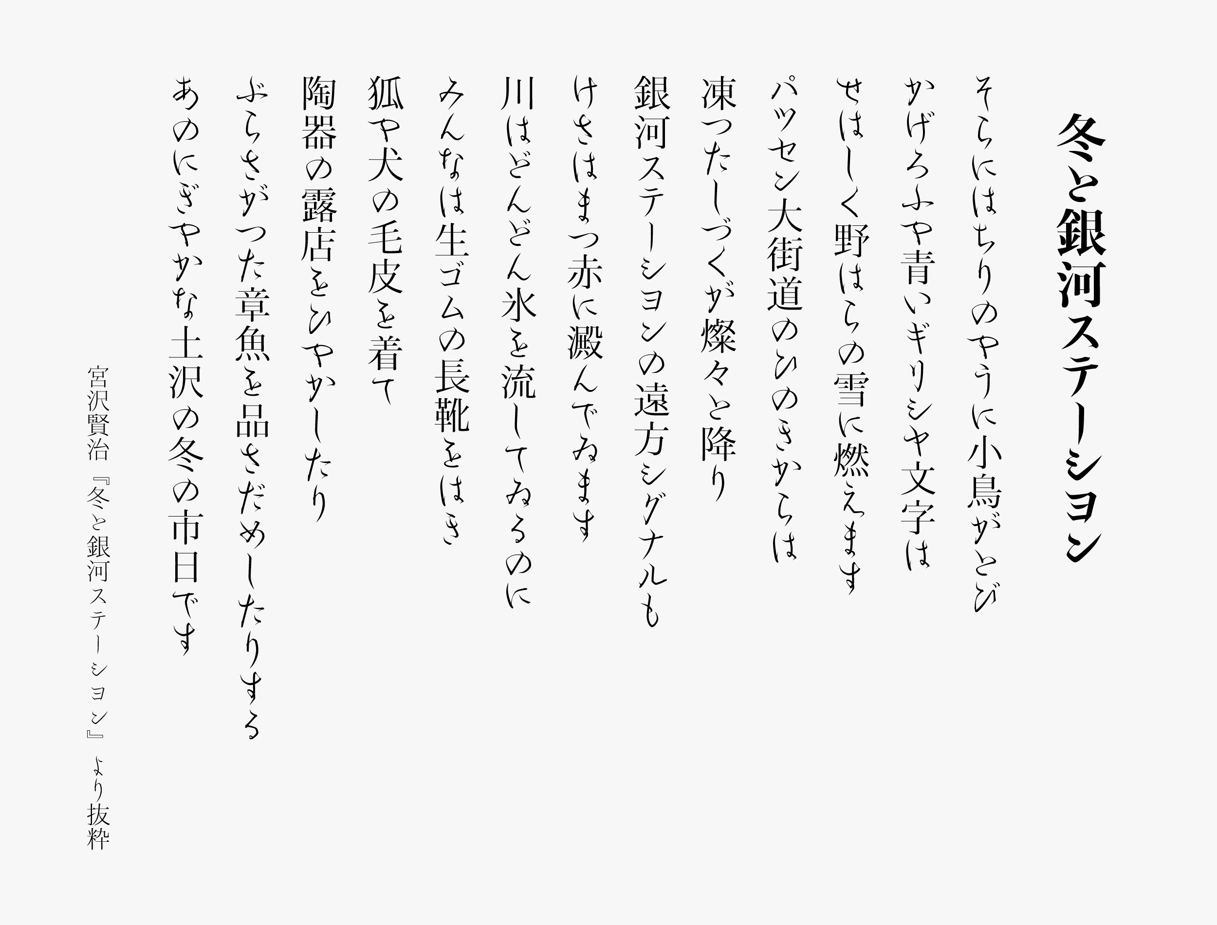
With the image of icicles created by the cold winter air, TP Tsurara was designed to install the essence of beauty that remains in coldness, Sabi – quiet simplicity -, and maturity into typeface design. Although the main axis of TP Tsurara is hiragana vertical typesetting, katakana horizontal typesetting is fresh and practical as a modern application. Latin sticks to the taste peculiar to Latin, while attempting to harmonize with Japanese characters, and the typeface is finished with a feeling of tension in the air. The Latin has a stronger element of originality compared to the Kana; the shape of the blackletter stenography writing system, such as **Bastard, is used as a reference for angular curves, etc. For Kanji, the Hama Mincho Headline that matches Kana in terms of beginning of a brushstroke in vertical strokes and the degree of the uroko’s sharp point are combined.
**Bastard
This is a Gothic typeface developed as simplified characters used at the time of writing books or manuscripts that were not so important. It was used in France and Germany between the 15th and 16th centuries.

Concept
The Seasonal Font Project aims at expressing Japanese in a richer and more delicate way with three elements: “seasonality” that reflects seasonal features in typeface, “lyricism” that richly expresses poetry including verse and song, and “inheritance” in the passing down of the high-quality culture from all eras and countries. Classics from different eras are researched, and essence from culture and art from around the world are widely absorbed to propose new typefaces that are suitable for modern times.
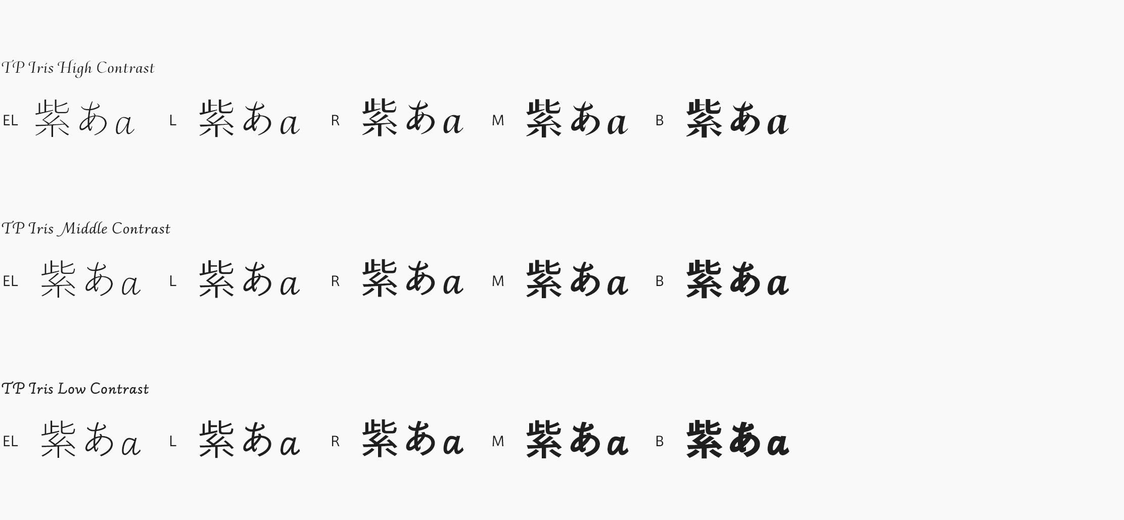
In the Seasonal Font series, the first release was TP Iris, with the image of the flowers “iris” and “Japanese iris,” representing early summer, and the second release was TP Meigetsu with the fall moon as a theme. The third release is TP Tsurara, with the image of icicles created by the cold winter air. It is a typeface with high practicality even in modern applications, with its own strong personality.
Features
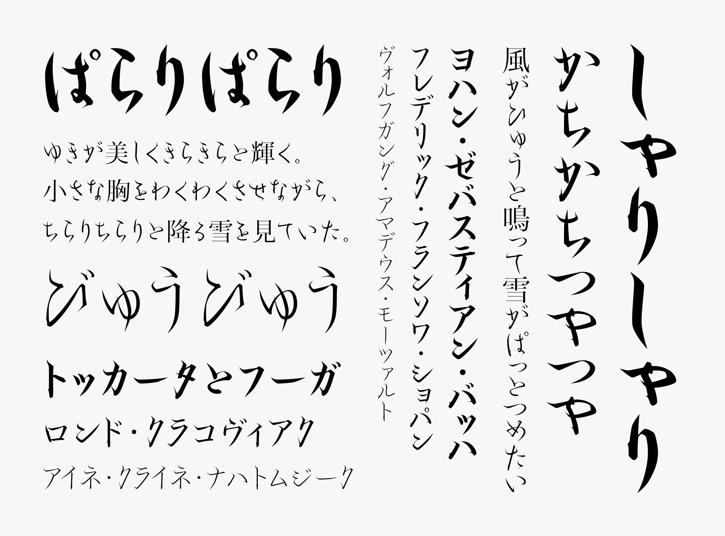
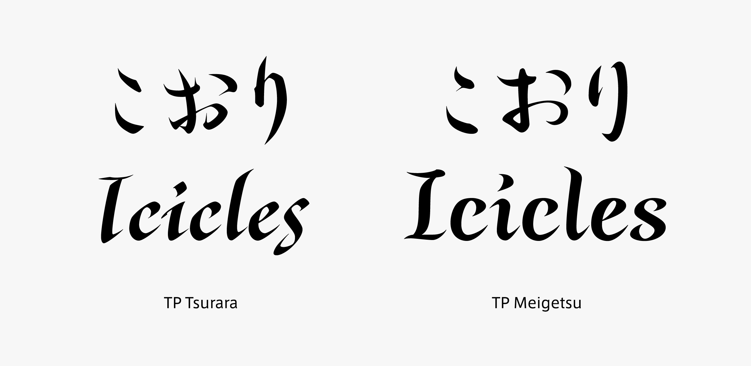
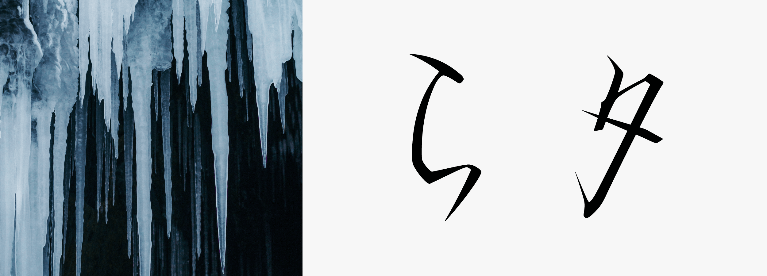
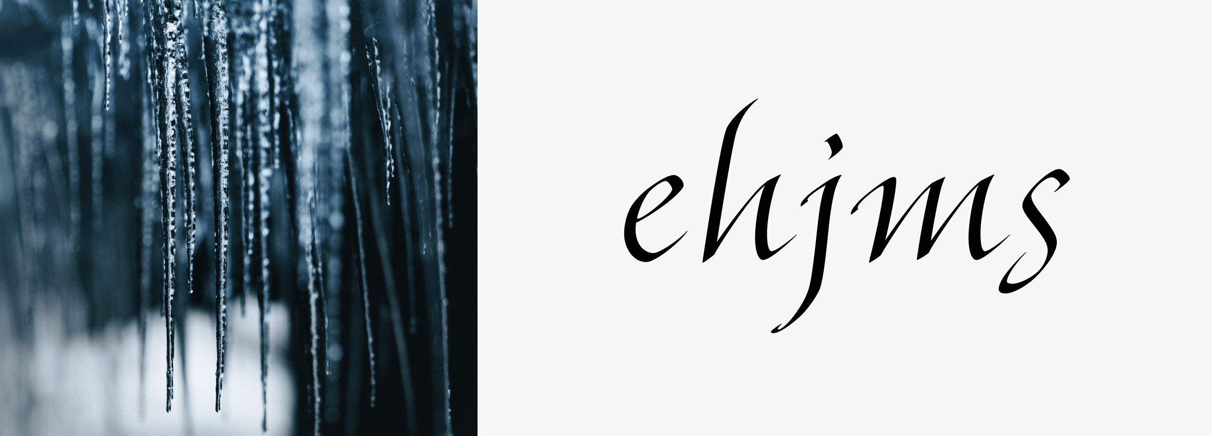
Utilizing the handwriting of Fujiwara no Toshinari, TP Tsurara reflects the sharpness and coldness of icicles in the character shape, and it is designed with the image of the beauty and sparkle of ice. The characters of his son, Fujiwara no Teika, are individualistic, but the characters of Toshinari are also distinctive like no other. Maintaining an appeal that is modern enough to apply at present, the typeface is finished. The Latin typeface is created based on writing with a pen to express the sharpness of icicles. Longer ascenders and descenders are designed with the intention to recall a long narrow icicle. The impression of icicles is strengthened by angulating the turnup part of the Latin character shape, equivalent to the turning parts in the Kana. Design processing to suggest the coldness of winter is adopted throughout. By combining with the Hama Mincho Headline Kanji, strength in contrast is also balanced. The blending of Kanji and Kana, Japanese and Latin are the highlights of this Seasonal Font.

Family
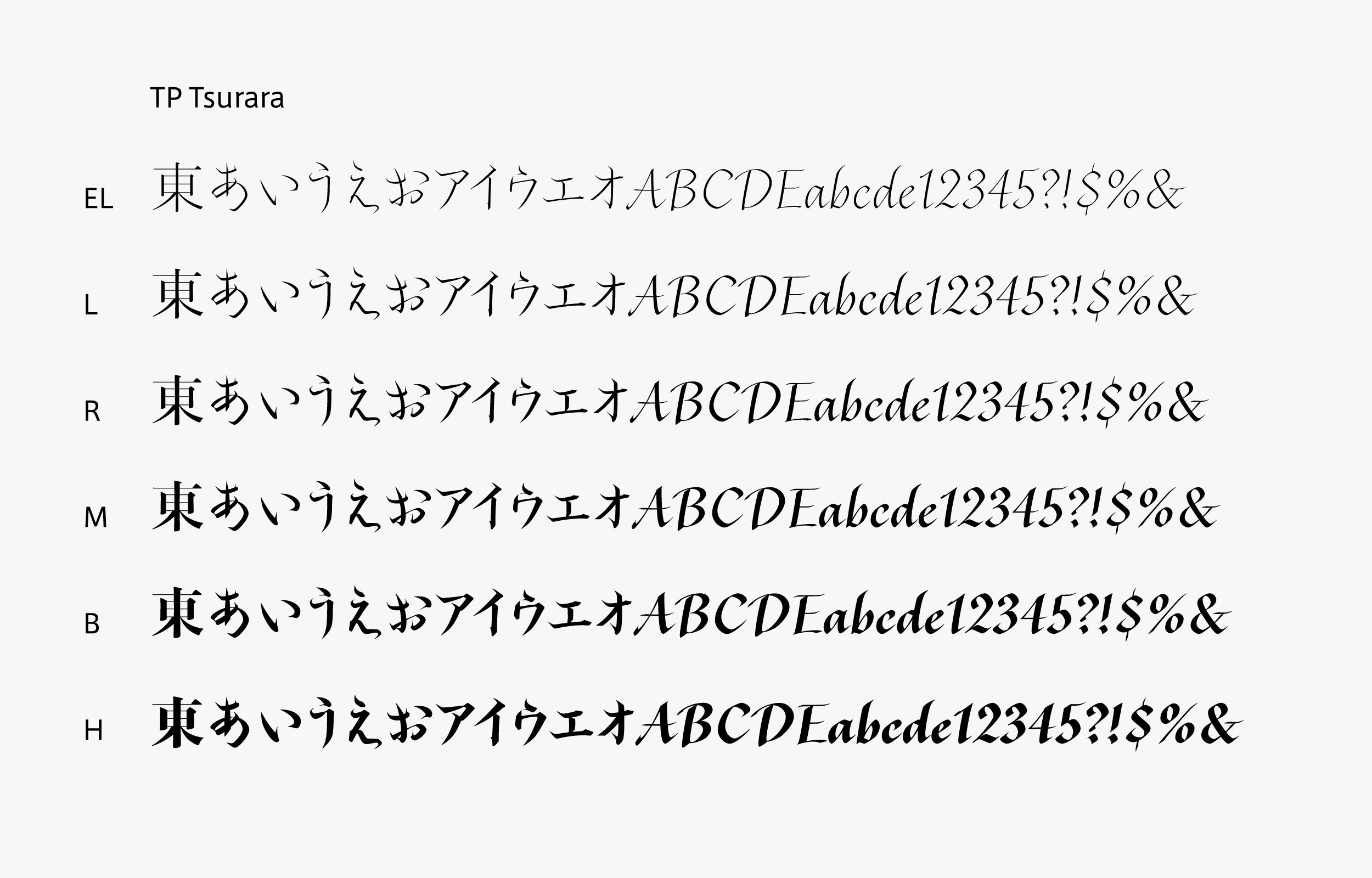
TP Tsurara consists of 6 weights, from EL (Extra Light) to H (Heavy), with an axis in high contrast, giving a sharp impression. The thickness from L (Light) to R (Regular) is close to the handwriting of Toshinari, which it is based on. Typeface features tend to appear in the narrow character, and also give a strong impression in heading applications, maintaining features even in thick weights. TP Tsurara is a typeface family with a modern and sharp atmosphere, though it is based on classic.
Specification
| Main feature |
OpenType font Cross platform Extractable outlines PDF embedded Kerning information Dynamic download No resolution restrictions |
| Supported operating system |
macOS Windows 10/11 |
| Font set |
Standard(StdN) 9,534 characters (Adobe-Japan 1-3, with custom glyphs added) |
| Languages | Japanese font (Std/StdN) almost fully covers 30 languages shown below. Japanese font based on Adobe Japan 1.3 covers all ISO-8859-1 proportional characters and Š, š, Ž, ž, Œ, œ, Ÿ. Then AXIS Font Japanese version can be used as multilingual font when you compose text using proportional characters. However, not all corresponding half-width characters are included, only Latin font is covered by half-width characters. Japanese (main script and covers JIS X 0208:1997) / English/ Icelandic (íslenska) / Irish (Gaelige) / Afrikaans (Afrikaans) / Albanian (Gjuha Shqipe) / Italian (Italiano) / Indonesian (Bahasa Indonesia) / Estonian (Eesti keel) / Occitan (lenga d’òc) / Dutch (Nederlands : U+0132 “IJ” and U+0133 “ij” shall be divided into I/i and J/j) / Oromo (Oromiffa) / Galician (Galego) / Swedish (Svenska) / Scottish Gaelic (Gàidhlig) / Spanish (Español) / Swahili (Kiswahili) / Danish (Dansk) / German (Deutsch) / Norwegian (Bokmål) / Norwegian (Nynorsk) / Finnish (Suomi) / Faroese (Føroyskt) / French (Française) / Brasilian Portuguese (Português Brasileiro) / Breton (Brezhoneg) / Portuguese (Português) / Latin (Latina : Classical orthography, without vowels with macron) / Luxembourg (Lëtzebuergesch) / Rhaeto-Romance languages (Rhaetian) / Walon (Walloon) *Full width version of Greek uppercase/lowercase (24 characters for each, excluding ending form of sigma) and Cyrillic (Russian) uppercase/lowercase (33 characters for each) are included as JIS Row6 and Row 7 (These characters are defined as full width in JIS spec) |

