2022.08/02
A lot of inspiration from mythology and architecture.
Type Project interviewed with the funders and type designer of BLAZE TYPE, Matthieu Salvaggio.
1. Tell us about your company.
Blaze Type is an independent French type foundry. We focus our efforts in designing contemporary retail & custom fonts. Our goal is to promote the work of type designers through high quality and high technicality font production. Something that makes us stand apart is the complexity of the font we produce: lots of languages are covered along with lots of alternate characters and wide font family in styles & weights. We take a lot of inspiration from mythology and architecture and use those as starting points in our own font catalog.
2. What are the main/leading fonts of your company?
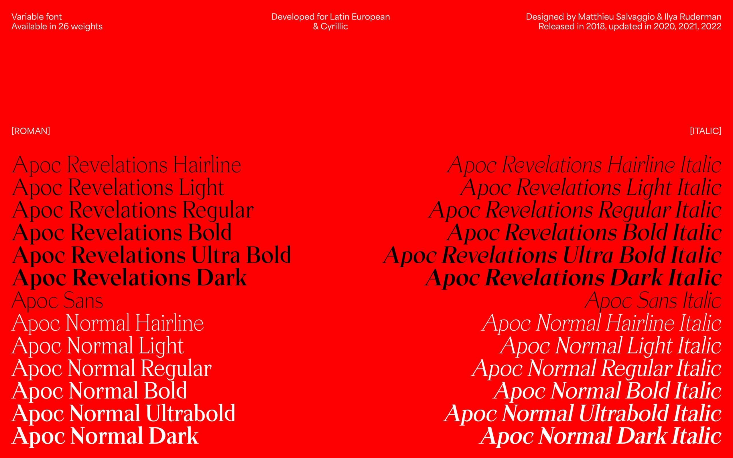
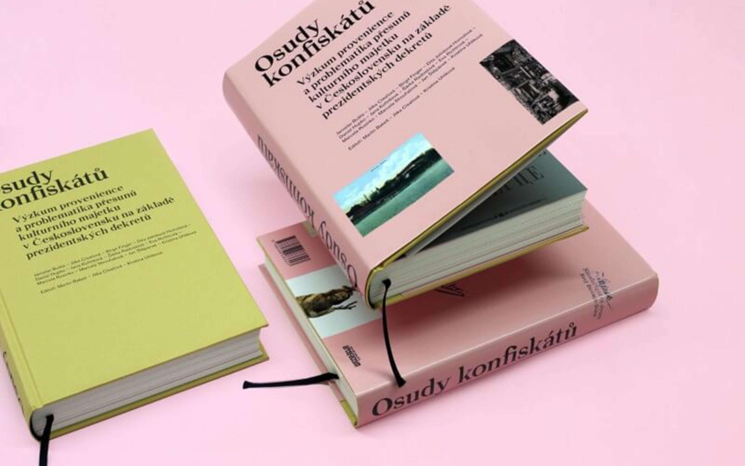
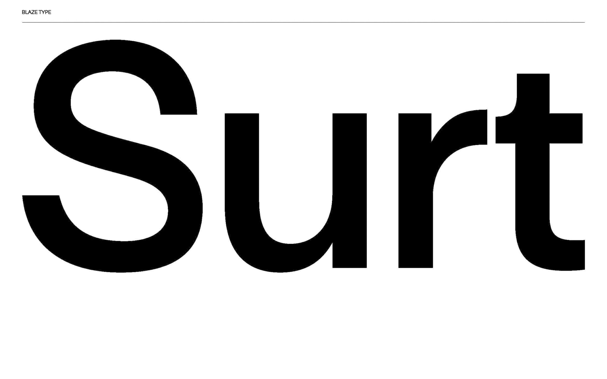
Our main leading fonts are Apoc, a serif display typeface family inspired by the Book of Revelations from Saint John, Surt, a sans typeface inspired by Scandinavian Mythology and Architecture. Both are font families that can define us: expressiveness & usefulness in all situations.
3. Is there any newly released typeface from your company?
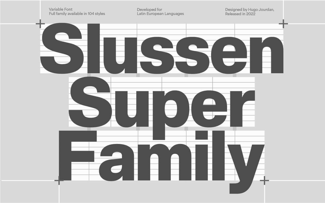
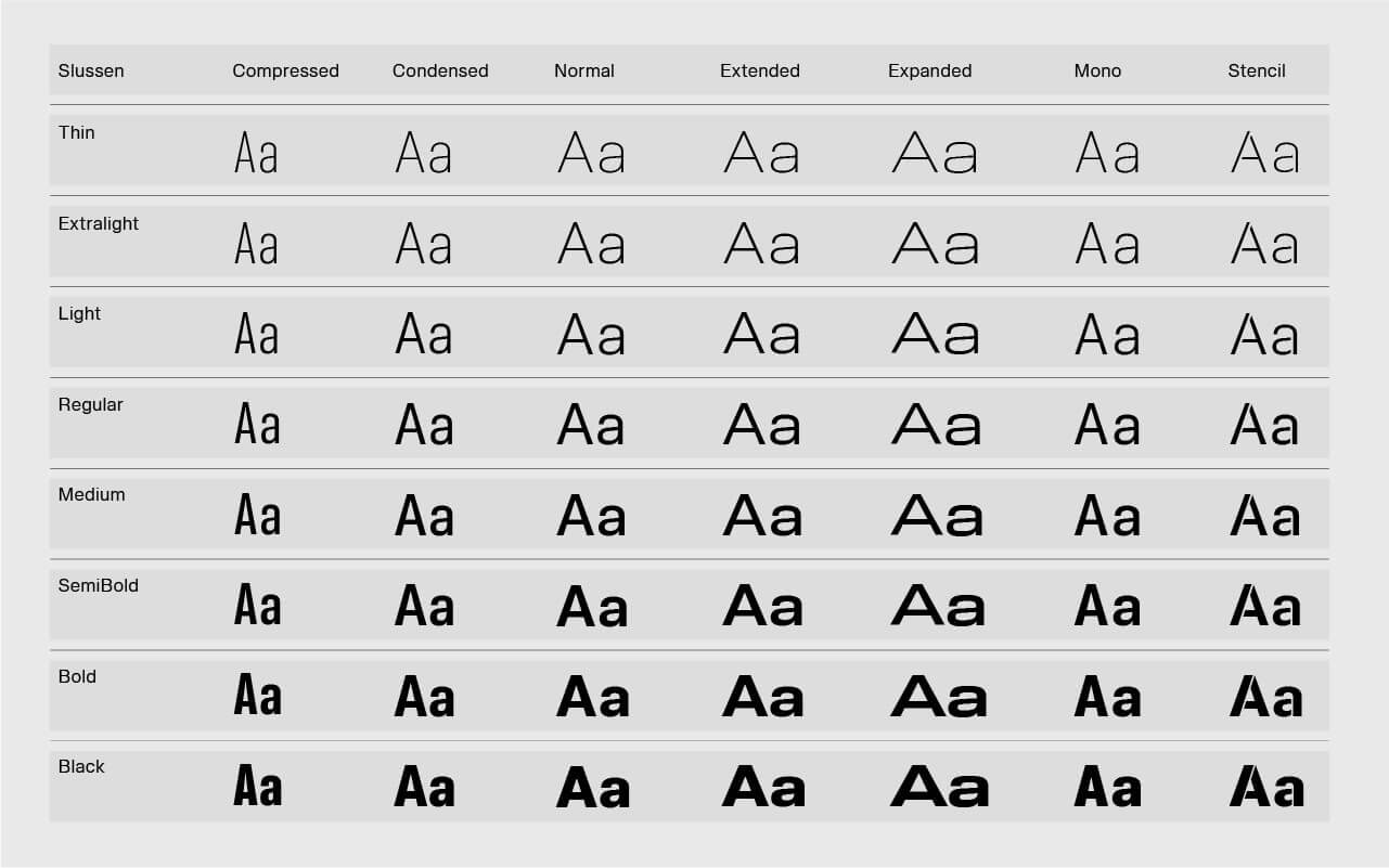
We do release a lot of fonts each year. The most recent are Slussen designed by Hugo Jourdan and Rules by Léon Hugues & Matthieu Salvaggio.
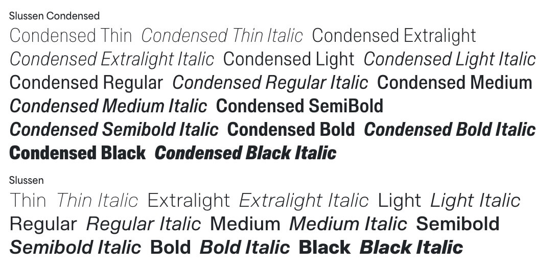
4. What is the ratio of your work for original design fonts and custom order fonts? Please tell us about custom work.
We have multiple retail fonts on the go every year, some font designs can take years to finish of course and will always try to have at least 2 font retail families in production.
Each year we have a various amount of clients coming to us directly for custom fonts: extend languages for their need, custom font design “from scratch” in order to produce a font family in direct link to their brand, custom font based on our own catalog in which case we design some specific changes in order to fir our client’s needs, custom logo design as well. We start each of these projects by a discussion with our clients in order to properly grasp their needs.
In order to design something relevant both in looks and in use important to us to understand what they plan to do with the fonts: which software they are going to be using them with, where they are going to be displayed etc. The more we talk and understand the goal our clients want to achieve with the font, the better it is for us in order to produce something of high quality. We had the pleasure to be working for companies like Hall & Partners for their brand’s font, Ogilvy Lab for Volleybal World font system and Graphéine for the font used for Le Mont Saint Michel.
5. Can you tell us about your customer?
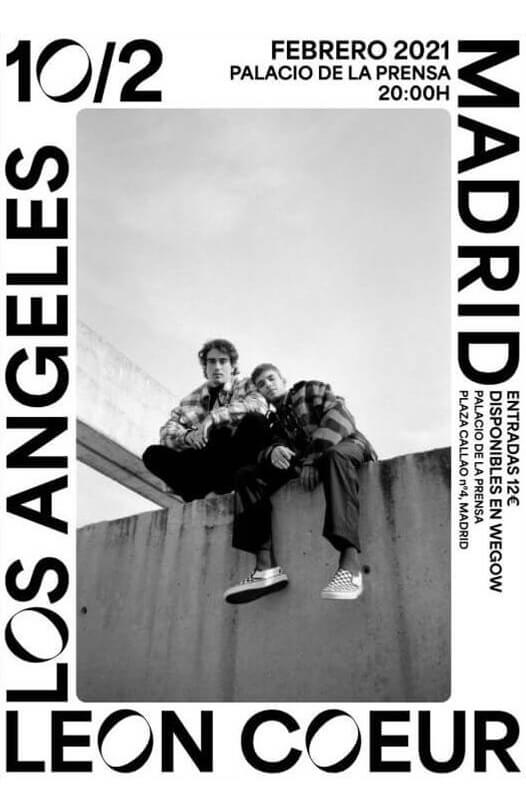
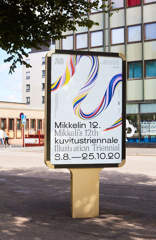
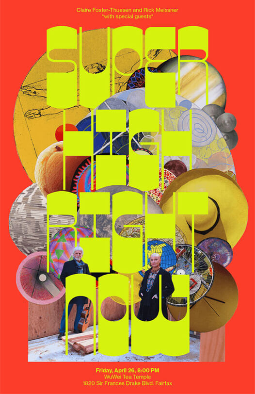
Most of our customers are designers, studios & design agencies. They use our fonts on pretty much anything you can think of: posters, books, website, apps, signage system and even video installations. We’ve had the honor to have our fonts being used by renowned agencies like Pentagram and freelance designers from all around the world. Each use a designer makes of our font is a reward to us: we love seeing what people design with our work!
6. What do you think about your company positioning, for its raison d’etre in the font design/development industry?
Blaze Type started as a solo adventure in 2016, since then the company has grown and now type designers, graphic designers, motion designers, developers from all around the world are involved in the company. Our main goal today is to promote the work of young font designers, teach, work, produce and distribute with them wherever they are. We recently launched a mini foundry called “The Box”(https://blazetype.eu/the-box)in which we will share the work of these amazing designers on a monthly basis.
7. What is your opinion about open source font and free font?
I personally love the idea of open source: a project where everyone can take their hands on and update, change, evolve. I don’t see open source or free fonts as a treat to commercial fonts, to each their own in terms of interests and market. The “only” issue I can picture is the fact that some people may consider fonts to be a free thing because most of the things accessible on internet “seem” free: easy to download and use. We have to teach people about the implication of using a font, about licensing, we advocate for that and that’s why we try our best to price our font in a fair manner with a fair licensing system.
8. How do you get to know Type Project, and what do you think about us?
Word of mouth! We’ve always wanted to get involved with a company in Asia, especially from Japan (the country has always fascinated us).
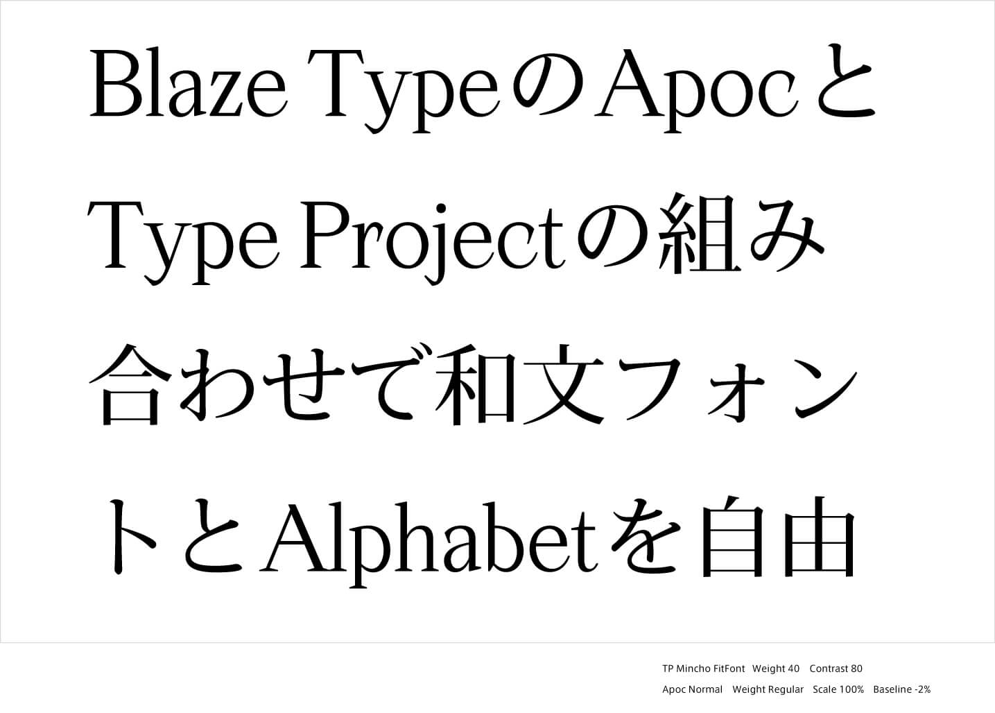
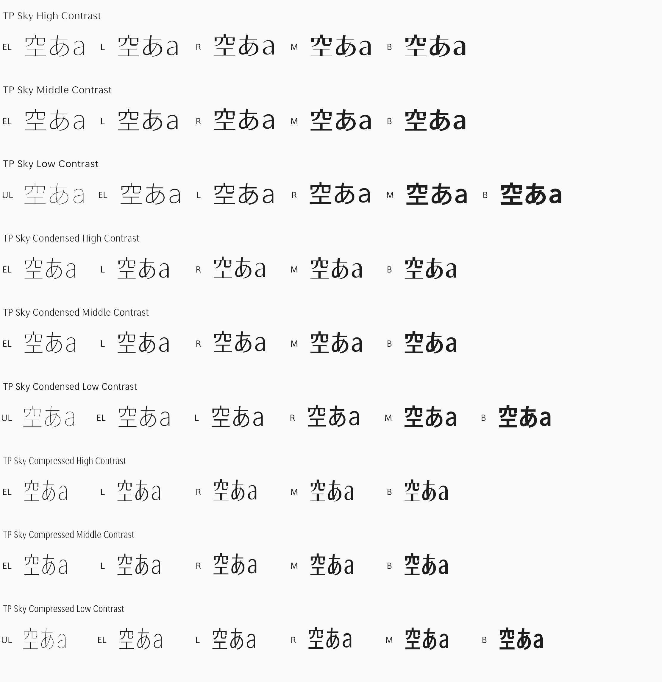
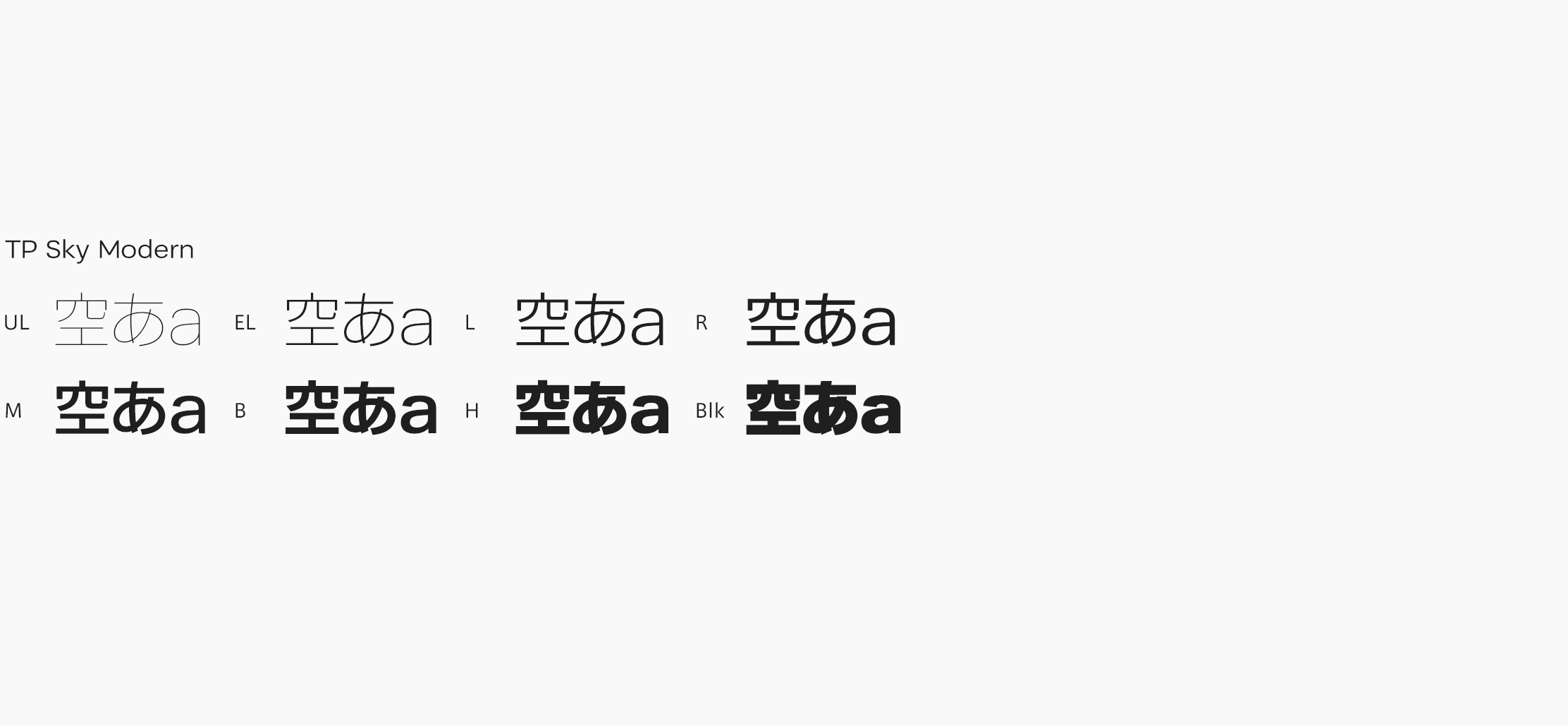
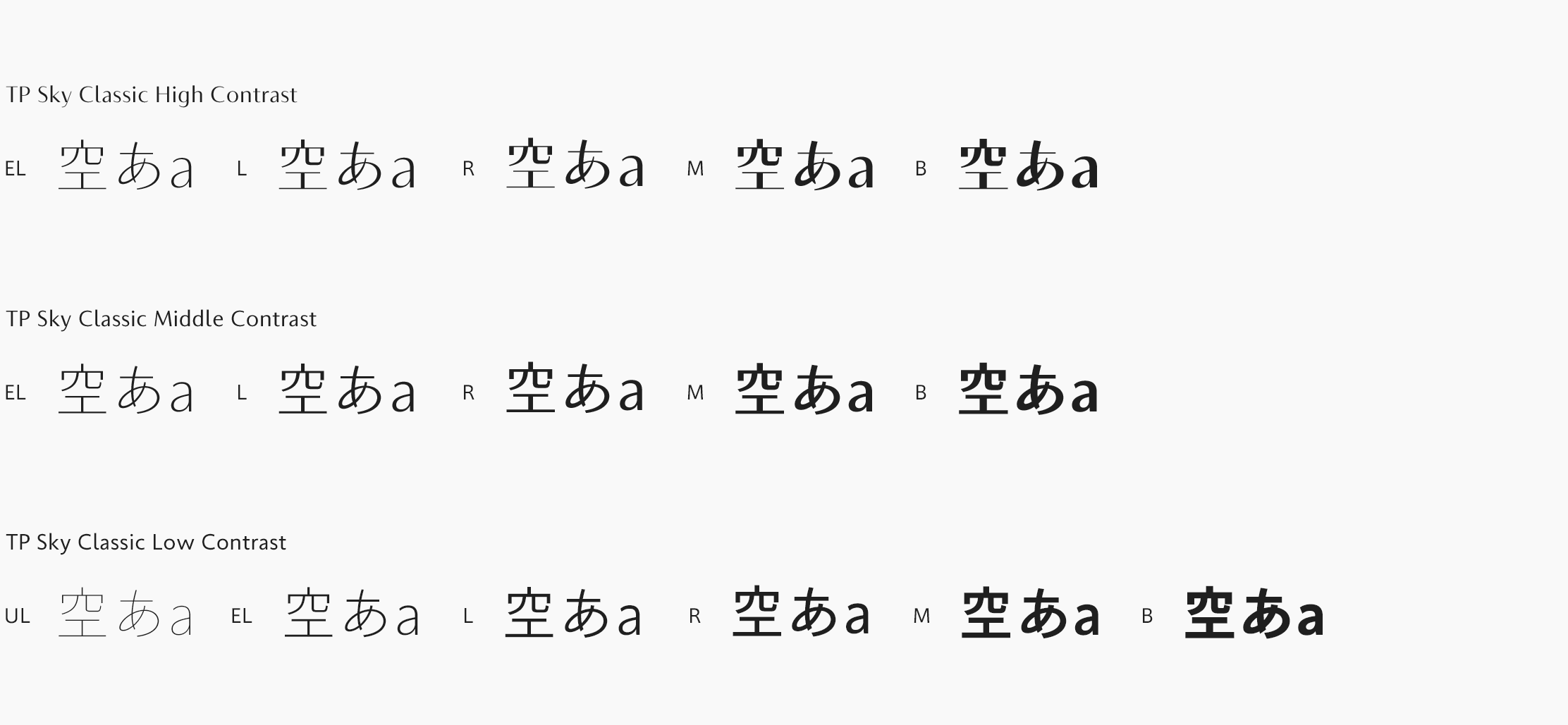
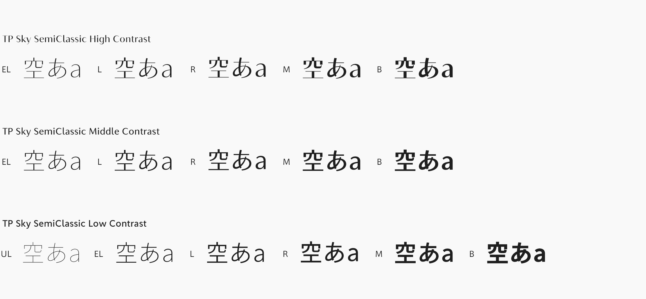
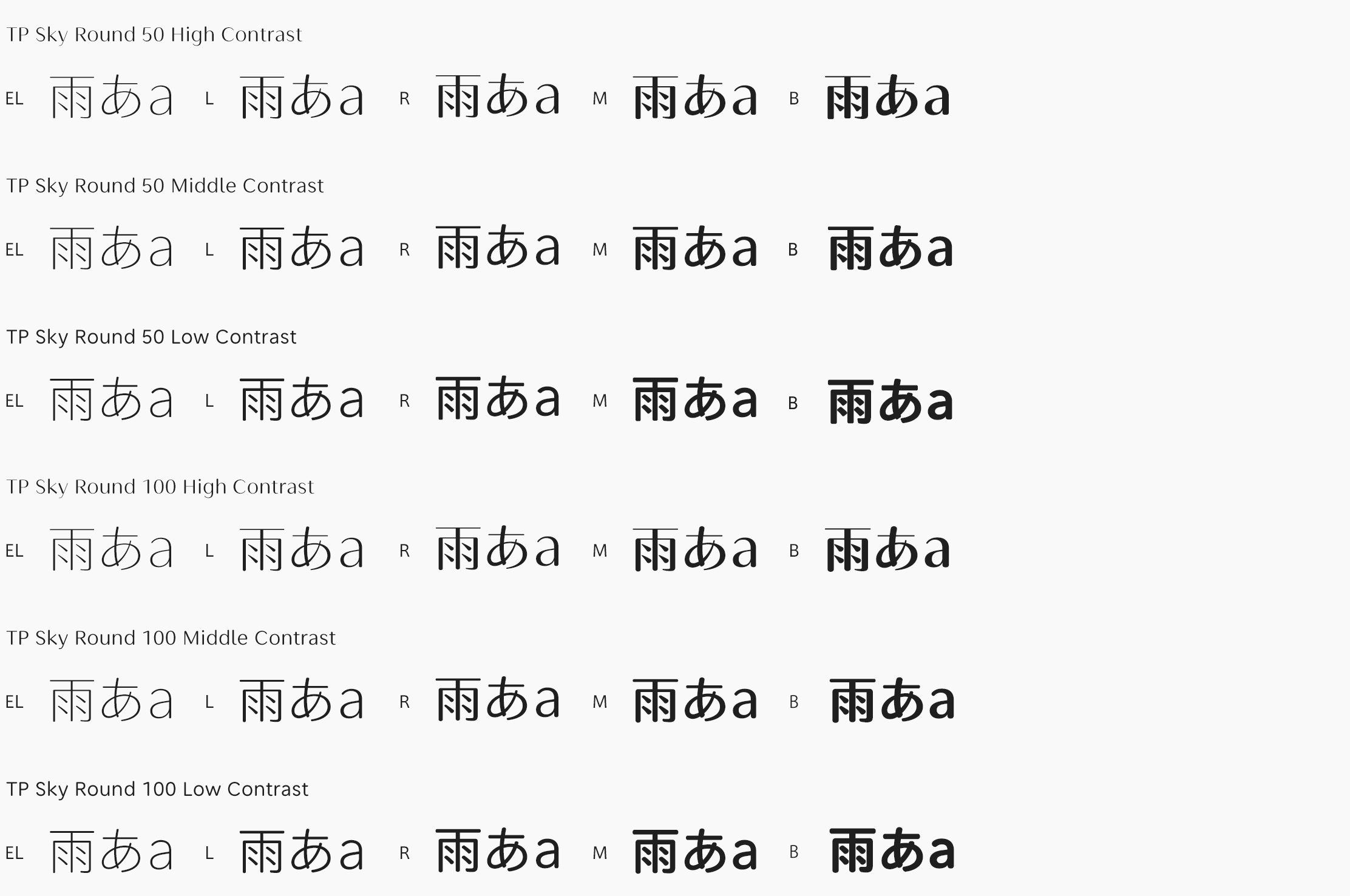
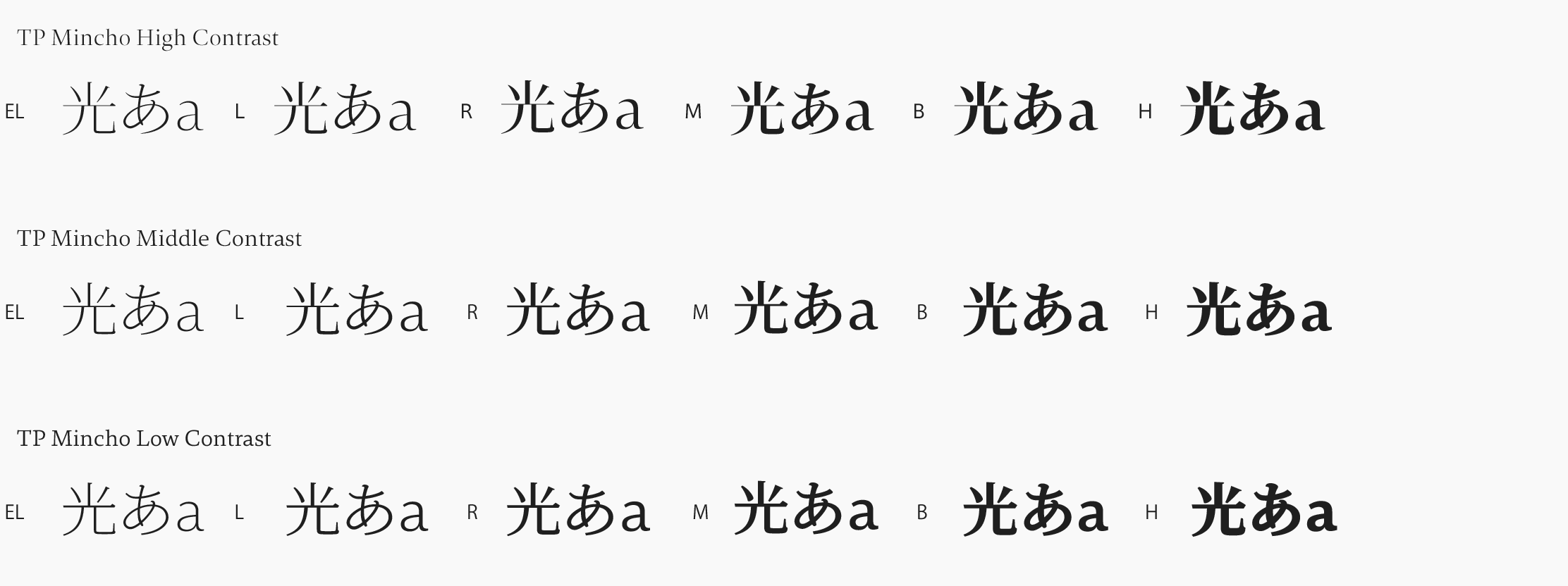
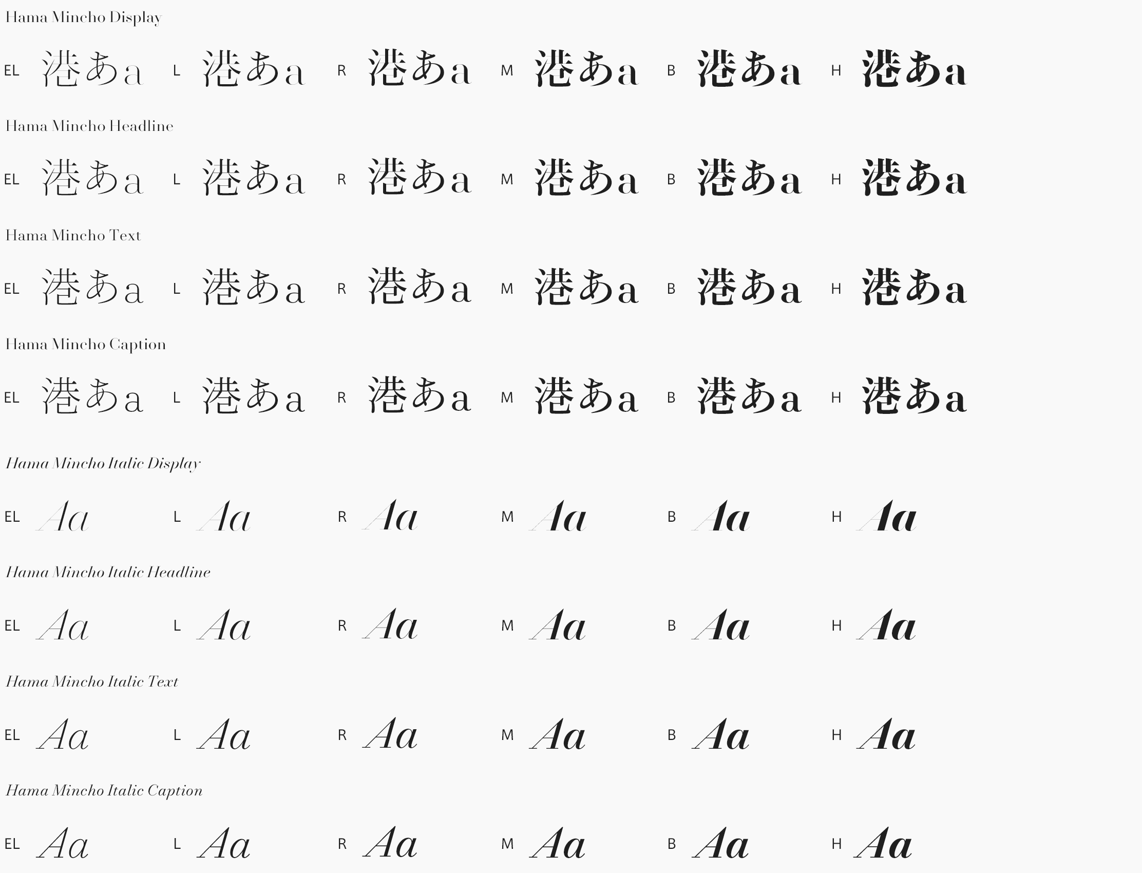
My own knowledge in Japanese and its font production is rather inexistant so I can only speak for the esthetic part of what I see and I think they are amazing. I love TP Sky and its straight to the point design, it’s elegant and feels steady. I do have to say though that Mincho has a special place for me, the High Contrast axis especially. I feel like a nice balance between hand design and digital design. Something we try to aim for with our fonts is to find a nice balance between historical references and contemporary design. Our expectations are rather simple: being able to have our fonts match with yours for the needs of a user, a company, is our end goal.
9. What do you think about FitFont service?
I believe it’s a great idea to propose something of the such. Allowing users to be able to find exactly what they are looking for in terms of design is something we should all be implementing. We’re simply delighted & honored to be part of this venture and we are eager to see you all design amazing project with our fonts!
