-
A
-
Buy
TP JPN
National Parks
MinchoL
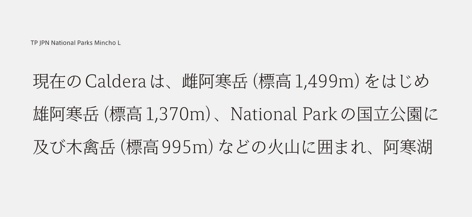
National Parks of Japanのために開発した書体 読みやすく、遠くからでも認識しやすいスラブセリフフォント 日本全国の国立公園の豊かな個性と調和する、オーソドックスでゆったりとした印象。
-
Buy
TP JPN
National Parks
MinchoR
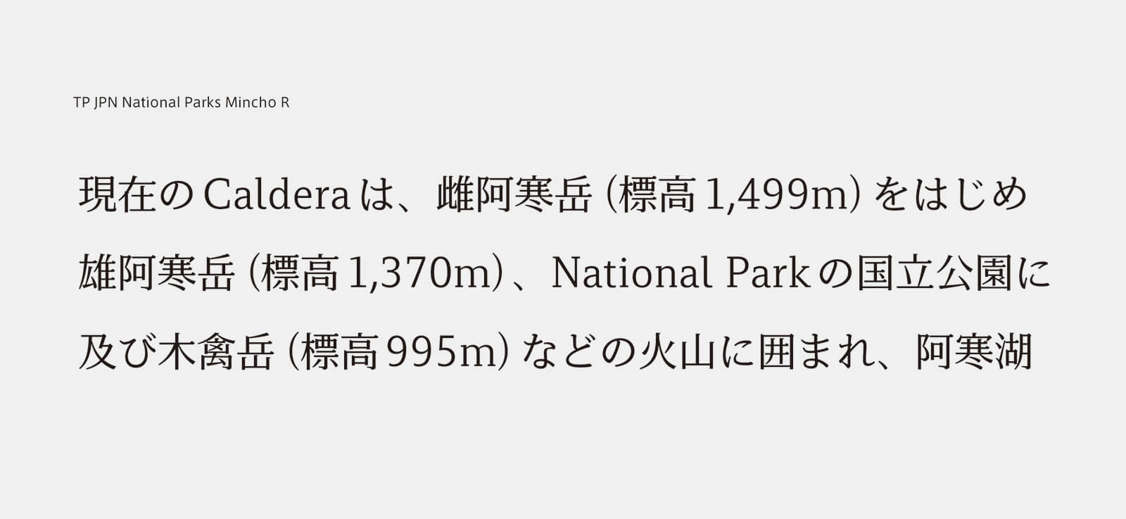
National Parks of Japanのために開発した書体 読みやすく、遠くからでも認識しやすいスラブセリフフォント 日本全国の国立公園の豊かな個性と調和する、オーソドックスでゆったりとした印象。
-
Buy
TP JPN
National Parks
MinchoB
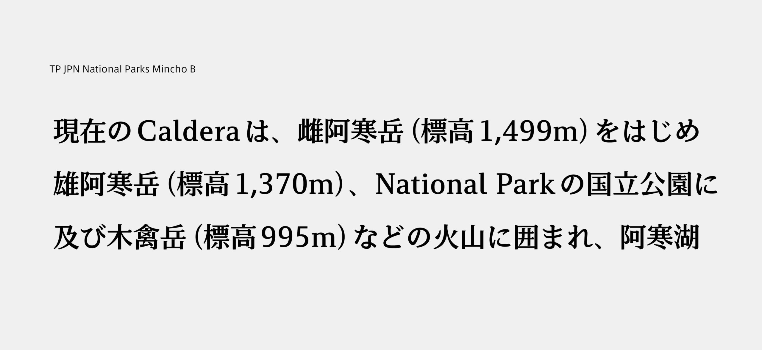
National Parks of Japanのために開発した書体 読みやすく、遠くからでも認識しやすいスラブセリフフォント 日本全国の国立公園の豊かな個性と調和する、オーソドックスでゆったりとした印象。
About Product
Overview
TP JPN National Parks Mincho was developed as part of the Project to Fully Enjoy National Parks, launched in 2016 by the Ministry of the Environment. The purpose is to make consistent the fonts used in National Park information signs and brochures, as well as on the National Parks logo in use nationwide, so as to further reinforce the branding of National Parks.
TP JPN National Parks Mincho is a slab serif typeface font based on a contemporary structure, delivered based on a request from the Ministry of the Environment to “ensure legibility of signboard lettering, etc., while conveying the dignity and character of Japan’s National Parks.” A “slab serif typeface font” is a font in which the serifs (small lines or strokes attached to the ends of larger strokes) are linear, and there is little difference in thickness between the larger vertical and horizontal strokes and the serifs (i.e. low contrast). We developed the Japanese TP JPN National Parks Mincho font, adapting TP Mincho’s low contrast and developing a new version for Latin-alphabet languages.
Because TP JPN National Parks Mincho has thicker horizontal lines than serif typefaces in general, it has outstanding legibility from a distance and is optimal for signage systems. Because horizontal strokes’ visibility is not easily lost, the font is also effective at small sizes, such as on brochures and business cards. There is an emphasis on harmony between the Latin-alphabet and Japanese typefaces, and by adjusting weight and contrast, the text is made slightly thicker to produce a smooth impression when multiple languages appear together.
The Latin font was developed through repeated discussions with Yoshiaki Irobe, Art Director, Nippon Design Center, who was in charge of the nationwide National Parks logo, maintenance of signage, brochure design and so forth.
-
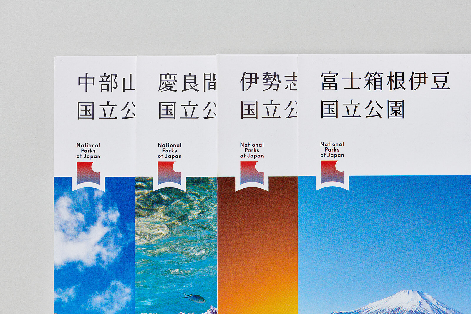
©️Nippon Design Center,Inc.
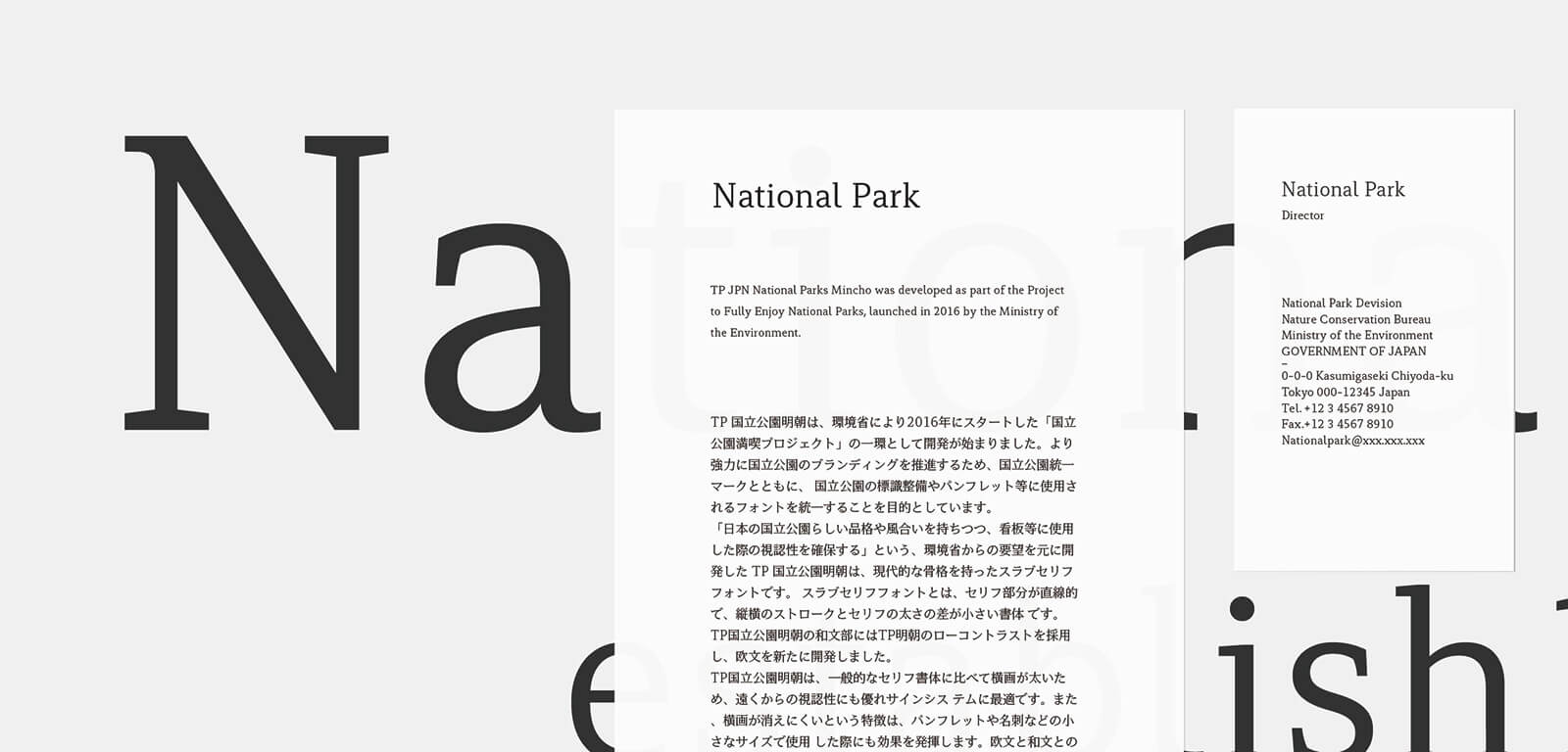
Concept
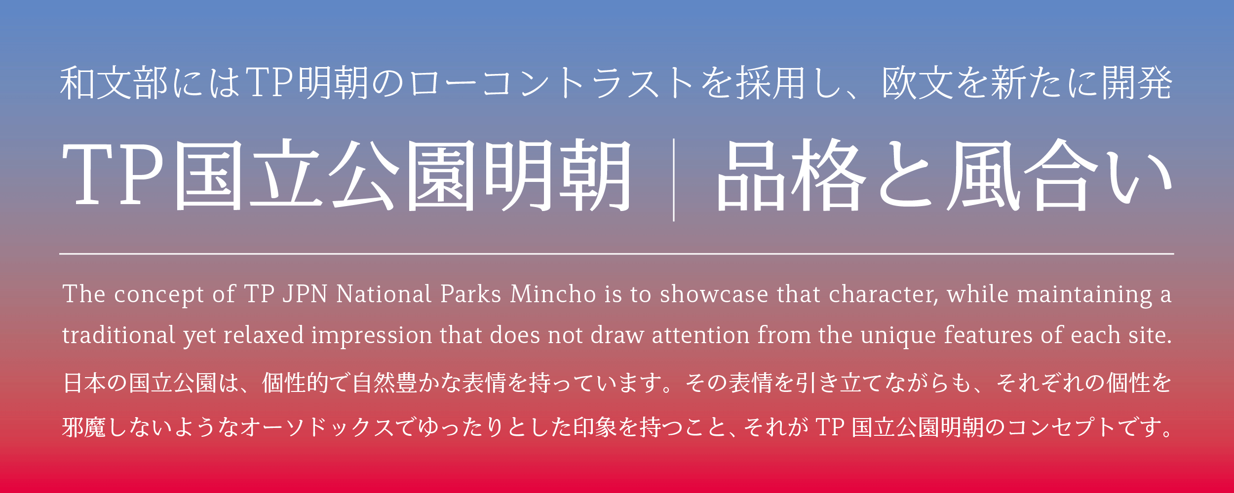
Development of TP JPN National Parks Mincho began with the premise of usage for signage systems at National Parks, which contain many vast places of natural beauty. How can this signage best assist visitors? Our answer was that the typeface should be easy to read, and highly legible even from a distance. National Parks, located throughout Japan, are distinguished by their natural abundance. The concept of TP JPN National Parks Mincho is to showcase that character, while maintaining a traditional yet relaxed impression that does not draw attention from the unique features of each site.
One approach to realizing this concept was the handling of joints between serifs and stems. While the serif sections of the TP Mincho Latin font are accompanied by curves, the TP JPN National Parks Mincho Latin font has been simplified by using straight lines.
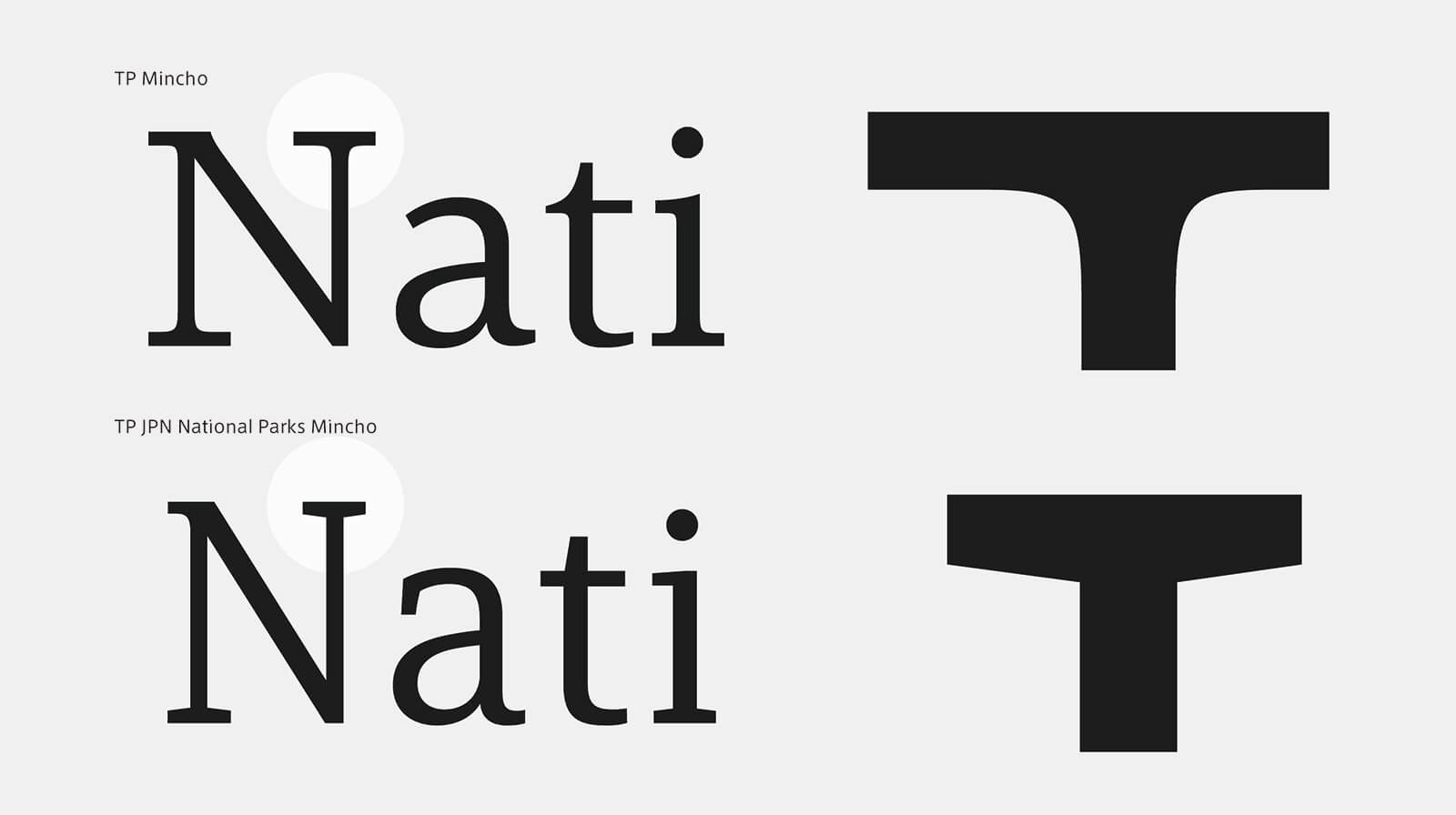
Features
In developing this specialized typeface, it was necessary to create a Latin font that did not look out of place to visitors to Japan from overseas, so as to brand Japan’s National Parks as “world-class national parks” in line with the Vision to Support the Future of Japan Through Tourism initiative being implemented by the entire Japanese government. Therefore, while TP Mincho’s standard Latin font gives a flowing impression reminiscent of handwriting, TP JPN National Parks Mincho comprises many straight elements that give it a more contemporary look.
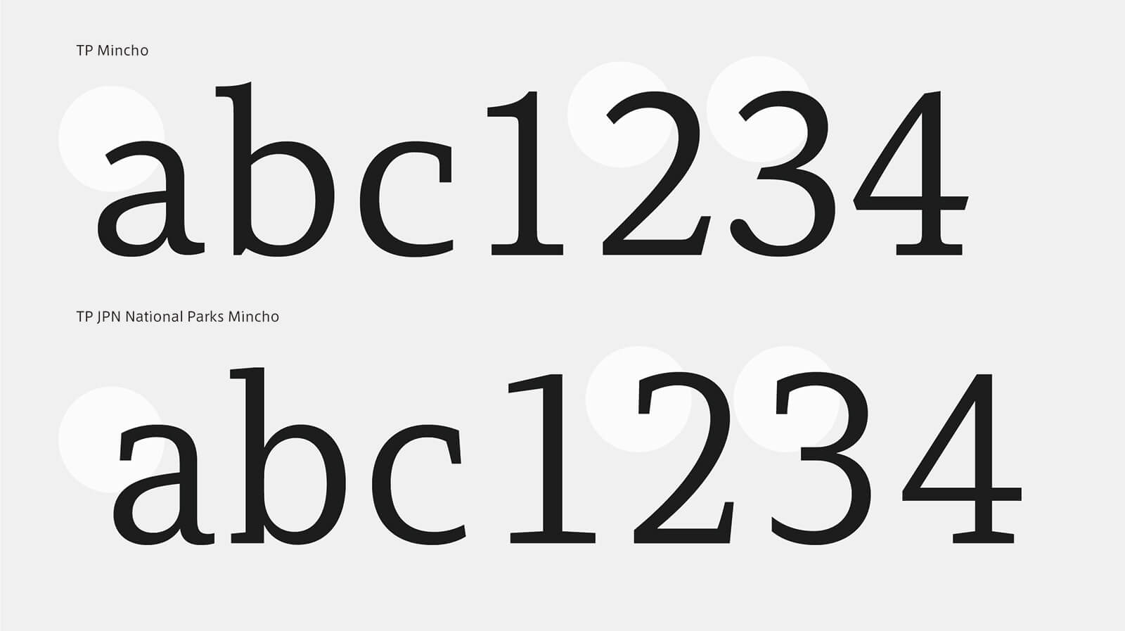
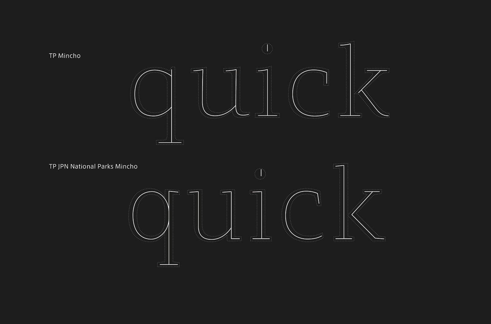
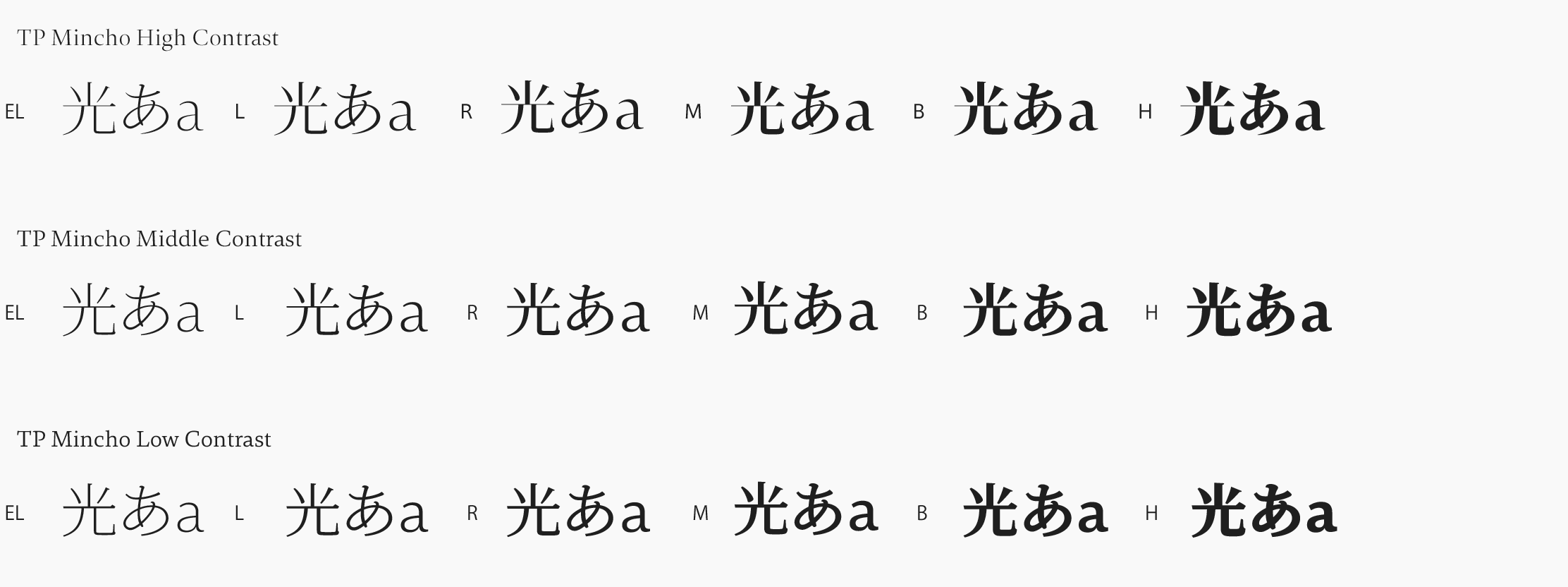
TP Mincho was the first Japanese font to introduce the concept of contrast (ratio of horizontal and vertical thickness). The low-contrast TP JPN National Parks Mincho has a line-weight ratio reminiscent of Gothic fonts, and is characterized by thicker, more robust and powerful horizontal strokes than conventional Mincho fonts. The Latin font newly developed for TP JPN National Parks Mincho was also designed with broad horizontal strokes, so there is no sense of incongruity even with negative-positive reversal (light lettering on dark backgrounds).
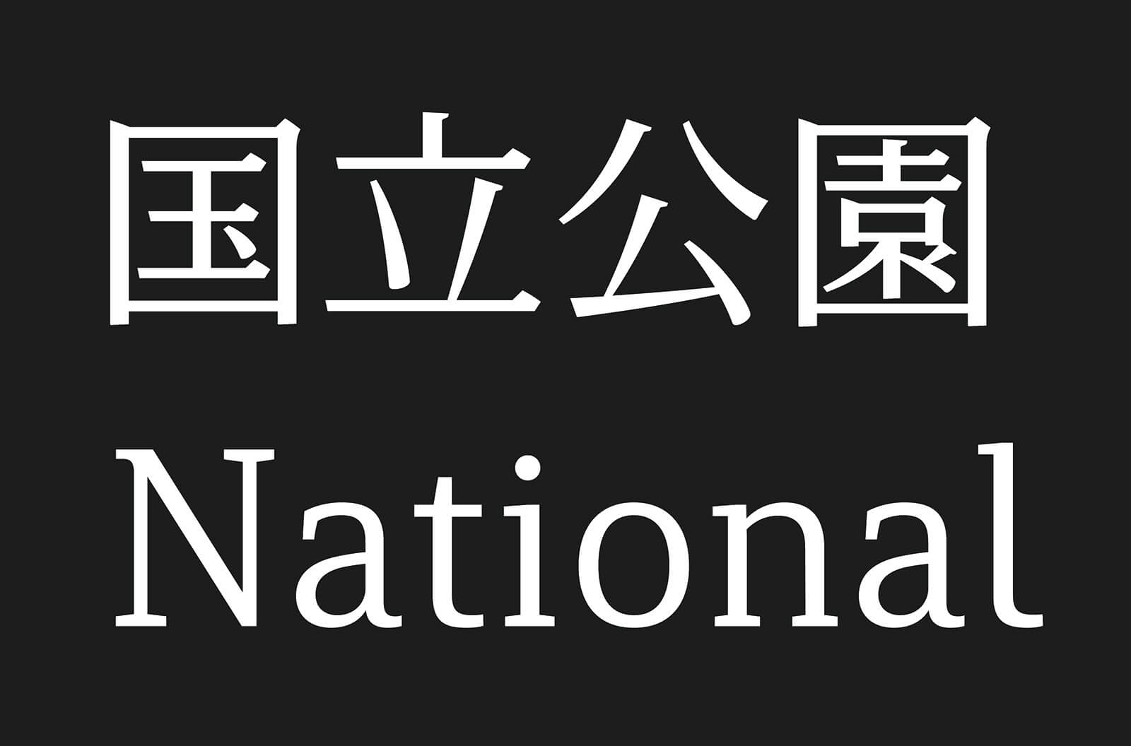
We designed the Latin font to harmonize with the Japanese font when the two appear together. As there are many cases where it is used alongside numerals and Japanese characters, we took particular care with the balance of these during the design process.
Family
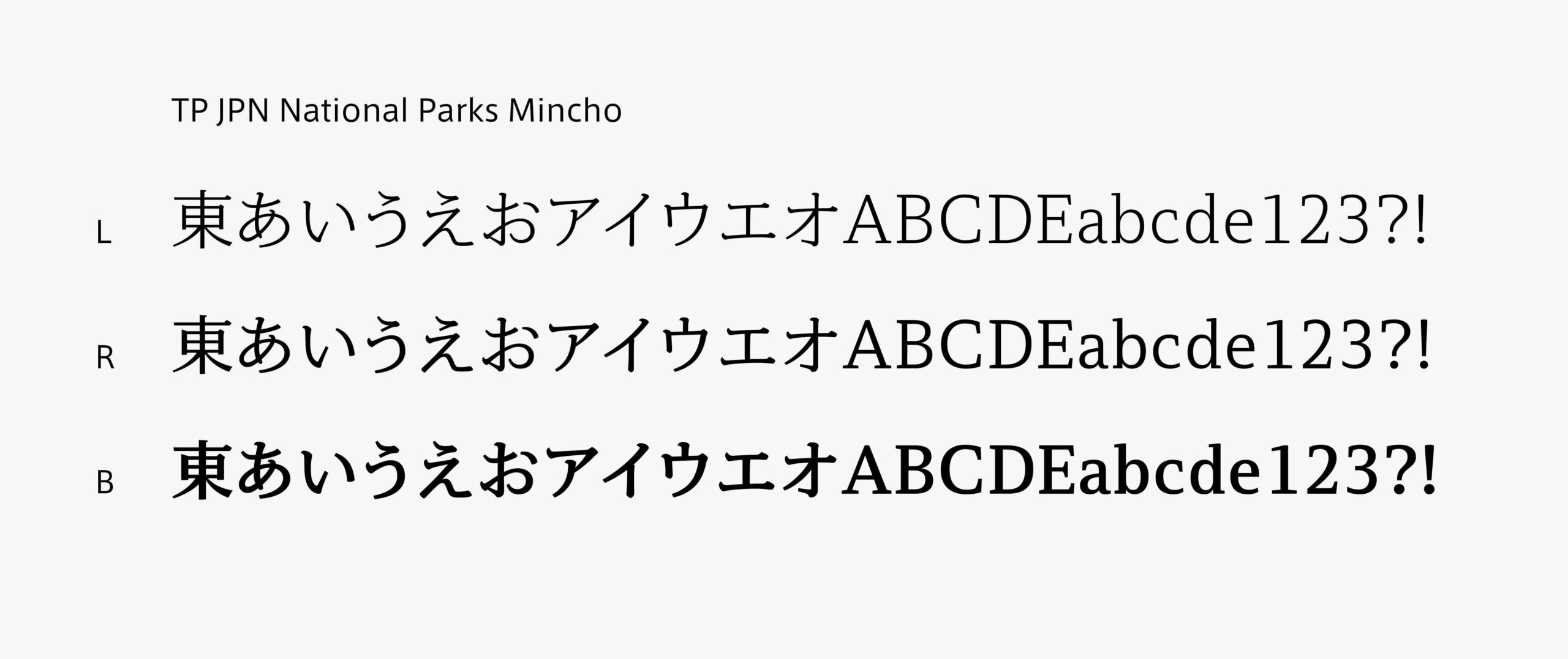
By designing the horizontal stroke of TP JPN National Parks Mincho thicker than typical Mincho typefaces, it has the appearance of a Gothic typeface while portraying the dignity and sensitivity of National Parks. TP JPN National Parks Mincho is a font family structured with three weights: L (Light) used for texts, R (Regular) used for headings, and B (Bold) designed with stronger stroke lines. L can be read clearly even in small sizes. R is suitable for headings and signature systems. As B is easy to read from far away, it is appropriate for explanation boards and traffic signs.
Specifications
| Main feature |
OpenType font Cross platform Extractable outlines PDF embedded Kerning information Dynamic download No resolution restrictions |
| Supported operating system |
macOS Windows 10/11 |
| Font set |
Standard(StdN) 9,504 characters(Adobe-Japan, with ff, ffi, ffl added) |
| Languages | Japanese font (Std/StdN) almost fully covers 30 languages shown below. Japanese font based on Adobe Japan 1.3 covers all ISO-8859-1 proportional characters and Š, š, Ž, ž, Œ, œ, Ÿ. Then AXIS Font Japanese version can be used as multilingual font when you compose text using proportional characters. However, not all corresponding half-width characters are included, only Latin font is covered by half-width characters. Japanese (main script and covers JIS X 0208:1997) / English/ Icelandic (íslenska) / Irish (Gaelige) / Afrikaans (Afrikaans) / Albanian (Gjuha Shqipe) / Italian (Italiano) / Indonesian (Bahasa Indonesia) / Estonian (Eesti keel) / Occitan (lenga d’òc) / Dutch (Nederlands : U+0132 “IJ” and U+0133 “ij” shall be divided into I/i and J/j) / Oromo (Oromiffa) / Galician (Galego) / Swedish (Svenska) / Scottish Gaelic (Gàidhlig) / Spanish (Español) / Swahili (Kiswahili) / Danish (Dansk) / German (Deutsch) / Norwegian (Bokmål) / Norwegian (Nynorsk) / Finnish (Suomi) / Faroese (Føroyskt) / French (Française) / Brasilian Portuguese (Português Brasileiro) / Breton (Brezhoneg) / Portuguese (Português) / Latin (Latina : Classical orthography, without vowels with macron) / Luxembourg (Lëtzebuergesch) / Rhaeto-Romance languages (Rhaetian) / Walon (Walloon) *Full width version of Greek uppercase/lowercase (24 characters for each, excluding ending form of sigma) and Cyrillic (Russian) uppercase/lowercase (33 characters for each) are included as JIS Row6 and Row 7 (These characters are defined as full width in JIS spec) |

