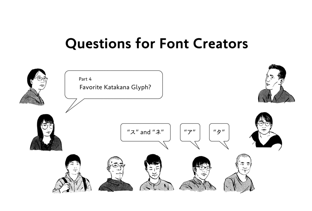
The question “What is your favorite katakana glyph?” was asked to staff at the Type Project. Their answers are given below.
・
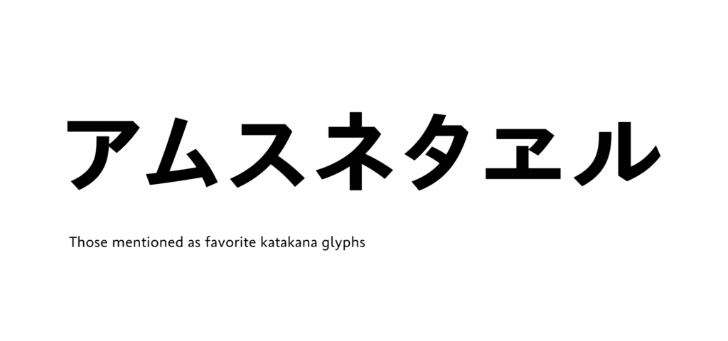
“ア”:
There is balance between the straight line and curved line.
・
“ム”:
I like the firmly tight shape.
・
“ス” and “ネ”:
“ス” and “ネ” in Tsukiji-tai No.5 and Iwata Mincho Old are crushed with a long and sharp left sweep, and this looks stylish.
・
“タ”:
The shape has a feeling of sharpness.
・
“ヱ”:
I like the intensity showing nostalgia with just this one character.
As mentioned above, some mentioned the sharp shapes and stylishness peculiar to katakana for their reasons. On the other hand, there were answers such as, “I don’t like it too much. I have no preferences” as follows:
・
“ア” and “ル”:
I feel that the shape of katakana in the type face space is not organic, if it is square, in comparison to the other glyphs. For that reason, it is both difficult to balance and show attractiveness. So I don’t really like to look at it or create it. Nevertheless, I’m okay with the glyphs “ア” and “ル,” as these two characters have stability.
・
“ア”:
Because katakana overall has a hard and inorganic impression, I don’t like it so much. If I have to choose my favorite, I choose “ア,” as the curved line and straight line are well-balanced.
・
“ア”:
I cannot really think of my favorite, but if I have to choose, this is the character.
・
“ス”:
I don’t have too much of a preference, but I think I like this character, because I can write the sweep with a good feeling.
This is the third time asking the “favorite glyph,” following kanji and hiragana. I have a bit different impression from the answers at this time. Some of them don’t have much of a special feeling for katakana, compared to kanji and hiragana, because the shapes are simple and not so organic.
Even so, many of them choose “ア.” This may be the glyph with a well-balanced impression in particular out of all the katakana.
(XYZ)
term
Series archive Other / Questions for Font Creators
- Questions for Font Creators Part 8: Difficult Glyphs to Design 2
- Questions for Font Creators Part 8: Difficult Glyphs to Design 1
- Questions for Font Creators Part 7: First Glyph to Be Designed
- Questions for Font Creators Part 6: Favorite Glyph Among Numbers and Symbols
- Questions for Font Creators Part 5: Favorite Latin Alphabet Glyph
- Questions for Font Creators Part 4: Favorite Katakana Glyph
- Questions for Font Creators Part 3: Favorite Hiragana Glyph 2
- Questions for Font Creators Part 3: Favorite Hiragana Glyph 1
- Questions for Font Creators Part 2: Favorite Kanji Glyph 3
- Questions for Font Creators Part 2: Favorite Kanji Glyph 2
- Questions for Font Creators Part 2: Favorite Kanji Glyph 1
- Questions for Font Creators Part 1: What Made You Interested in Typeface Design? 2
- Questions for Font Creators Part 1: What Made You Interested in Typeface Design? 1