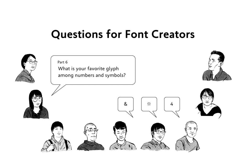
The question “What is your favorite glyph among numbers and symbols?” was asked to staff at the Type Project.
There are a variety of numbers and symbols included in each font, and the number of glyphs increases with the combination of those originating from Japanese and those coming from Latin. The answers given by designers, however, are frequently used, familiar glyphs.
・
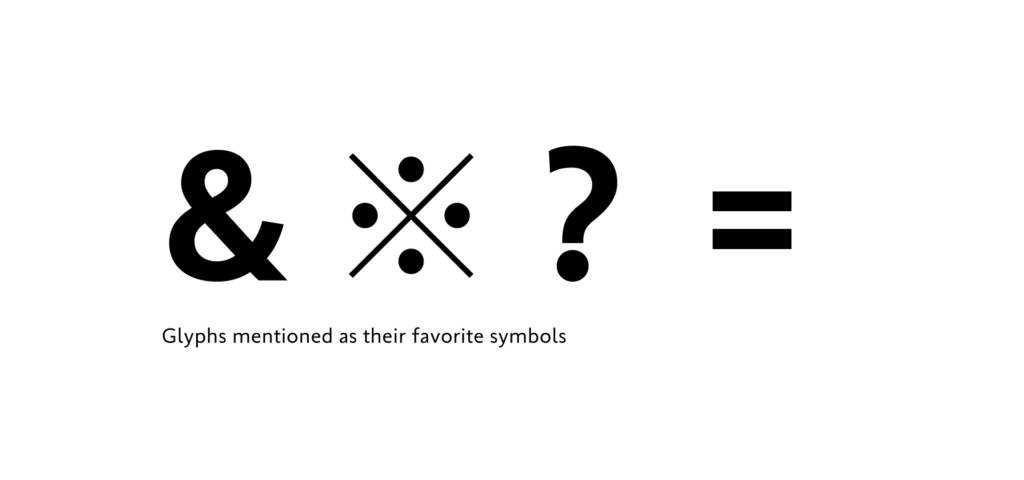
&:
Although it indicates a link, I feel it has a star-class attractive aura on its own. This is the character that I find myself unintentionally checking.
・
&:
As there are various character shapes and arrangement methods, this is a glyph that can broaden the design width. It is enjoyable to think about creating a shape that matches the typeface concept.
・
※:
As I use it frequently, I somehow feel at ease when the size of the symbol matches in the typeface.
・
?:
I feel that I still haven’t met the ideal “?” inside of me, so I’m concerned in particular about this glyph.
・
=:
I am a math major, so I have a preference for balance between numbers and the equal sign. In math, it is a symbol that divides the left hand side and the right hand side. I would be pleased to see some blank space on both sides, but I feel it is jammed in many cases used with numbers in general typesetting and in glyph creation methods.
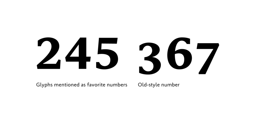
Although numbers have fewer variations than symbols, the answers included glyphs in which typeface features tend to appear, and derived styles, such as old-style numbers, etc.
・
4:
It has a large straight line part out of all the numbers.
・
4:
It is not especially my favorite glyph, but I chose it because April is my birthday month.
・
5:
When trying to recognize typeface in numbers, I look at 5.
・
2:
I like to draw the shape of 2.
・
Old-style number:
Not a single unit, but I like the sense of rhythm and atmosphere when typesetting old-style numbers with different heights in line. It is difficult to balance design, so creation is a hard task.
Due to the great numbers of glyphs related to symbols and numbers, understanding use and appropriate design is difficult even for creators. Therefore, creation is often performed in reference to a variety of different materials. Although the design management is difficult, there are many glyphs that can show typeface individuality by adding different arrangements and playfulness. You may discover something interesting when purchasing a font by checking the design of numbers and symbols you don’t normally use.
(XYZ)
term
Series archive Other / Questions for Font Creators
- Questions for Font Creators Part 8: Difficult Glyphs to Design 2
- Questions for Font Creators Part 8: Difficult Glyphs to Design 1
- Questions for Font Creators Part 7: First Glyph to Be Designed
- Questions for Font Creators Part 6: Favorite Glyph Among Numbers and Symbols
- Questions for Font Creators Part 5: Favorite Latin Alphabet Glyph
- Questions for Font Creators Part 4: Favorite Katakana Glyph
- Questions for Font Creators Part 3: Favorite Hiragana Glyph 2
- Questions for Font Creators Part 3: Favorite Hiragana Glyph 1
- Questions for Font Creators Part 2: Favorite Kanji Glyph 3
- Questions for Font Creators Part 2: Favorite Kanji Glyph 2
- Questions for Font Creators Part 2: Favorite Kanji Glyph 1
- Questions for Font Creators Part 1: What Made You Interested in Typeface Design? 2
- Questions for Font Creators Part 1: What Made You Interested in Typeface Design? 1