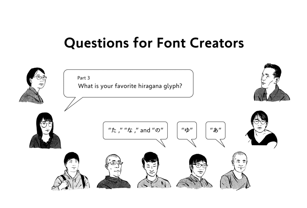
The question “What is your favorite hiragana glyph?” was asked to staff at the Type Project.
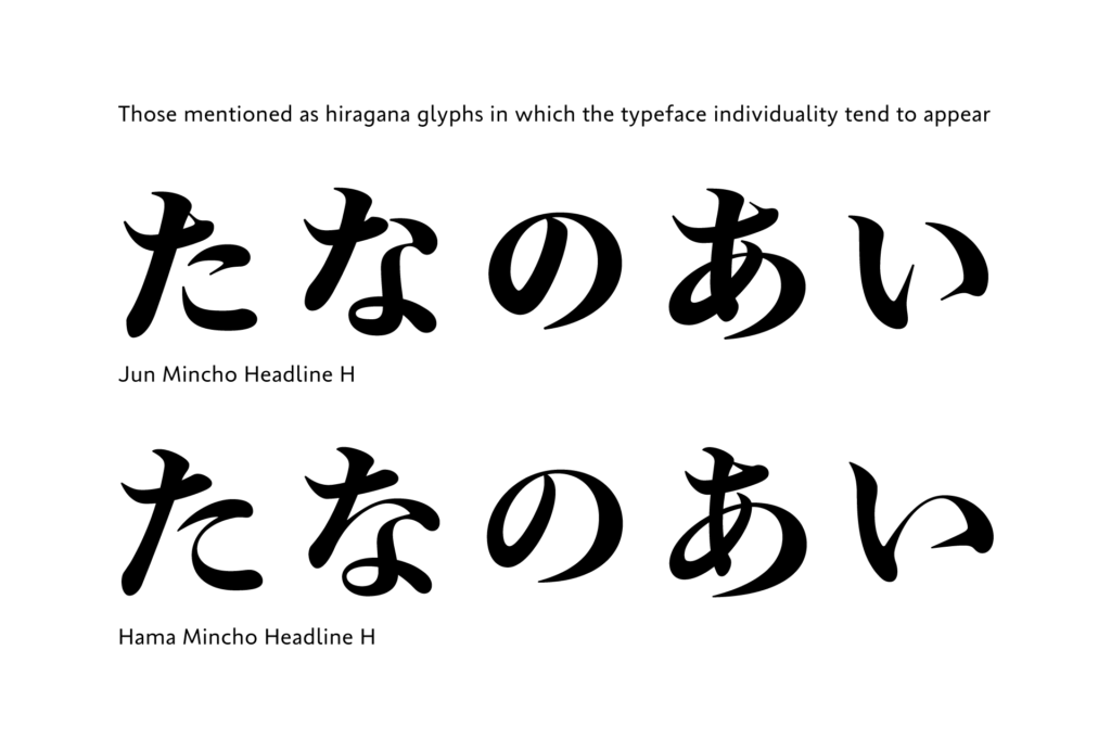
For the answers to this question, there are many answers involving choosing hiragana with the reason: “because it is the glyph in which the feature of the entire typeface appears well.” This is similar to the answers to the “favorite kanji glyph” in the previous question. Reading the individuality of the entire typeface from one glyph is a perspective distinctive of typeface designers and engineers who normally deal with various typefaces and think about how to create typefaces with individuality.

・
“た,” “な,” and “の”:
The feature of font appears well in these characters. Although there is little to express design in “の” in particular, there are differences when you compare fonts, so I like it.
・
“の”:
I observe the entry of the brush. I always look at this character when looking at a typeface, because the property of the brush in the typeface is shown clearly, as the brush goes around, and it makes me think how that curve is handled.
・
“い”:
The typeface individuality is unexpectedly clear.
・
“あ”:
I think the individuality is shown in this character.
There are answers that mention the impression at the time of actual creation or looking.
・
“あ”:
I feel everything will work well when the shape of “あ” and “か” are decided perfectly when creating hiragana.
・
“ふ”:
I enjoy the feeling of being distressed over which part to connect and separate.
・
“む” and “を”:
It is fun to look at these hiragana, as the brush movement is very clear.
Although hiragana has few constituent elements, and there are glyphs in which showing individuality is difficult, and it is conveyed that finding design features from each glyph and its constituent parts are enjoyable for designers.
XYZ
term
Series archive Other / Questions for Font Creators
- Questions for Font Creators Part 8: Difficult Glyphs to Design 2
- Questions for Font Creators Part 8: Difficult Glyphs to Design 1
- Questions for Font Creators Part 7: First Glyph to Be Designed
- Questions for Font Creators Part 6: Favorite Glyph Among Numbers and Symbols
- Questions for Font Creators Part 5: Favorite Latin Alphabet Glyph
- Questions for Font Creators Part 4: Favorite Katakana Glyph
- Questions for Font Creators Part 3: Favorite Hiragana Glyph 2
- Questions for Font Creators Part 3: Favorite Hiragana Glyph 1
- Questions for Font Creators Part 2: Favorite Kanji Glyph 3
- Questions for Font Creators Part 2: Favorite Kanji Glyph 2
- Questions for Font Creators Part 2: Favorite Kanji Glyph 1
- Questions for Font Creators Part 1: What Made You Interested in Typeface Design? 2
- Questions for Font Creators Part 1: What Made You Interested in Typeface Design? 1