Japanese yakumono (punctuation marks and symbols) is a generic term for symbols (punctuation marks, parentheses, etc.) apart from words and numbers used in typesetting. In this series, I would like to mainly introduce points and anecdotes on creating glyphs created along with Japanese alongside yakumono. I would like to introduce punctuation marks (“。” and “、”), which are frequently used yakumono this time.
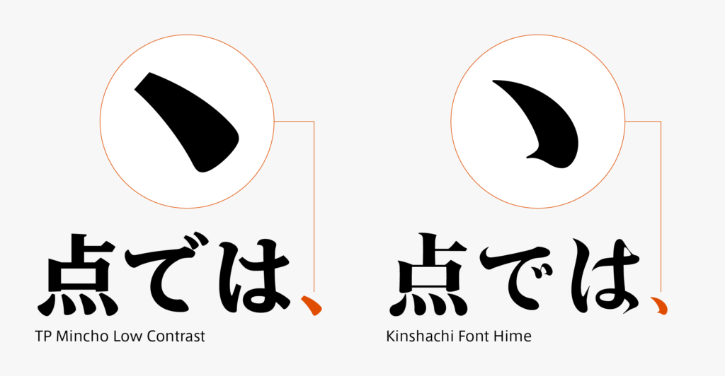
A comma called “ten” (“、”) is created in accordance with the design of dots in kana and kanji. A little square-like dot in TP Mincho Low Contrast, and a dot in Kinshachi Font Hime that resembles the brush connection to the next character, etc. give a sense of the individuality of the font with just a comma.

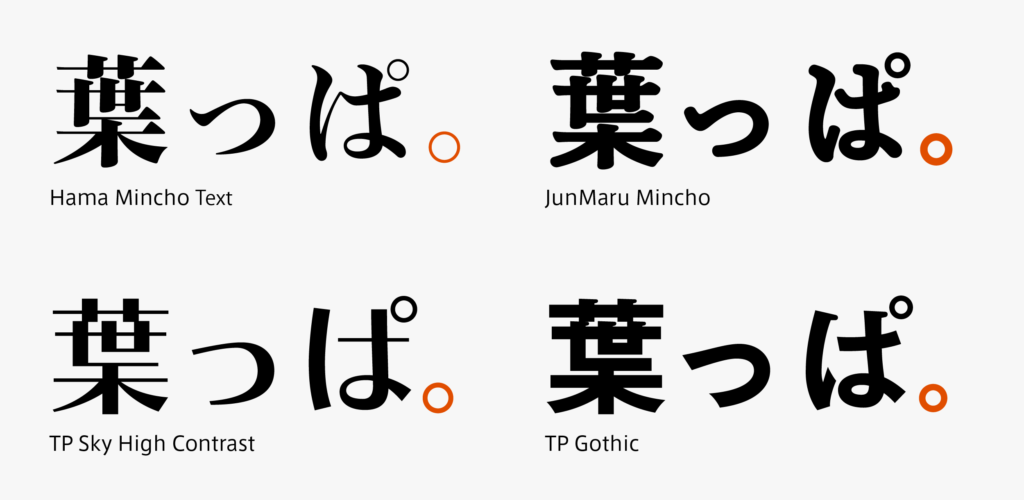
A period called “maru” (“。”) is often designed in a perfect circle as if written with a compass. As there is no part with a perfect circle in kana and kanji, I often feel strange about the shape of the period. Similarly, semi-voiced dot (“゜”) is basically a perfect circle. As many of you may already know, there were no punctuation marks, voiced dots, and semi-voiced dots in Japanese for a long time – the present use only began from the Meiji period. This may be the key to solving the mystery of the perfect circle that suddenly appeared in differences of the histories of kana and kanji.

(T.I)
Series archive Japanese Type Design / Japanese Yakumono (Punctuation Marks and Symbols)
- Japanese Yakumono (Punctuation Marks and Symbols) 05: “Symbols”
- Japanese Yakumono (Punctuation Marks and Symbols) 04: “Arrow”
- Japanese Yakumono (Punctuation Marks and Symbols) 03: “Parentheses”
- Japanese Yakumono (Punctuation Marks and Symbols) 02: “Macron and Iteration Mark”
- Japanese Yakumono (Punctuation Marks and Symbols) 01: “Punctuation Mark”