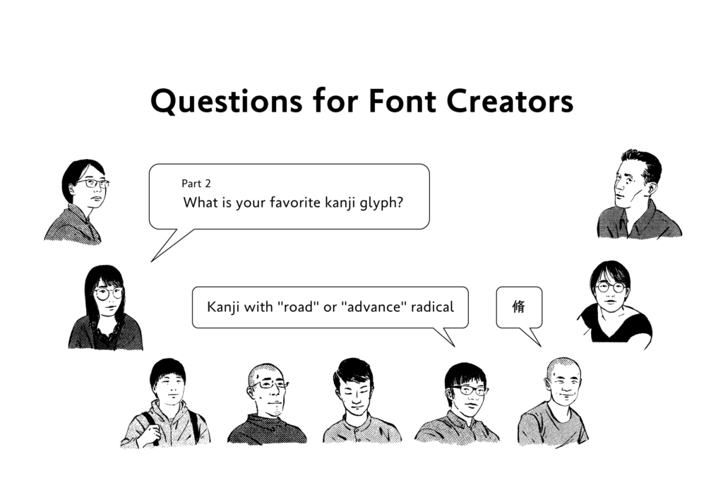
The question “What is your favorite kanji glyph?” was asked to staff at the Type Project.
In this article, answers referencing the kanji structure are presented.
・
“東”:
The inside space between strokes and gravity of the font can be understood well.
・
“愛”:
In addition to the fact that it is a frequently seen glyph, I think that typeface concepts, including type face, inside space between strokes, tightness, modulation, and features can be judged in a well-balanced way.
・
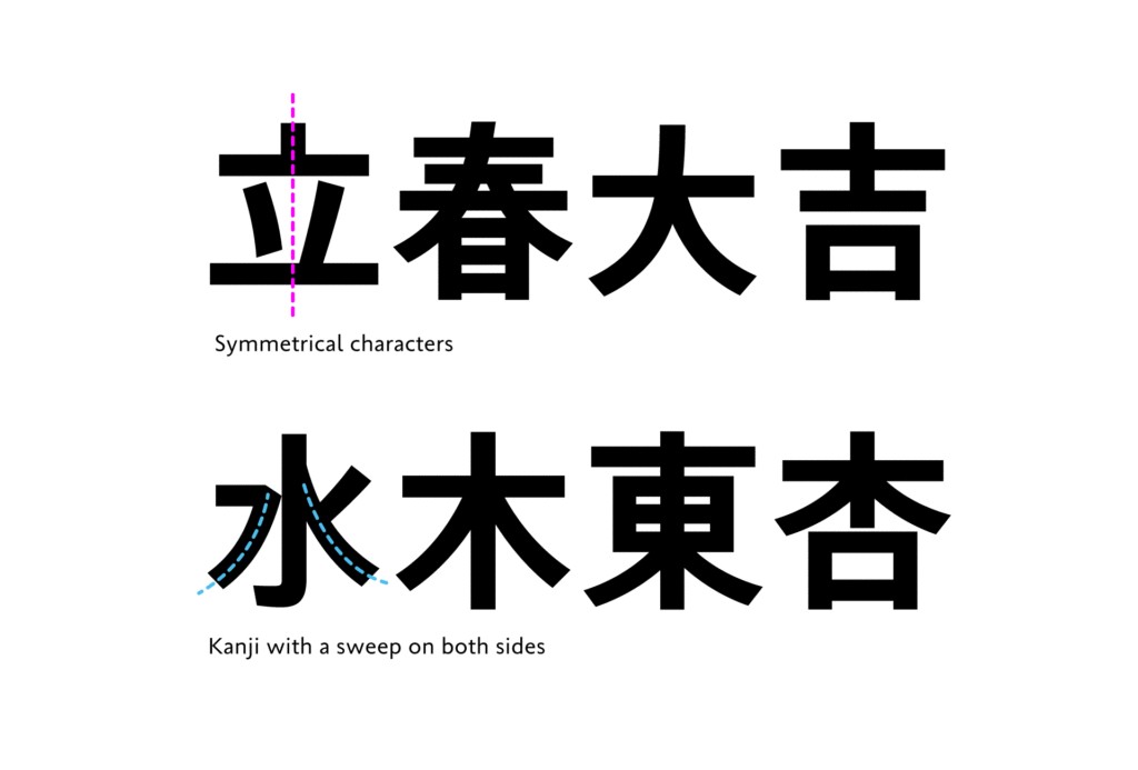
Symmetrical characters, such as “立春大吉”:
Talking about minor details, they are not symmetrical, but I feel humanity in these parts, and if they are completely symmetrical, they are patterns and not characters. I like that kind of balance.
・
Kanji with a sweep on both sides, such as “水木東”:
I like them, because they give off a lively atmosphere and strength of hand-written characters with the organic sweep lines that extend to both sides. I find these characters attractive in particular in typeface with design maintaining the texture of brush and hand writing.
In kanji creation, we can see that each kanji is not looked at as a single unit, but an element that structures each glyph, and the balance for the entire typeface is adjusted.
From these answers, we can catch a glimpse of the perspective of creators who read the atmosphere of the entire typeface from one glyph, and unify glyphs with similar constituent elements, etc.
(XYZ)
Series archive Other / Questions for Font Creators
- Questions for Font Creators Part 8: Difficult Glyphs to Design 2
- Questions for Font Creators Part 8: Difficult Glyphs to Design 1
- Questions for Font Creators Part 7: First Glyph to Be Designed
- Questions for Font Creators Part 6: Favorite Glyph Among Numbers and Symbols
- Questions for Font Creators Part 5: Favorite Latin Alphabet Glyph
- Questions for Font Creators Part 4: Favorite Katakana Glyph
- Questions for Font Creators Part 3: Favorite Hiragana Glyph 2
- Questions for Font Creators Part 3: Favorite Hiragana Glyph 1
- Questions for Font Creators Part 2: Favorite Kanji Glyph 3
- Questions for Font Creators Part 2: Favorite Kanji Glyph 2
- Questions for Font Creators Part 2: Favorite Kanji Glyph 1
- Questions for Font Creators Part 1: What Made You Interested in Typeface Design? 2
- Questions for Font Creators Part 1: What Made You Interested in Typeface Design? 1