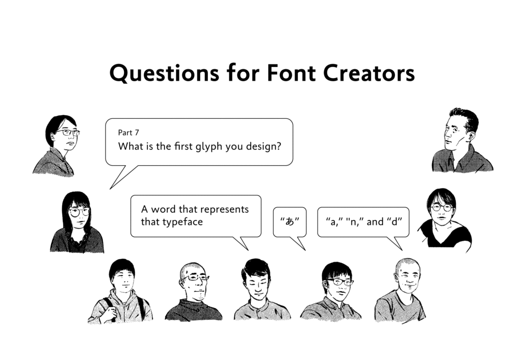
The question “What is the first glyph you create in typeface design?” was asked to staff at the Type Project.
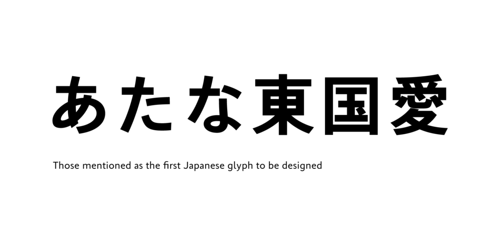
Among the answers from the Japanese designers, “あ” is mentioned as a specific glyph in many cases. Also, the second most common answers are the “glyph that matches the atmosphere of the typeface.” After all, the first character to be created becomes a standard for design of the characters to follow later, so many designers tend to start working on a glyph that leads them to imagine the other images in the entire typeface.
・
“あ” or a character that matches that typeface:
To think about the atmosphere that typeface has, I always write “あ” first.
・
“東,” “国,” “愛” “あ,” “た,” and “な”:
Although I don’t have much experience in creation, I start creation from either hiragana or kanji.
・
Although it is different depending on the typeface, I often create “あ” at an early stage:
Depending on the typeface, there are quite a lot of cases in which I start from kanji.
・
A character required in documents or a word that resembles that typeface:
For work at Type Project, I start creation from a character that is required in documents. When I create something individually, I often start creation from a word that should represent the typeface. When I can create the atmosphere with that, my motivation increases.
・
First, I decide on a word that suits the image to start creation. So, I don’t have a single choice in particular.
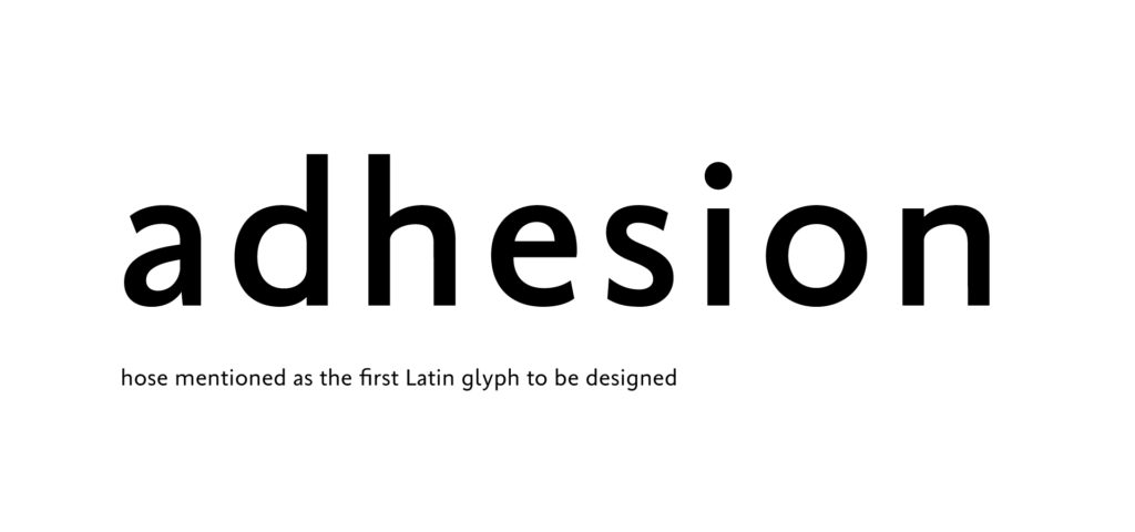
In the answers from Latin designers, “adhesion” appeared commonly.
This eight-character word is recommended many times in workshops, classes, etc. for Latin design is a character string containing well-balanced elements that can be applied to other glyphs. There is a website “[adhesiontext]” that can generate text to use to check the design of the Latin creation in progress.
・
“a,” “n,” and “d”:
Ever since I learned in a class in my college days that it is good to start creation from “adhesion,” I have always started creation with these characters. When I have to sketch quickly, an eight-character word is too long, so I often start from “a,” which can show typeface features well in particular, and “n,” and “d,” which have elements that can be applied to the other glyphs.
・
”a”:
For “Adhesion” in Latin to be created first, I mistakenly created “adhesion,” and it has been my habit to start creation from the lower case letter “a.”
(XYZ)
term
Series archive Other / Questions for Font Creators
- Questions for Font Creators Part 8: Difficult Glyphs to Design 2
- Questions for Font Creators Part 8: Difficult Glyphs to Design 1
- Questions for Font Creators Part 7: First Glyph to Be Designed
- Questions for Font Creators Part 6: Favorite Glyph Among Numbers and Symbols
- Questions for Font Creators Part 5: Favorite Latin Alphabet Glyph
- Questions for Font Creators Part 4: Favorite Katakana Glyph
- Questions for Font Creators Part 3: Favorite Hiragana Glyph 2
- Questions for Font Creators Part 3: Favorite Hiragana Glyph 1
- Questions for Font Creators Part 2: Favorite Kanji Glyph 3
- Questions for Font Creators Part 2: Favorite Kanji Glyph 2
- Questions for Font Creators Part 2: Favorite Kanji Glyph 1
- Questions for Font Creators Part 1: What Made You Interested in Typeface Design? 2
- Questions for Font Creators Part 1: What Made You Interested in Typeface Design? 1