
The question “What is a glyph that you feel is difficult to design?” was asked to staff at the Type Project.
Answers mentioning the number of strokes were introduced in the previous article. This time, different answers and answers referencing Latin glyphs are introduced.
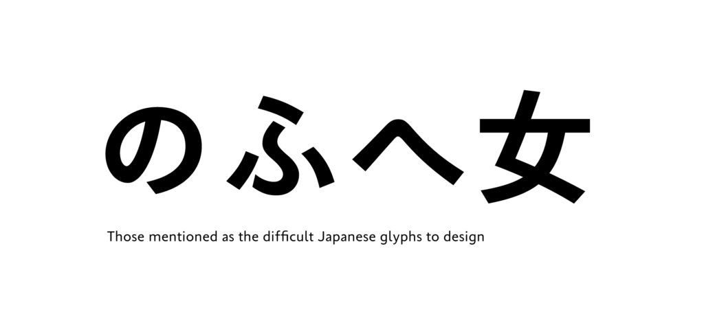
Two of the staff mentioned “ふ” in Japanese glyphs. As there are many variations in the structure in “ふ,” such as where to connect and where to release, etc., it may be a difficult glyph in which to maintain balance.
・
It often differs depending on the typeface, but I have a surprisingly difficult time creating “へ” and “ふ.”
・
“の,” “ふ,” and “女”
The feeling of nothing that can be covered up in “の.”
Maintaining balance in “ふ.”
The balance of the angle of left sweep in the first and second strokes of “女.”
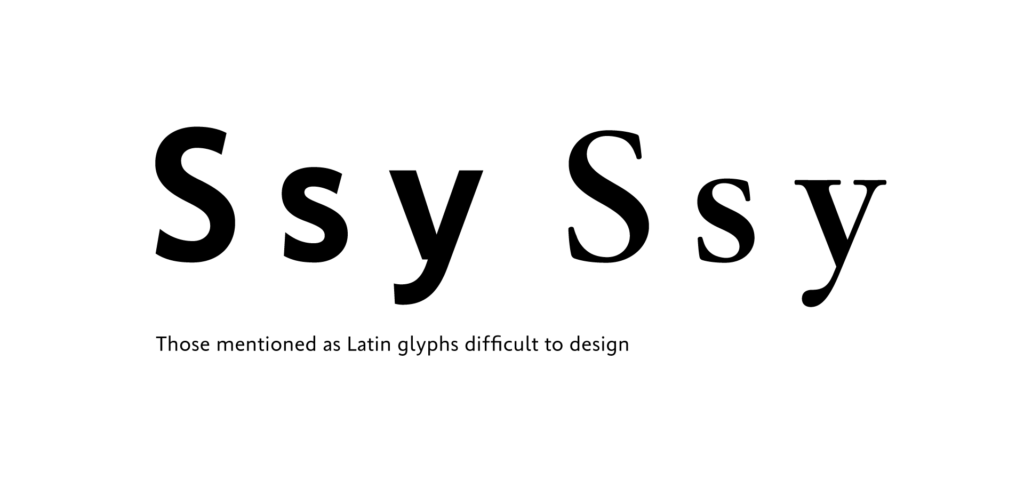
For Latin glyphs, “s” and “y” are mentioned.
・
“S”:
The balance and thickness of curves in outside and inside are difficult.
・
“S,” “s,” and “y”:
It is difficult to maintain balance between the thickness and counter width. It takes time to complete the shape in particular in a thick weight that I’m satisfied with.
・
“y”:
Balancing is difficult.
There were other answers that mentioned music symbols. Although there are relatively few opportunities to use music symbols, it may be interesting to look at and compare how design differs depending on the font.
・
“♪,” “♯,” and “♭”:
As I used to be in a brass band club, I can imagine them all too well. However, I always worry about including uniqueness peculiar to a given font.
The content of the answers varied depending on the person for this question. However, the word “balance” appeared in many answers.
Although it is different from person to person in regard to what they feel is difficult in design in what form, it is a common perspective for all designers to focus on “maintaining balance” in design.
(XYZ)
term
Series archive Other / Questions for Font Creators
- Questions for Font Creators Part 8: Difficult Glyphs to Design 2
- Questions for Font Creators Part 8: Difficult Glyphs to Design 1
- Questions for Font Creators Part 7: First Glyph to Be Designed
- Questions for Font Creators Part 6: Favorite Glyph Among Numbers and Symbols
- Questions for Font Creators Part 5: Favorite Latin Alphabet Glyph
- Questions for Font Creators Part 4: Favorite Katakana Glyph
- Questions for Font Creators Part 3: Favorite Hiragana Glyph 2
- Questions for Font Creators Part 3: Favorite Hiragana Glyph 1
- Questions for Font Creators Part 2: Favorite Kanji Glyph 3
- Questions for Font Creators Part 2: Favorite Kanji Glyph 2
- Questions for Font Creators Part 2: Favorite Kanji Glyph 1
- Questions for Font Creators Part 1: What Made You Interested in Typeface Design? 2
- Questions for Font Creators Part 1: What Made You Interested in Typeface Design? 1