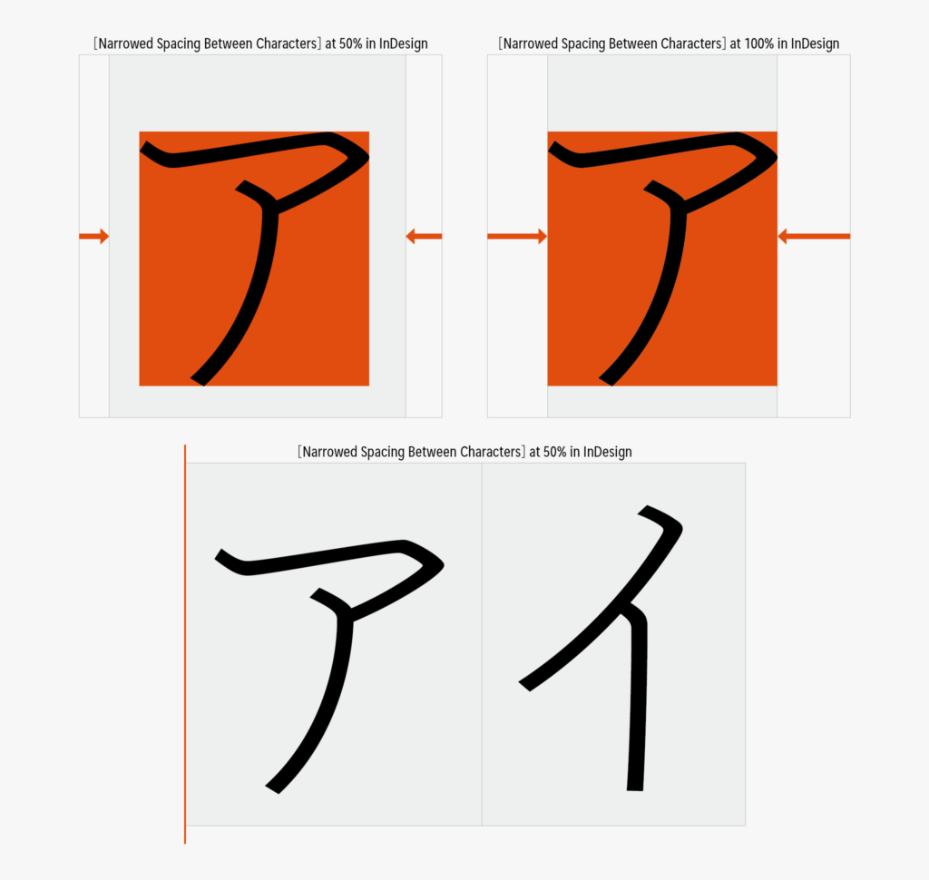
There is a function called [Narrowed Spacing Between Characters] in InDesign/Illustrator. While tracking explained in the previous entry is narrowing the spacing between characters evenly, the amount of the narrowed spacing between characters differs per character in [Narrowed Spacing Between Characters].
[Narrowed Spacing Between Characters] is specified by percentage, which means “how much percentage of side bearing is removed?” For example, specifying 100% at [Narrowed Spacing Between Characters] completely removes the side bearing. This is a situation in which the back and forth characters and the bounding box are tightly in contact.
As its name is [Narrowed Spacing Between Characters], when I was getting started with InDesign, I tried using it as a means to achieve typesetting with narrowed spacing between characters, but this did not work very well. As it also removes the side bearing of Latin designed originally in proportion, Latin is over-narrowed when settings are adjusted in accordance with Kana.

So, which function should be used for narrowed spacing between characters? My recommendation is [Proportional Metrics] and [Kerning (Metrics)]. I will discuss further details in the continuation of this series.
(mm)
Series archive Typesetting Japanese / Font Typesetting Function
- Font Typesetting Function 17: “Lining Numbers and Old Style Numbers (lnum/onum)”
- Font Typesetting Function 16: “Tabular Figures and Proportional Figures (tnum/pnum)”
- Font Typesetting Function 15: “Expert Forms (expt)”
- Font Typesetting Function 14: “Discretionary Ligature (dlig) Part 2”
- Font Typesetting Function 13: “Discretionary Ligature (dlig)”
- Font Typesetting Function 12: “Latin Ligature (liga)”
- Font Typesetting Function 11: “JIS78 Character Shape (jp78)”
- Font Typesetting Function 10: “Group of Fraction (afrc/frac)”
- Font Typesetting Function 09: “JIS90 Character Shape (jp90)”
- Font Typesetting Function 08: “Metrics Kerning”
- Font Typesetting Function 07: “Various Things About Kerning”
- Font Typesetting Function 06: “Proportional Metrics”
- Font Typesetting Function 05: “[Narrowed Spacing Between Characters] in Adobe Applications”
- Font Typesetting Function 04: “Which Function for Narrowed Spacing Between Characters is Used?”
- Font Typesetting Function 03: “Mechanism of Typesetting with Narrowed Spacing Between Characters”
- Font Typesetting Function 02: “GPOS and GSUB”
- Font Typesetting Function 01: “What are the OpenType Features?”