Kerning is used to adjust the spacing between specific characters. Options in the Kerning Menu in InDesign/Illustrator include: Japanese Fixed-Width, Metrics (“Auto” depending on the version of Illustrator), Optical, and Value Specified (Manual).
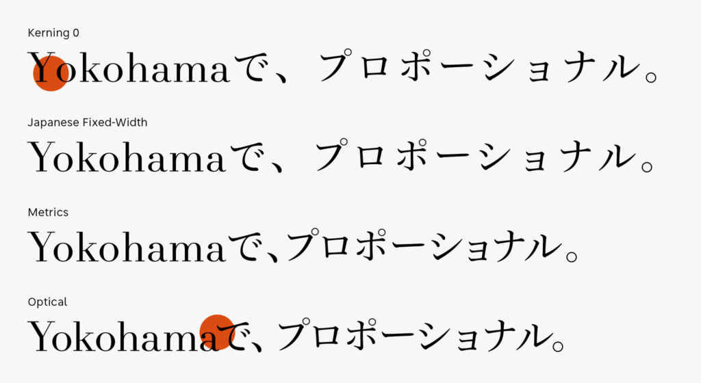
Settings for Japanese fixed-width are for solid typesetting. Even in case of solid typesetting, many want kerning to be effective and used in Latin. Looking at the example of kerning 0 at the top of the figure, I’m concerned about the spacing between “Y” and “o.” Settings to turn on only kerning for Latin without narrowing the spacing for Japanese is Japanese fixed-width. Kerning for Latin in Japanese fixed-width is the later mentioned metrics kerning.
Metrics is kerning based on the information inside the font set in advance by the font maker. I will talk in more detail about metrics kerning in the next entry.
Optical is kerning based on the algorithm installed in the application software. The kerning information inside the font is not referred to. As seen at the bottom of the figure, tightly narrowed spacing between “a” and “で” is special to optical. In optical, the font that does not have the kerning information can be narrowed. However, it cannot be used for vertical typesetting in Japanese.
(mm)
Series archive Typesetting Japanese / Font Typesetting Function
- Font Typesetting Function 17: “Lining Numbers and Old Style Numbers (lnum/onum)”
- Font Typesetting Function 16: “Tabular Figures and Proportional Figures (tnum/pnum)”
- Font Typesetting Function 15: “Expert Forms (expt)”
- Font Typesetting Function 14: “Discretionary Ligature (dlig) Part 2”
- Font Typesetting Function 13: “Discretionary Ligature (dlig)”
- Font Typesetting Function 12: “Latin Ligature (liga)”
- Font Typesetting Function 11: “JIS78 Character Shape (jp78)”
- Font Typesetting Function 10: “Group of Fraction (afrc/frac)”
- Font Typesetting Function 09: “JIS90 Character Shape (jp90)”
- Font Typesetting Function 08: “Metrics Kerning”
- Font Typesetting Function 07: “Various Things About Kerning”
- Font Typesetting Function 06: “Proportional Metrics”
- Font Typesetting Function 05: “[Narrowed Spacing Between Characters] in Adobe Applications”
- Font Typesetting Function 04: “Which Function for Narrowed Spacing Between Characters is Used?”
- Font Typesetting Function 03: “Mechanism of Typesetting with Narrowed Spacing Between Characters”
- Font Typesetting Function 02: “GPOS and GSUB”
- Font Typesetting Function 01: “What are the OpenType Features?”