


-
A Modern
-
TP Sky ModernModern
Blk
スクリーン時代のクリアなフォント、TPスカイ アウトラインの滑らかさに重点を置いた純度の高いデザイン TPスカイは、明朝体ともゴシック体とも異なる「第三の書体」として開発しました。
About Product
Overview
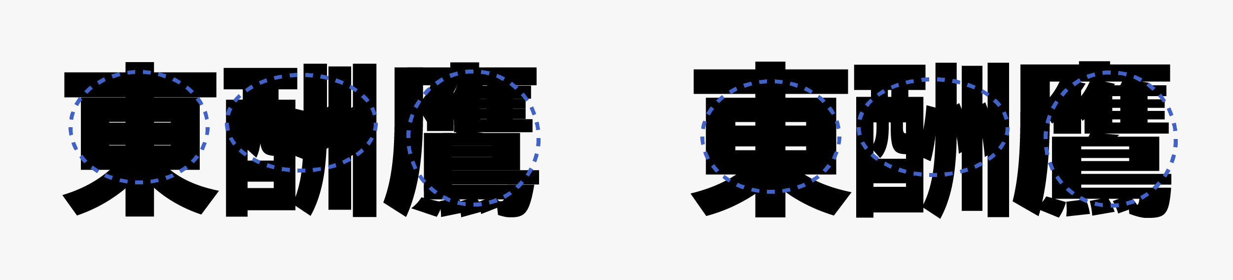
An extremely thick weight is achieved in TP Sky Modern Blk (Black) by widening the inside space between strokes. It manages both thickness and visibility by strengthening the contrast between straight lines and curved lines, and making strokes longer to allow a generous structure. Extra bold strokes have been repeatedly adjusted, so kanji, kana, and Latin with differences in the number of strokes can be seen in good order even when they are placed side by side. For example, kana, Latin, Chinese numerals with a few number of strokes, etc. of TP Sky Modern Blk are around 1.5 times thicker than TP Sky Low Contrast B.
TP Sky Modern Blk has the widest inside space between strokes among the Type Project fonts, which leads to expansion of the modern typeface category.
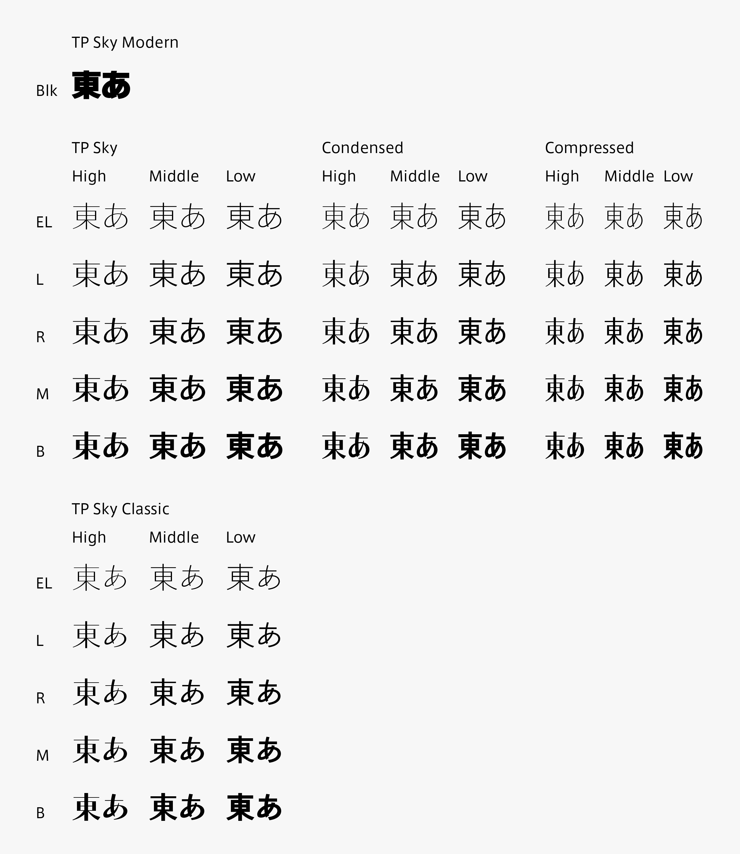
TP Sky is the first Japanese font family to have the four attributes of weight, contrast, character width, and inside space between strokes.
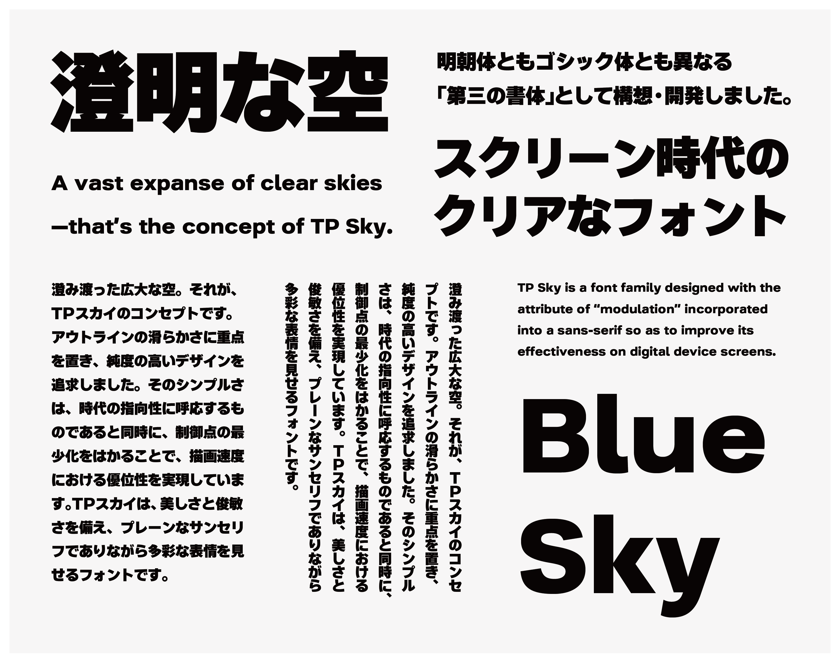
TP Sky is a font family designed with the attribute of “modulation” incorporated into a sans-serif typeface so as to improve its effectiveness on digital device screens. It is available of forty-five fonts in five weights, three contrasts, and three character widths.
Although TP Sky Classic is a simple sans-serif typeface, it has a classical appearance. The well-balanced proportion carried out for kanji, kana, and Latin characters the screen. At the same time, it creates a relaxed atmosphere.
By using each TP Sky font properly, the relationship between headings and texts or titles and captions can be expressed more effectively, enabling a high level of unity on the screen.
Concept
A vast expanse of clear skies above us – that’s the concept of TP Sky. With a well-proportioned space between the inside and outside of each character, TP Sky Modern Blk maintains the plain and flat impression common to the TP Sky series. With a generous structure that fills space, and a stable, strong black color, TP Sky Modern Blk expresses messages as if talking in a clear loud voice.
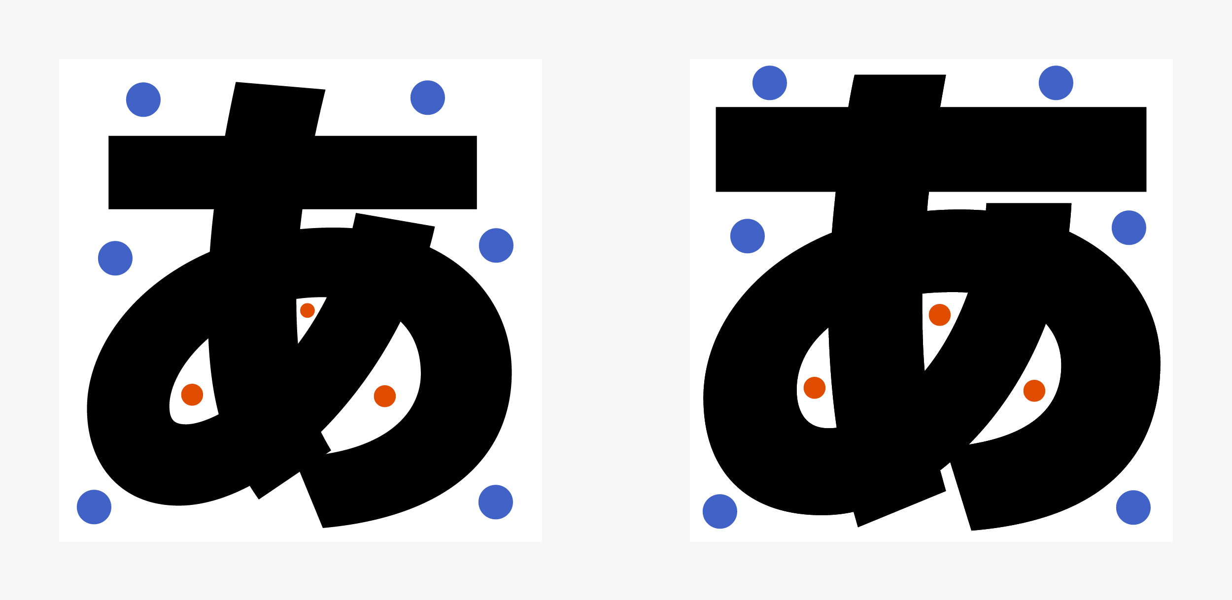
(Left) TP Sky Low Contrast B simply thickened at 150% (Right) TP Sky Modern Blk
●Inside space/●Outside space
The inside space of the modest structure of TP Sky is widened to create a well-proportioned space between the inside and outside of characters.
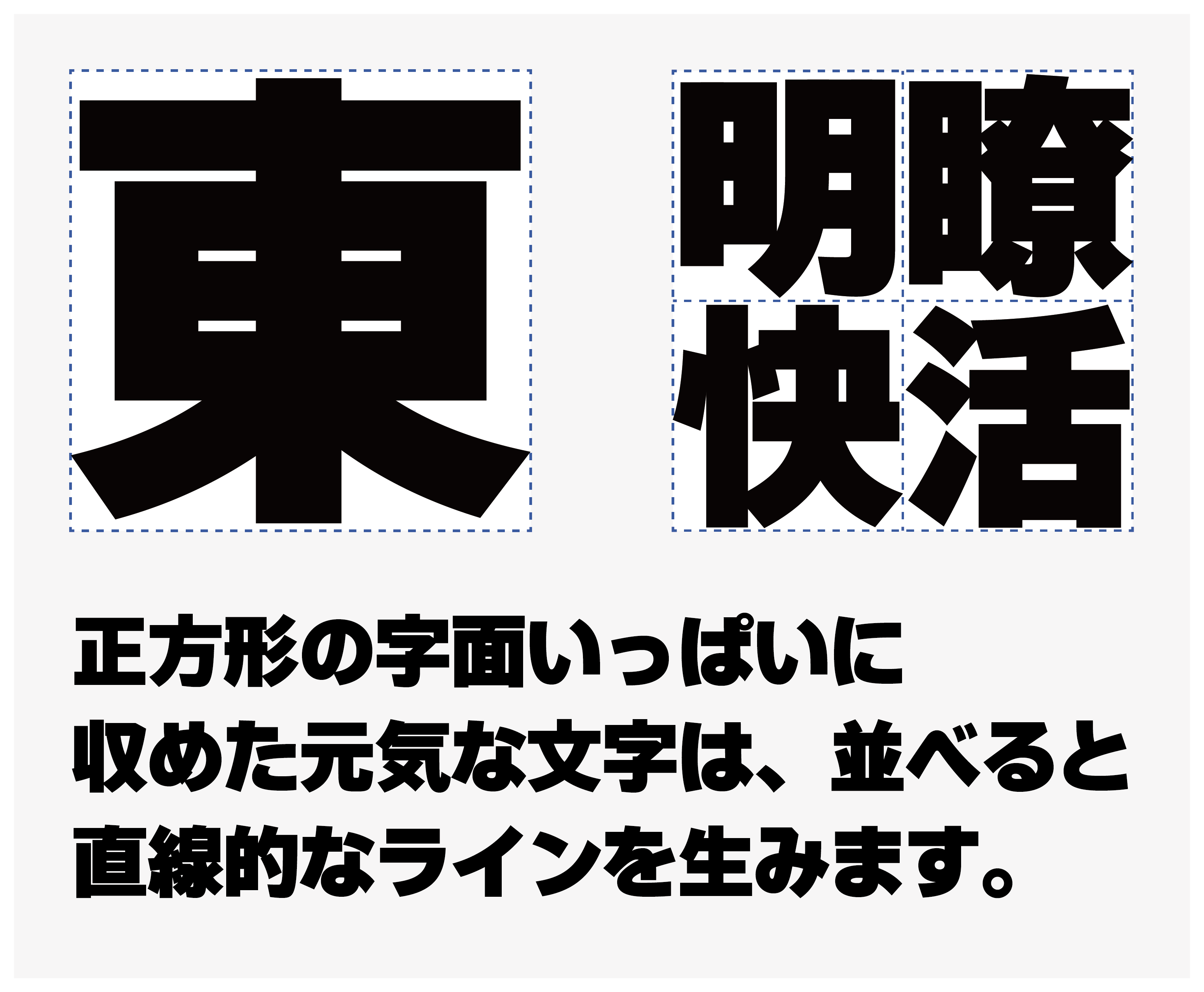
In contrast to TP Sky Classic, in which a tightened block style format is incorporated, TP Sky Modern Blk is created with the awareness of generating a silhouette that is close to square. As TP Sky Modern Blk has little room for spacing, it is compatible with solid typesetting.
Features
TP Sky Modern Blk features large characters designed to fill up space, and a distinguishing thickness approximately 150% of TP Sky Low Contrast B. In kanji characters with a large number of strokes, the main strokes are thickened, and the other parts are handled thinned to prevent damage to the image of the character and black accumulation, and to maintain the balance of density with characters with fewer number of strokes. Also, one of its features is that the sizes of kanji and kana are closely similar. It can also restrain dispersion in blackness of character, even when used in large size, such as on headings, signboards, etc.
Comparison between TP Sky Low Contrast B simply thickened at 150% and TP Sky Modern Blk
TP Sky Modern gives a plain and flat impression. TP Sky Classic has a classical appearance. A range of new expression has been added to the TP Sky family.
Family
In the lineup of forty-five TP Sky fonts (five weights × three contrasts × three character widths), TP Sky Classic (five weights × three contrasts) and TP Sky Modern Blk have been added. Now, a family of sixty-one fonts is available. TP Sky Modern Blk demonstrates its strength with a clear and strong presence to attract attention, such as in titles, headings, catch phrases, etc. The font also flourishes where there is a desire for strong impact in the entertainment field, such as in gaming, etc.
Specification
| Main feature |
OpenType font Cross platform Extractable outlines PDF embedded Kerning information Dynamic download No resolution restrictions |
| Supported operating system |
macOS Windows 10/11 |
| Font set |
Standard(StdN) 9,499 characters (Adobe-Japan1-3) |
| Languages | Japanese font (Std/StdN) almost fully covers 30 languages shown below. Japanese font based on Adobe Japan 1.3 covers all ISO-8859-1 proportional characters and Š, š, Ž, ž, Œ, œ, Ÿ. Then AXIS Font Japanese version can be used as multilingual font when you compose text using proportional characters. However, not all corresponding half-width characters are included, only Latin font is covered by half-width characters. Japanese (main script and covers JIS X 0208:1997) / English/ Icelandic (íslenska) / Irish (Gaelige) / Afrikaans (Afrikaans) / Albanian (Gjuha Shqipe) / Italian (Italiano) / Indonesian (Bahasa Indonesia) / Estonian (Eesti keel) / Occitan (lenga d’òc) / Dutch (Nederlands : U+0132 “IJ” and U+0133 “ij” shall be divided into I/i and J/j) / Oromo (Oromiffa) / Galician (Galego) / Swedish (Svenska) / Scottish Gaelic (Gàidhlig) / Spanish (Español) / Swahili (Kiswahili) / Danish (Dansk) / German (Deutsch) / Norwegian (Bokmål) / Norwegian (Nynorsk) / Finnish (Suomi) / Faroese (Føroyskt) / French (Française) / Brasilian Portuguese (Português Brasileiro) / Breton (Brezhoneg) / Portuguese (Português) / Latin (Latina : Classical orthography, without vowels with macron) / Luxembourg (Lëtzebuergesch) / Rhaeto-Romance languages (Rhaetian) / Walon (Walloon) *Full width version of Greek uppercase/lowercase (24 characters for each, excluding ending form of sigma) and Cyrillic (Russian) uppercase/lowercase (33 characters for each) are included as JIS Row6 and Row 7 (These characters are defined as full width in JIS spec) |