


-
A Low Contrast
-
A Middle Contrast
-
A High Contrast
-
TP Sky ClassicLow Contrast
EL
スクリーン時代のクリアなフォント、TPスカイ アウトラインの滑らかさに重点を置いた純度の高いデザイン TPスカイは、明朝体ともゴシック体とも異なる「第三の書体」として開発しました。
-
TP Sky ClassicLow Contrast
L
スクリーン時代のクリアなフォント、TPスカイ アウトラインの滑らかさに重点を置いた純度の高いデザイン TPスカイは、明朝体ともゴシック体とも異なる「第三の書体」として開発しました。
-
TP Sky ClassicLow Contrast
R
スクリーン時代のクリアなフォント、TPスカイ アウトラインの滑らかさに重点を置いた純度の高いデザイン TPスカイは、明朝体ともゴシック体とも異なる「第三の書体」として開発しました。
-
TP Sky ClassicLow Contrast
M
スクリーン時代のクリアなフォント、TPスカイ アウトラインの滑らかさに重点を置いた純度の高いデザイン TPスカイは、明朝体ともゴシック体とも異なる「第三の書体」として開発しました。
-
TP Sky ClassicLow Contrast
B
スクリーン時代のクリアなフォント、TPスカイ アウトラインの滑らかさに重点を置いた純度の高いデザイン TPスカイは、明朝体ともゴシック体とも異なる「第三の書体」として開発しました。
-
TP Sky ClassicMiddle Contrast
EL
スクリーン時代のクリアなフォント、TPスカイ アウトラインの滑らかさに重点を置いた純度の高いデザイン TPスカイは、明朝体ともゴシック体とも異なる「第三の書体」として開発しました。
-
TP Sky ClassicMiddle Contrast
L
スクリーン時代のクリアなフォント、TPスカイ アウトラインの滑らかさに重点を置いた純度の高いデザイン TPスカイは、明朝体ともゴシック体とも異なる「第三の書体」として開発しました。
-
TP Sky ClassicMiddle Contrast
R
スクリーン時代のクリアなフォント、TPスカイ アウトラインの滑らかさに重点を置いた純度の高いデザイン TPスカイは、明朝体ともゴシック体とも異なる「第三の書体」として開発しました。
-
TP Sky ClassicMiddle Contrast
M
スクリーン時代のクリアなフォント、TPスカイ アウトラインの滑らかさに重点を置いた純度の高いデザイン TPスカイは、明朝体ともゴシック体とも異なる「第三の書体」として開発しました。
-
TP Sky ClassicMiddle Contrast
B
スクリーン時代のクリアなフォント、TPスカイ アウトラインの滑らかさに重点を置いた純度の高いデザイン TPスカイは、明朝体ともゴシック体とも異なる「第三の書体」として開発しました。
-
TP Sky ClassicHigh Contrast
EL
スクリーン時代のクリアなフォント、TPスカイ アウトラインの滑らかさに重点を置いた純度の高いデザイン TPスカイは、明朝体ともゴシック体とも異なる「第三の書体」として開発しました。
-
TP Sky ClassicHigh Contrast
L
スクリーン時代のクリアなフォント、TPスカイ アウトラインの滑らかさに重点を置いた純度の高いデザイン TPスカイは、明朝体ともゴシック体とも異なる「第三の書体」として開発しました。
-
TP Sky ClassicHigh Contrast
R
スクリーン時代のクリアなフォント、TPスカイ アウトラインの滑らかさに重点を置いた純度の高いデザイン TPスカイは、明朝体ともゴシック体とも異なる「第三の書体」として開発しました。
-
TP Sky ClassicHigh Contrast
M
スクリーン時代のクリアなフォント、TPスカイ アウトラインの滑らかさに重点を置いた純度の高いデザイン TPスカイは、明朝体ともゴシック体とも異なる「第三の書体」として開発しました。
-
TP Sky ClassicHigh Contrast
B
スクリーン時代のクリアなフォント、TPスカイ アウトラインの滑らかさに重点を置いた純度の高いデザイン TPスカイは、明朝体ともゴシック体とも異なる「第三の書体」として開発しました。
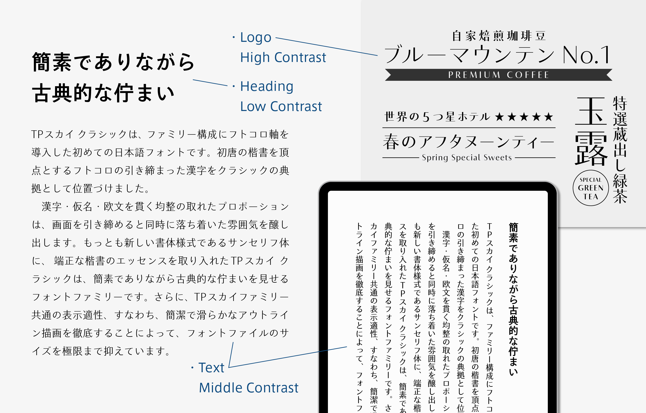
About Product
Overview
TP Sky Classic is the first Japanese font to implement the attribute of inside space between strokes in a family configuration. Kanji with tightened inside space between strokes, with peaks in the *block style of the first period of the Tang dynasty are positioned as the standard for Classic.
The well-balanced proportion carried out for kanji, kana, and Latin tightens the screen. At the same time, it creates a relaxed atmosphere. TP Sky Classic, in which the essence of the proper block style is incorporated in sans-serif typeface - the newest typeface format - is a font family that maintains a classical appearance while remaining simple. Furthermore, the font file size is restrained to the utmost limits by the displayability common to the TP Sky family, with concise and smooth outlines drawn thoroughly.
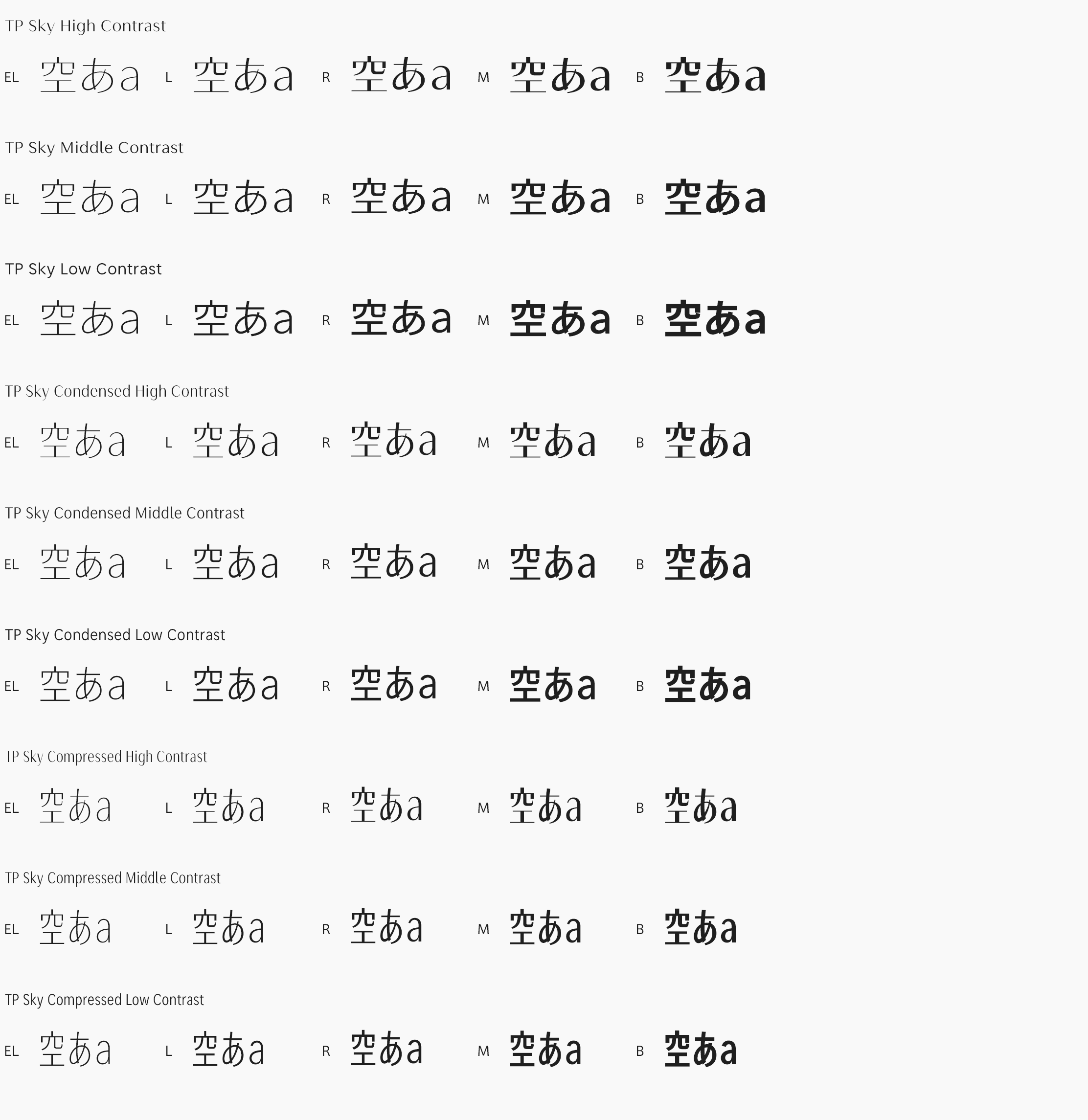
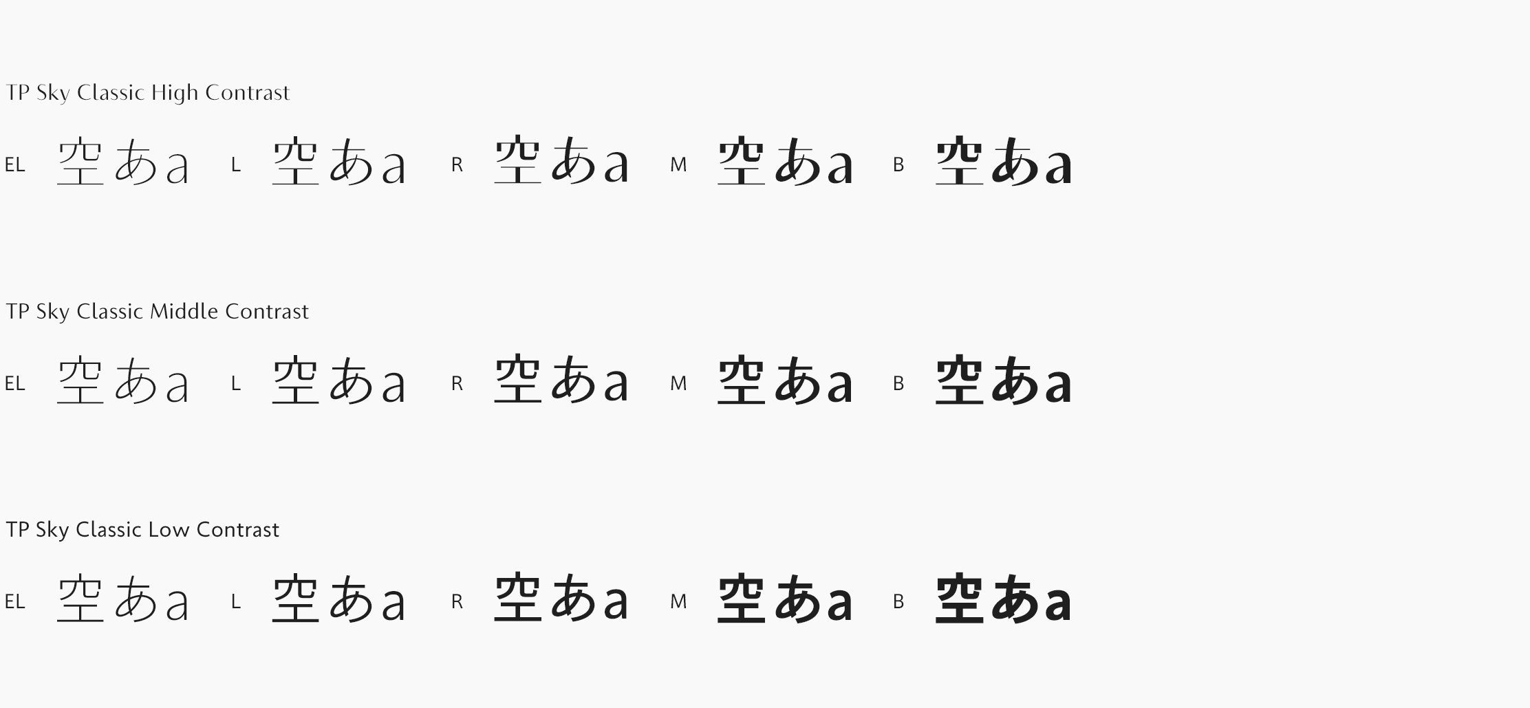
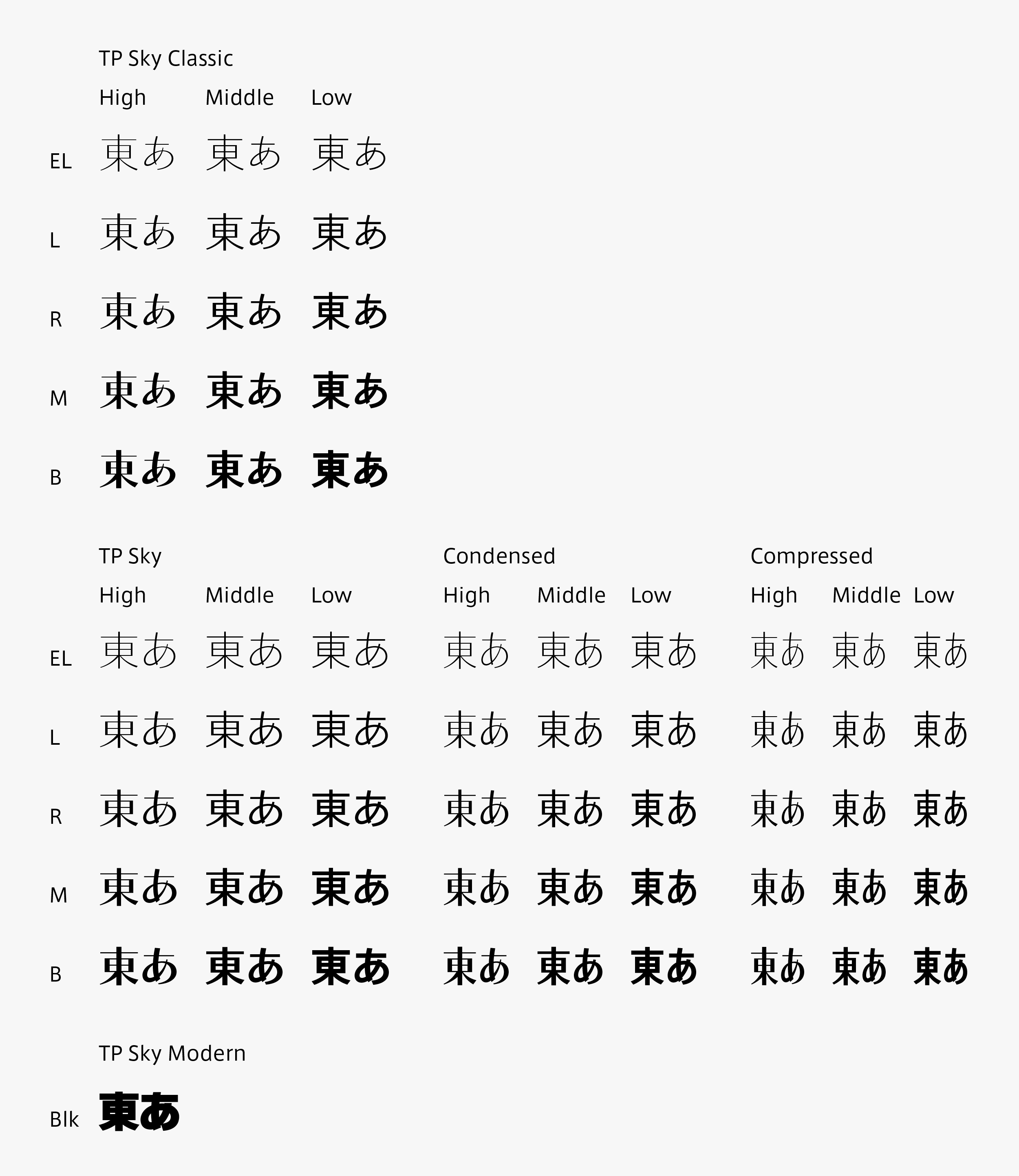
TP Sky Classic provides a total of fifteen fonts in five weights each for high contrast with a sharp impression, middle contrast with a calm but distinct expression, and low contrast with a nuance of the natural modulation of handwriting.
*Block style of the first period of the Tang dynasty
The first period of the history of literature, of the four periods of the Tang dynasty of China. The period is 100 years, from the year 618 of the first period of Tang dynasty to 712 (the year before the enthronement of Xuanzong).
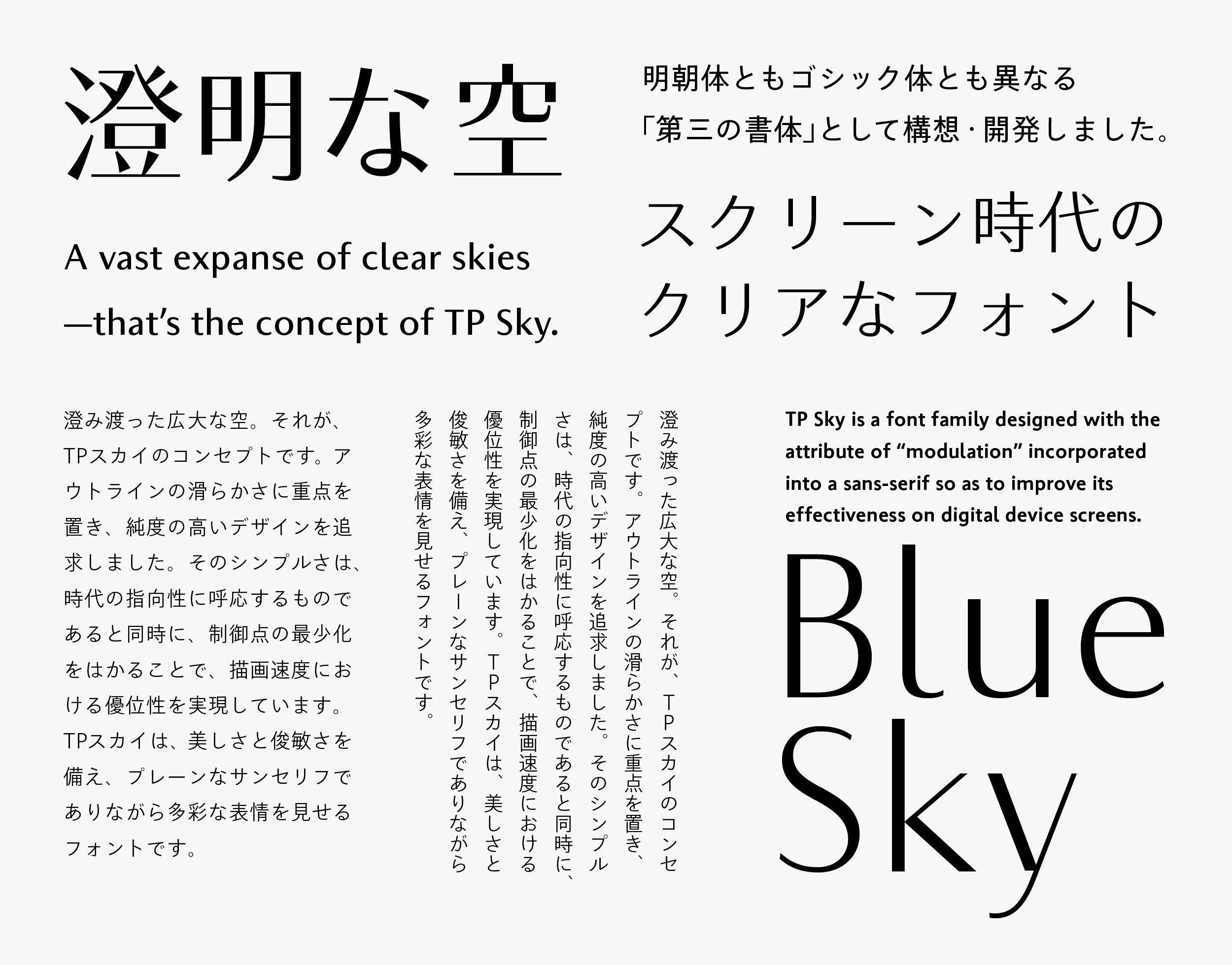
TP Sky is a font family designed with the attribute of “modulation” incorporated into a sans-serif typeface so as to improve its effectiveness on digital device screens. It is available of forty-five fonts in five weights, three contrasts, and three character widths.
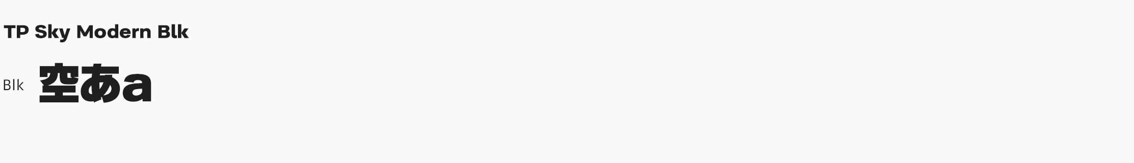
An extremely thick weight is achieved in TP Sky Modern Blk by widening the inside space between strokes. This manages both thickness and visibility by strengthening the contrast between straight lines and curved lines, and making strokes longer to allow a generous structure.
By using each TP Sky font properly, the relationship between headings and texts or titles and captions can be expressed more effectively, enabling a high level of unity on the screen.
Concept
Based on the concept of “a vast expanse of clear skies above us” that covers the entire family, TP Sky Classic aims at the expansion of applications in formal scenes, and incorporates a well-balanced block style proportion. The font combines a compact and clear sans-serif typeface and proper classical block style.
(Left)TP Sky Low Contrast L (Right)TP Sky Classic Low Contrast L
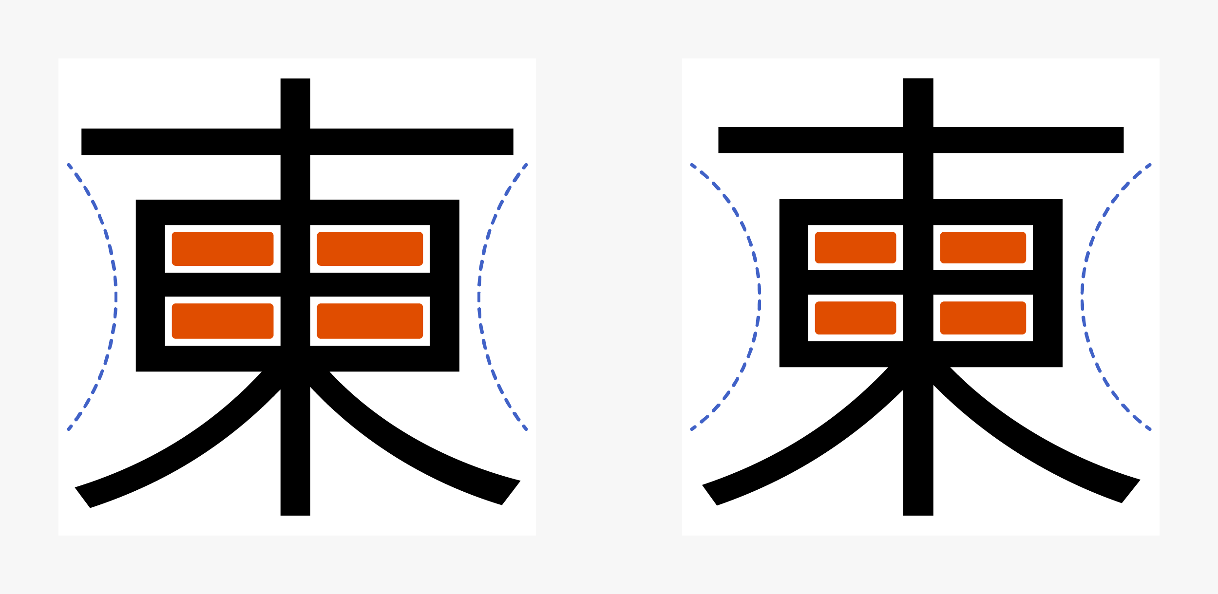
■Inside space between strokes
Using the classical typeface as a model, the inside space between strokes of the modest structure of TP Sky is tightened.
It also manages both a classical and tightened structure of inside space between strokes and a simple outline drawing. In addition to the conventional TP Sky family, it can be used depending on the scene by changing the attributes of the inside space between strokes.
Features
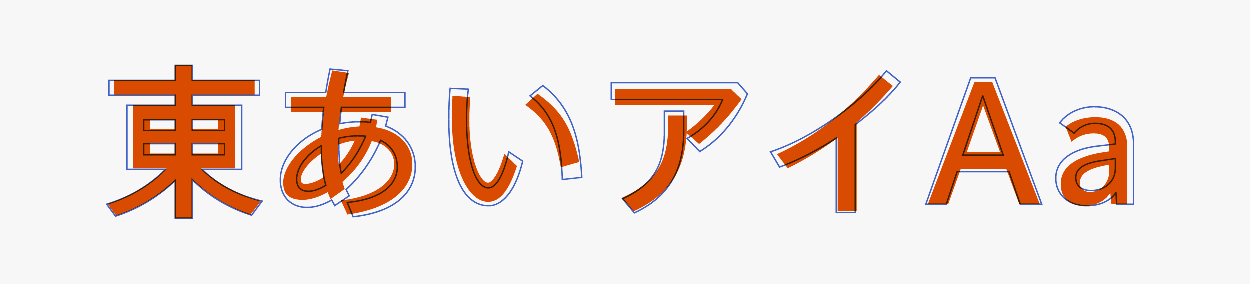
TP Sky Classic has a natural flavor, with contrast between tightened inside space between strokes and free strokes. Through collaboration between the attributes of inside space between strokes and the attributes of contrast (High, Middle, and Low), the classical impression is strengthened.
■TP Sky Classic / ーTPS Sky
Using well-balanced classical typeface for kanji, kana, and Latin as a model, its essence is incorporated in sans-serif typeface. The font combines concise expression and expressive face, an adult calmness along with the force of strokes, and classical image mixed with modern impression.
In Middle Contrast and High Contrast, in which the brush modulation is incorporated in “sweeping,” “point brush,” etc., the classical expression is stronger than in Low Contrast. It can be said that the direction of TP Sky Classic, which is modeled after the proper classical block style, is more clearly shown.
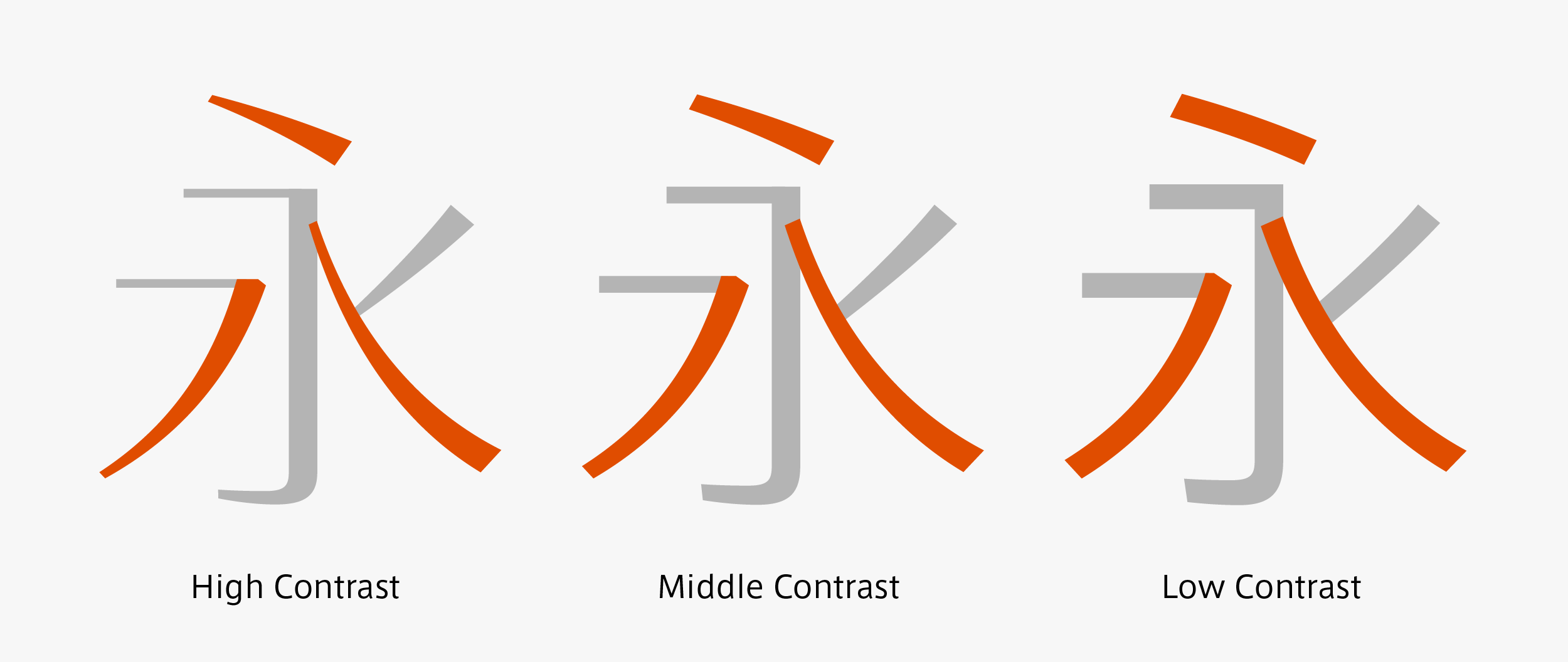
High Contrast with a sharp impression is effective in titles, catch phrases, etc. It is also ideal for product logos with a desire to show high quality. Middle Contrast with an expressive calmness has versatility appropriate for the digital environment. It provides charm to screens that otherwise tend to become monotonous. TP Sky Classic is suitable in formal scenes and content, with a thin weight in Middle Contrast in particular that combines both ease of reading and beauty. It is appropriate for horizontal typesetting and also in long vertical sentences. Although Low Contrast looks as though there is no stroke intensity, there is a nuance of the natural modulation of handwriting when used in large sizes, such as headings, etc.
TP Sky Modern gives a plain and flat impression. TP Sky Classic has a classical appearance. A range of new expression has been added to the TP Sky family.
Family
In the lineup of forty-five TP Sky fonts (five weights × three contrasts × three character widths), TP Sky Classic (five weights × three contrasts) and TP Sky Modern Blk have been added. Now, a family of sixty-one fonts is available. TP Sky Classic has a tone inherited from classical typeface, and it works well in formal applications.
Specification
| Main feature |
OpenType font Cross platform Extractable outlines PDF embedded Kerning information Dynamic download No resolution restrictions |
| Supported operating system |
macOS Windows 10/11 |
| Font set |
Standard(StdN) 9,499 characters (Adobe-Japan1-3) |
| Languages | Japanese font (Std/StdN) almost fully covers 30 languages shown below. Japanese font based on Adobe Japan 1.3 covers all ISO-8859-1 proportional characters and Š, š, Ž, ž, Œ, œ, Ÿ. Then AXIS Font Japanese version can be used as multilingual font when you compose text using proportional characters. However, not all corresponding half-width characters are included, only Latin font is covered by half-width characters. Japanese (main script and covers JIS X 0208:1997) / English/ Icelandic (íslenska) / Irish (Gaelige) / Afrikaans (Afrikaans) / Albanian (Gjuha Shqipe) / Italian (Italiano) / Indonesian (Bahasa Indonesia) / Estonian (Eesti keel) / Occitan (lenga d’òc) / Dutch (Nederlands : U+0132 “IJ” and U+0133 “ij” shall be divided into I/i and J/j) / Oromo (Oromiffa) / Galician (Galego) / Swedish (Svenska) / Scottish Gaelic (Gàidhlig) / Spanish (Español) / Swahili (Kiswahili) / Danish (Dansk) / German (Deutsch) / Norwegian (Bokmål) / Norwegian (Nynorsk) / Finnish (Suomi) / Faroese (Føroyskt) / French (Française) / Brasilian Portuguese (Português Brasileiro) / Breton (Brezhoneg) / Portuguese (Português) / Latin (Latina : Classical orthography, without vowels with macron) / Luxembourg (Lëtzebuergesch) / Rhaeto-Romance languages (Rhaetian) / Walon (Walloon) *Full width version of Greek uppercase/lowercase (24 characters for each, excluding ending form of sigma) and Cyrillic (Russian) uppercase/lowercase (33 characters for each) are included as JIS Row6 and Row 7 (These characters are defined as full width in JIS spec) |