


2024.10/01
From this issue, vol. 230 (issued in October 2024), the new weight “AXIS FF ProN T” of “AXIS Font” is being used as the main font for texts. Regarding the FitFont service utilized for that development, and provided by Type Project, which conducts research, development, creation of fonts, and examples of development of corporate fonts for corporations, I interviewed Isao Suzuki, a representative from Type Project.
Text by Aia Urakawa

In this magazine, the new fonts developed by Type Project have been implemented, and minute adjustments have been added to match the content of the magazine pages and renewal in the past. At this time, the FitFont service was utilized and the weight between L and R, “AXIS FF ProN T,” was created. It was developed after repeating many tests, including balance between the page size, number of font points and weight, visibility, readability.
Creation of New Weight in AXIS Font Exclusively for this Magazine
AXIS Font was researched and developed over several years by Type Project exclusively for this magazine. Ever since it was adopted for pages of this magazine to aim for unification in 2001, this font has been the “voice” of the magazine that delivers the messages we want to convey to the reader in a simpler, clearer manner. As the proper and sophisticated shape has high readability, it brought a good reputation and a close feeling of warmth. Since it went on the market in 2003, the font has been widely used at corporations, design offices, art museums.
Another feature of AXIS Font is that a variety of weights (thickness of font) are available in seven types, from UL (Ultra Light) to H (Heavy). However, due to the drastic reform carried out in vol. 229 issued in July, the need for a new weight arose. Yuki Nitta , the art director of this magazine gives the reason as follows: “When I reduced the number of points of font for texts to match the reduced format, L (Light) – which has been used until then – looked too thin, and the thicker R (Regular) had a slightly thick impression. I thought it would be good to have a font with a weight between L and R.”
Type Project has developed a service for font design called “FitFont.” It is the service that designs and provides original fonts after making minute adjustments, such as weight, character width, etc. of an in-house product to match the purpose and application. As the development is conducted upon repeating many tests in assumption of various usages, the high degree of multiplicity that can correspond flexibly to various applications, which is also its appeal.
Utilizing this FitFont, the Japanese and Latin weight between L and R for this magazine called “AXIS FF ProN T” was newly developed, and it is used as the main font for texts from this issue, vol. 230. According to Mr. Nitta, it also led to more efficient work. “Another advantage of FitFont is that the Japanese and Latin fonts are provided upon packaging them in one file. In the past, the Japanese and Latin fonts were selected respectively. But now, mixed typesetting is automatically done by just selecting one font – it is very convenient.” AXIS FF T is a special specification, in which regular and italic for each small capital, old style number, and proportional lining number from AXIS Latin Pro are included in addition with the AXIS Font Latin.
Implementation of Corporate Fonts for Corporations is Increasing
Awareness of the role and value of fonts has increased in Japan in the past 10 years. Similar to the example of the weight for AXIS Font, various inquiries have been made in regard to the FitFont service. Above all, it is said that requests to design corporate fonts for corporations have been increasing.
As a typical example, there are cases in which Japanese fonts are newly created to match their own Latin fonts to conduct global development or strengthen the brand. Apparently, there are many requests to design new fonts based on the AXIS Font, which has combined elements of sophistication, readability, and warmth. The case of Bridgestone is an example. By having Japanese and Latin corporate fonts available, it is said that “it became possible to express the brand image outside the company with a sense of unity. As the employees use the fonts for routine work, an internal branding effect is also felt.”
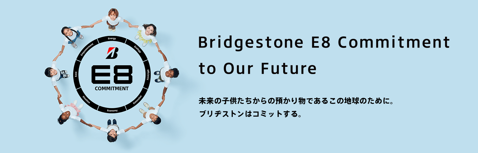
At Bridgestone, the Japanese font “Bridgestone Type TP” was implemented to match their company’s Latin font. It is also used in the key visual for the corporate commitment “Bridgestone E8 Commitment” established in March 2022.
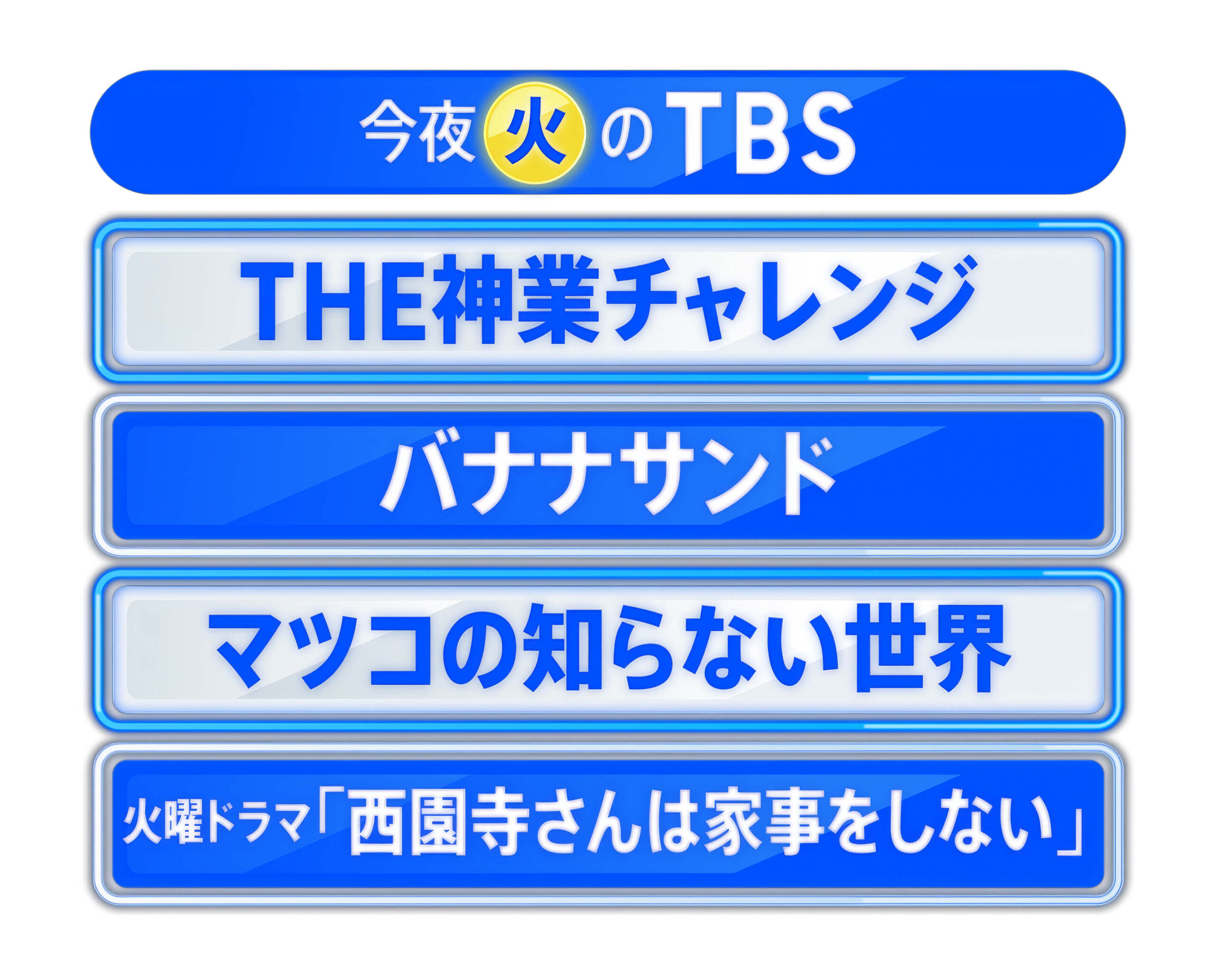
At the time of re-branding, TBS developed the branding font “TBS Sans TP” and corporate fonts “TBS Gothic TP” and “TBS Mincho TP.” Currently, it is pre-installed in computers for all employees, and used daily.
In corporations, the font usage varies from paper media to digital media, such as business cards, envelopes, meeting materials, public relations, sales promotion, websites, etc. At TBS, the effect of implementation of the corporate font is realized: “the broadcast and website are unified. In a news program with time constraints, there is no longer trouble in selecting the fonts every time, which initially led to costs and reduced work time.”
Like Suntory Holdings, there is a case in which the problem of typesetting mandatory content efficiently in the small space of beverage ingredient indication led to the solution. From the Design Center, there was a response: “not only is the typesetting prompt and beautiful, but it also brings us close to the level of completion by just entering the text.”
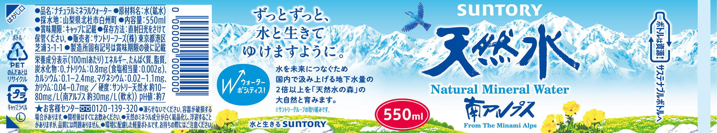
Due to rises in health consciousness, the content of beverage ingredient labels is tending to increase. At Suntory Holdings, the customized font “AXIS SUNTORY TP” for ingredient labels was implemented. There was a comment that “productivity at work has increased by 30%.”
Mr. Suzuki, a representative from the Type Project, says: “we don’t merely design beautiful fonts, but we also incorporate various elements, such as corporate history, mission, purpose, application, function, problem solving, etc. to work on development. Therefore, I think that the corporate font expresses corporate identity, and it can be the ‘voice’ that fluently speaks a philosophy and value.”
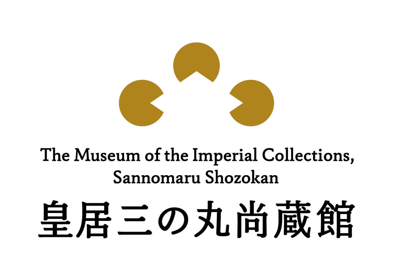
Type Project provided the font “JunMaru Mincho” after adjustment that matches the logo mark for the Museum of the Imperial Collections, created by the Irobe Design Institute at the Nippon Design Center. It features a proper structure and elegant expression; it is also under development for original items at the museum.
More than the character typeface, the font contains a lot of information, and it can also be said that this brings unknown possibilities. Also, having an original “voice” that other companies don’t have means having a communication tool to compete globally for a company that wants to develop internationally in particular. The importance of corporate fonts will increase more and more in the future.
AXIS Web: https://www.axismag.jp/