2019.07/26
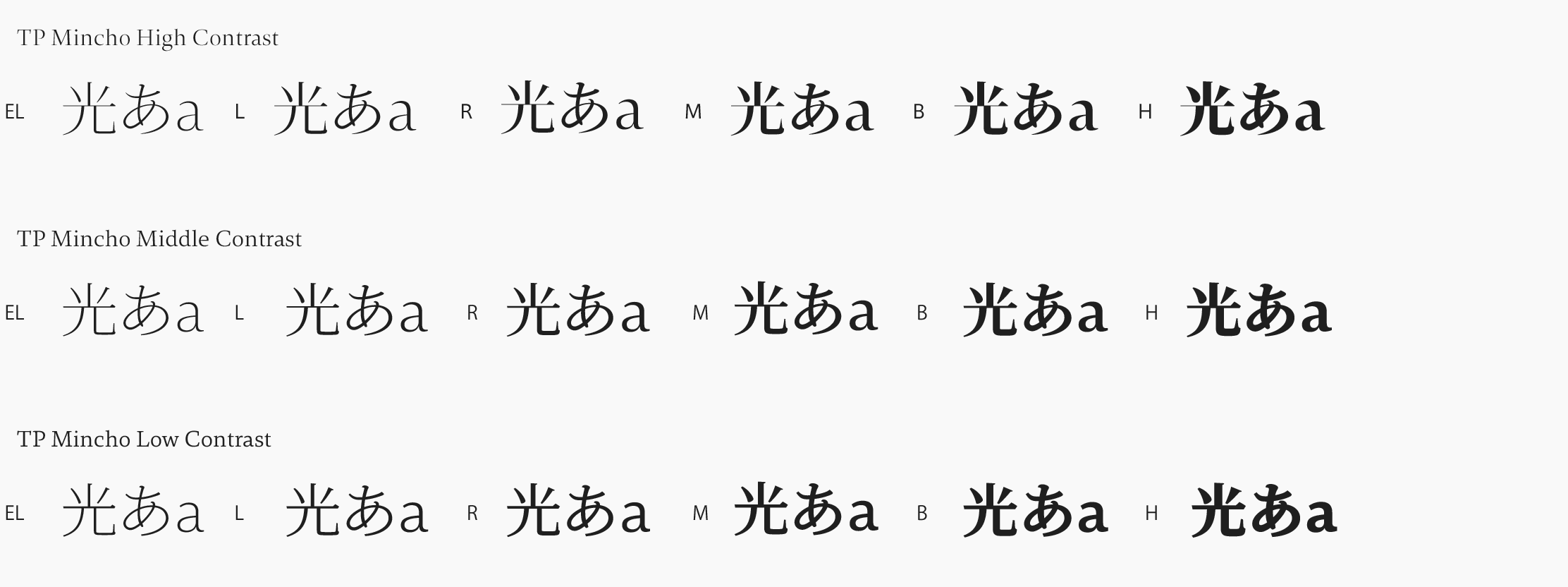
Type Project has announced a new product, TP JPN National Parks Mincho. It was developed as part of the Project to Fully Enjoy National Parks, launched in 2016 by the Ministry of the Environment. The purpose is to make consistent the fonts used in National Park information signs and brochures, as well as on the National Parks logo in use nationwide, so as to further reinforce the branding of National Parks.TP JPN National Parks Mincho is a slab serif typeface font based on a contemporary structure, delivered based on a request from the Ministry of the Environment to “ensure legibility of signboard lettering, etc., while conveying the dignity and character of Japan’s National Parks.” A “slab serif typeface font” is a font in which the serifs (small lines or strokes attached to the ends of larger strokes) are linear, and there is little difference in thickness between the larger vertical and horizontal strokes and the serifs (i.e. low contrast). We developed the Japanese TP JPN National Parks Mincho font, adapting TP Mincho’s low contrast and developing a new version for Latin-alphabet languages.
https://typeproject.com/en/fonts/jpn-nationalparks

