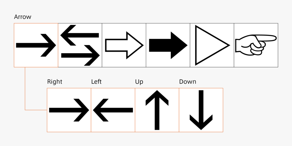
Similar to the previously-mentioned parentheses, there are several types of arrows. Depending on the arrow, each glyph must be prepared up and down, left and right. Using the same shape for the horizontal direction and vertical direction may not look like the same thickness. In such cases, adjustment is made so as make arrows look the same. If we don’t properly check where the same shape is used, and where adjustments are made, it can become a problem at the time of correction.
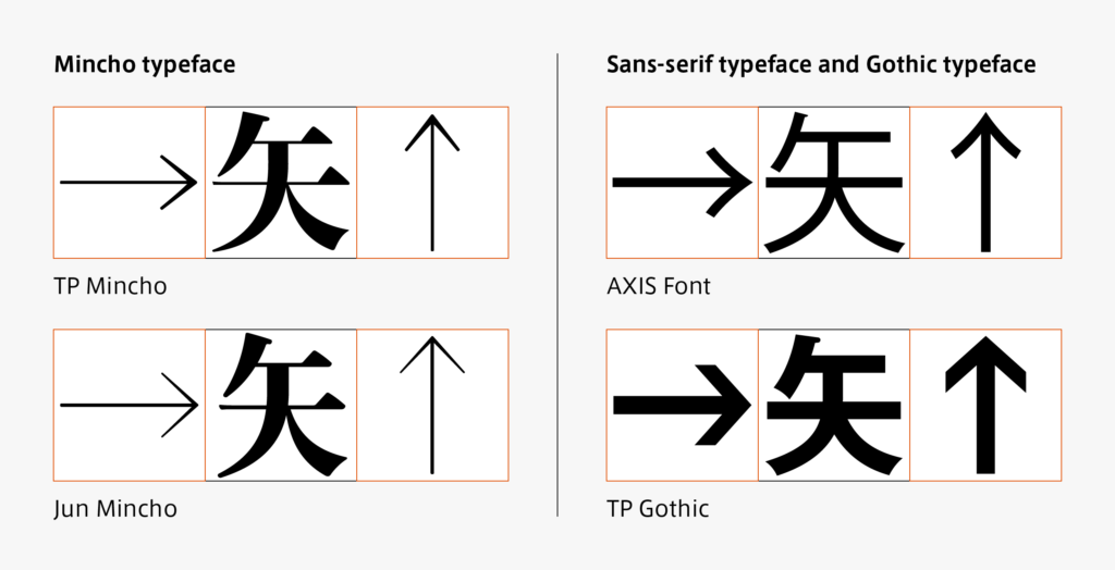
The way of attaching thickness in arrow changes using Mincho typeface, and Gothic typeface and sans-serif typeface is a point of consideration. For Gothic typefaces and sans-serif typefaces, the thickness is the same as the other glyphs. For the Mincho typeface, the thinner arrow is generally used even for the thick weight. Its thinness is close to the horizontal kanji stroke. The thickness is not set like the vertical stroke for an arrow in the vertical direction.
(T.I)
Series archive Japanese Type Design / Japanese Yakumono (Punctuation Marks and Symbols)
- Japanese Yakumono (Punctuation Marks and Symbols) 05: “Symbols”
- Japanese Yakumono (Punctuation Marks and Symbols) 04: “Arrow”
- Japanese Yakumono (Punctuation Marks and Symbols) 03: “Parentheses”
- Japanese Yakumono (Punctuation Marks and Symbols) 02: “Macron and Iteration Mark”
- Japanese Yakumono (Punctuation Marks and Symbols) 01: “Punctuation Mark”