Type Project fonts will be introduced based on examples of usage in different media, including packages, books, websites, and advertisements. I would like to introduce advertisements in this article.
*Including some adjusted characters.

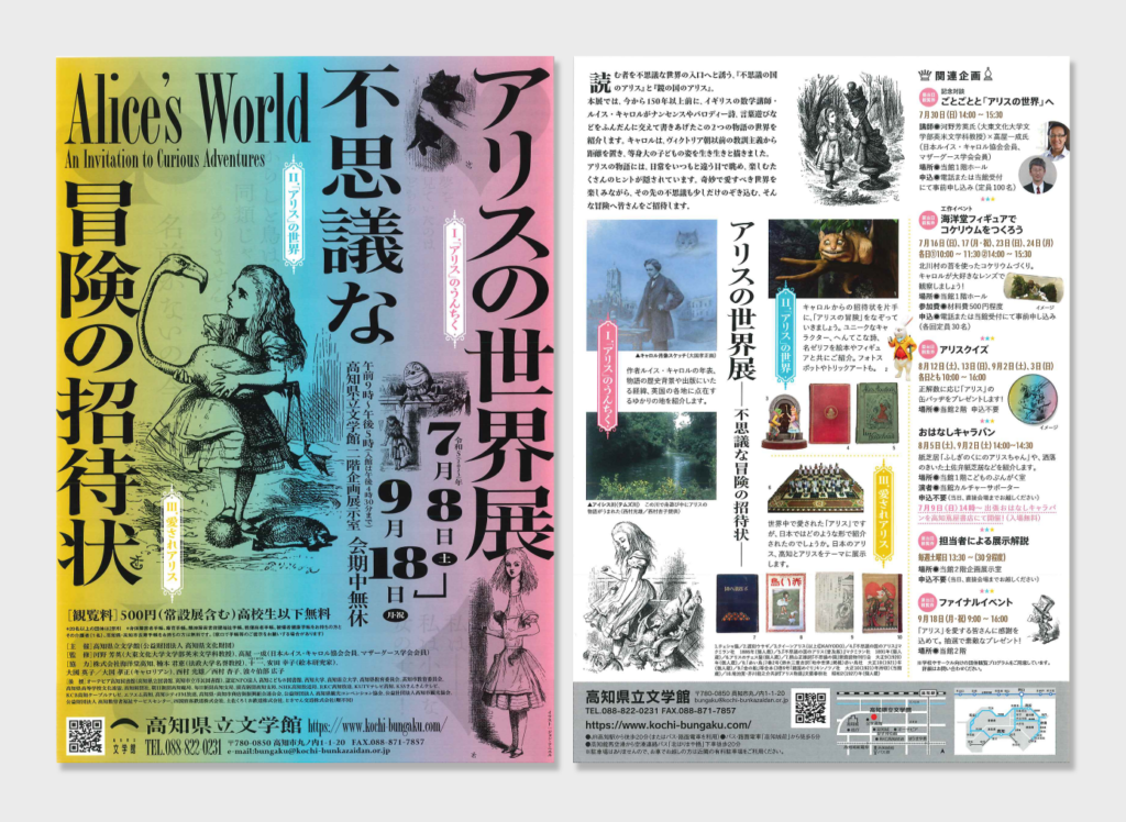
Announcement Leaflet on Exhibition: “The World of Alice – Invitation to Mysterious Adventures”
Advertiser: Kochi Literary Museum
URL: https://www.kochi-bungaku.com/exhibition/8473/
[Type Project Font Used]
The front and part of the back: Kinshachi Font Hime
Kinshachi Font Hime was used in publicity materials, including an announcement leaflet for the exhibition: “The World of Alice – Invitation to Mysterious Adventures” held at Kochi Literary Museum last year.
Illustrations by John Tenniel and gradation in red, blue, and yellow, and slightly extended Kinshachi Font Hime convey his mysterious view of the world.
Kinshachi Font Hime, which has high decorativeness in comparison to normal Mincho typeface with features of unique shapes and lively strokes, is used in many parts in Japanese. It helps to succeed in illustrating the strange and lovable world of Alice’s tales.
It is also very innovative for Kinshachi Font Hime, which is part of the CityFont Project incorporating symbols of Nagoya culture, to be matched with the world of Alice.
For more details about the CityFont Project, please refer to the below article:
https://typeproject.com/story/3740

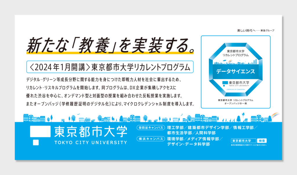
Advertisement inside the Train: “Tokyo City University”
Advertiser: Tokyo City University
URL: https://www.tcu.ac.jp/guidance/trafficadvertising/
[Type Project Font Used]
Catch phase, lead phase, and body phase: AXIS Font Condensed R
AXIS Font Condensed R is used in the phase parts of the advertisement for Tokyo City University inside trains.
Although text is the main constituent, there is no disordered impression. The well-organized information design with the elegant extended font gives an impression of reliability.
The AXIS Font family with three character widths (Basic, Condensed, and Compressed) can correspond to input a lot of information in limited space by adjusting the character width instead of minimizing the characters. Utilizing that feature, AXIS Font Condensed utilizes information space efficiently while with secure readability and beauty.
(KT)
Series archive Font in use / TP Font in use
- Introduction to Examples of TP Font Usage: “Advertisements Part 1”
- Introduction to Examples of TP Font Usage: “Book Titles Part 4”
- Introduction to Example of TP Font Usage: “Websites Part 2”
- Introduction to Example of TP Font Usage: “Websites Part 1”
- Introduction to Example of TP Font Usage: “Book Titles Part 3”
- Introduction to Example of TP Font Usage: “Book Titles Part 2”
- Introduction to Example of TP Font Usage: “Book Titles Part 1”
- Introduction to Example of TP Font Usage: “Iemon Jasmine”