Today, I would like to introduce points on creating half-width and blocks of multiple characters arranged in a space equivalent to that of a single character, testing the application ability from points described in the previous article (With Voiced Dots, Semi-Voiced Dots, and Small Scripts).
Half-width kana
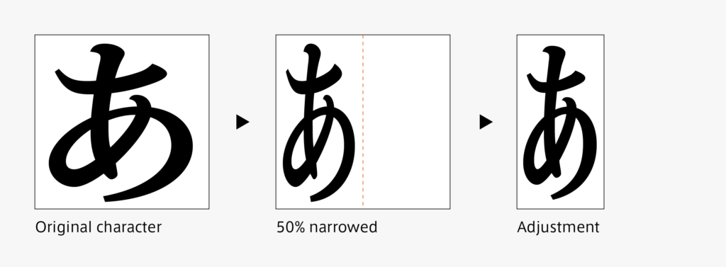
Adjustment is made after reducing the horizontal width by 50%. With thick weights in particular, it may feel difficult to adjust the black wash. Try to search for a suitable outline while paying attention to several perspectives including the natural looking balance of the thickness of vertical strokes and horizontal strokes, and matching the black wash to the other glyphs.
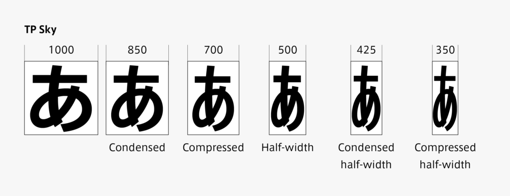
In the case of TP Sky, which is a narrow font family, for example, the narrow kana glyph is created similar to the half-width, and even glyphs with very narrow width in the half-width that are further from narrow fonts are also prepared.
Kana in blocks of multiple characters arranged in a space equivalent to that of a single character
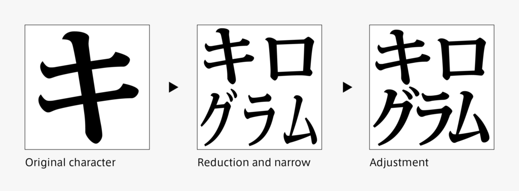
When the original kana design is decided, block of multiple characters arranged in a space equivalent to that of a single character, such as “㍉㍑㌕”, is also created. After reducing and combining the characters, the thickness, character width, arrangement, etc. are adjusted. The character is balanced with unity as a singular glyph and together with other typesetting characters.
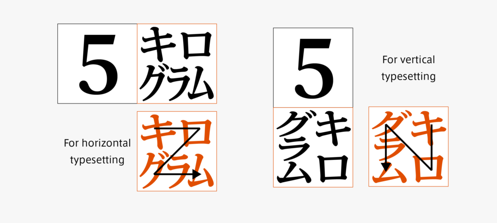
In blocks of multiple characters arranged in a space equivalent to that of a single character, there are variations for horizontal typesetting and vertical settings. The character arrangement is decided upon looking at the vertical flow and horizontal flow.
(T.I)
Series archive Japanese Type Design / Surprisingly Many Kana System Glyphs
- Surprisingly Many Kana System Glyphs 04: “There are Many More”
- Surprisingly Many Kana System Glyphs 03: “Half-Width, and Block of Multiple Characters Arranged in a Space Equivalent to That of a Single Character”
- Surprisingly Many Kana System Glyphs 02: “With Voiced Dots, Semi-Voiced Dots, and Small Scripts”
- Surprisingly Many Kana System Glyphs 01: “Hiragana: Not Enough with 50 Characters”