Type Project font will be introduced based on examples of usage in each medium, including packages, books, websites, and advertisements.
I would like to introduce books in which *TP Mincho is used altogether.
*Including some adjusted characters.
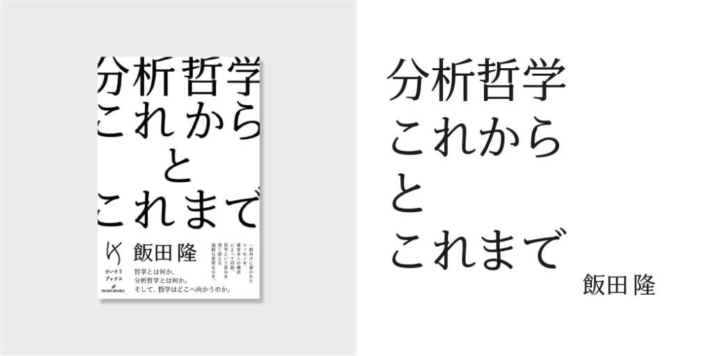
“Analytic Philosophy: Future and Past”
Author: Takashi Iida
Publisher: Keiso Shobo
Book Information: https://www.keisoshobo.co.jp/book/b510213.html
“Modern and Strong Mincho Typeface”
TP Mincho Low Contrast is used for the title, subtitle, name of author, etc. over the whole surface of the essay collection on philosophy with an easy-to-understand introduction and explanation.
It has a large and impressive book title that jumps out from the cover, and practical-minded, pleasant design with characters only constituent in black and white, matching the modern and strong TP Mincho Low Contrast very well.
[Type Project Font Used]
Title: TP Mincho Low Contrast R
Name of Author: TP Mincho Low Contrast R
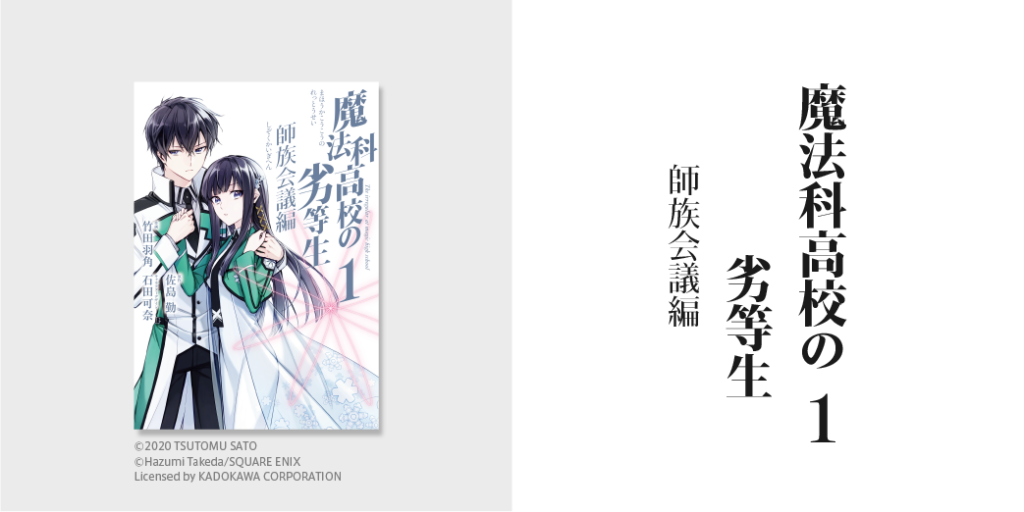
“The Irregular At Magic High School: Master Clans Council Arc, Part I”
Original Author: Tsutomu Sato
Character Design: Kana Ishida
Drawing: Hazumi Takeda
Publisher: SQUARE ENIX
Book Information: https://www.keisoshobo.co.jp/book/b510213.html
“Characteristic Shape of Corner Uroko”
TP Mincho High Contrast is used for the title, subtitle, and volume number of the comic version of a popular light novel.
The title is impressive and sharp with a variation in character size and diagonally deformed characters. With a simple shape, the characteristic corner uroko, etc., TP Mincho is also appropriate for usage in which deformation is applied.
[Type Project Font Used]
Title: TP Mincho High Contrast H
Subtitle: TP Mincho High Contrast R
Volume Number: TP Mincho High Contrast B
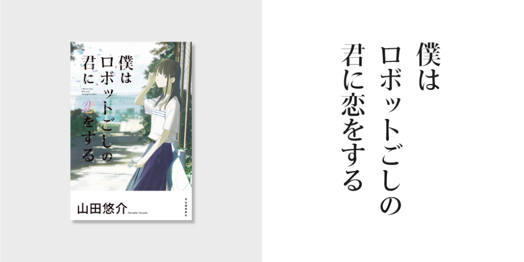
“I Fall in Love with You Through a Robot“
Author: Yusuke Yamada
Publisher: Kawade Shobo Shinsha
Book Information: https://www.kawade.co.jp/np/isbn/9784309026107/
“Mincho Typeface with a Charm in Simple Design”
TP Mincho High Contrast is used for the title of this novel set in the near future along with a design that gives an impression of digital block noise.
I think that the title that includes the contradictory words of “robot” and “love” in a compatible combination with TP Mincho, conveying the charm of Mincho typeface in not becoming too inorganic in simple design, assuming usage in a digital environment.
[Type Project Font Used]
Title: TP Mincho High Contrast M
(KT)
Series archive Font in use / TP Font in use
- Introduction to Examples of TP Font Usage: “Advertisements Part 1”
- Introduction to Examples of TP Font Usage: “Book Titles Part 4”
- Introduction to Example of TP Font Usage: “Websites Part 2”
- Introduction to Example of TP Font Usage: “Websites Part 1”
- Introduction to Example of TP Font Usage: “Book Titles Part 3”
- Introduction to Example of TP Font Usage: “Book Titles Part 2”
- Introduction to Example of TP Font Usage: “Book Titles Part 1”
- Introduction to Example of TP Font Usage: “Iemon Jasmine”