Type Project font will be introduced based on examples of usage in each medium, including packages, books, websites, and advertisements.
I would like to introduce books in which *AXIS Round 100 Condense is used altogether.
*Including some adjusted characters.
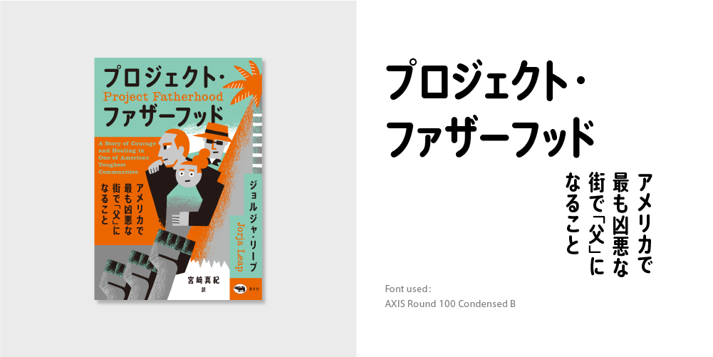
“Project Fatherhood: A Story of Courage and Healing in One of America’s Toughest Communities”
Author: Jorja Leap
Translator: Maki Miyazaki
Publisher: Shobunsha
Book information: https://www.shobunsha.co.jp/?p=6620
“Narrow Font Flourishes Where There is a Lot of Character Information”
Along with distinctive illustrations of the main characters, AXIS Round 100 Condense is used for the title, subtitle, name of author, etc. over the whole surface.
The narrow font utilizes space efficiently where there is a lot of character information due to the long katakana sentences and Latin written together.
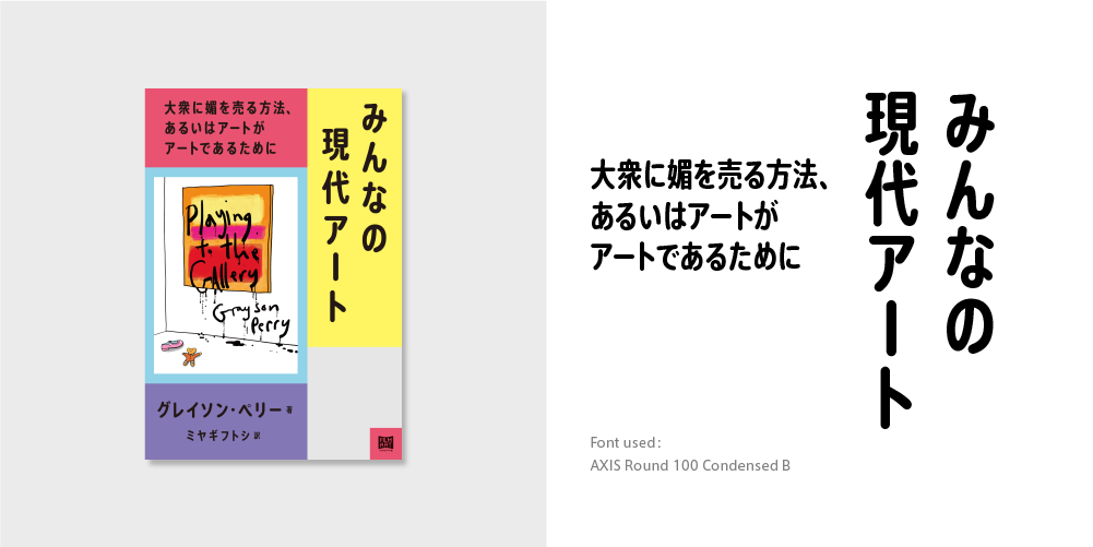
“Playing to the Gallery: Helping Contemporary Art in Its Struggle to Be Understood”
Author: Grayson Perry
Translator: Futoshi Miyagi
Publisher: Film Art, Inc.
Book information: http://filmart.co.jp/books/art/composite_art/playing_to_the_gallery/
“Modern Round Gothic Wearing Familiarity and Proper Air”
Along with a popular design with yellow, red, and blue, AXIS Round 100 Condense is used for the title, subtitle, name of author, etc. over the whole surface.
Modern round gothic, left with the sharp expression of modern sans-serif, conveys familiarity and a proper air.

“Super Illustrated Magazine of 1,000 Records in the Showa Period: Admire the Jackets and Read the Dense News”
Author: Chappy Kato
Publisher: 303 Books
Book information: https://303books.jp/showarecord/
“Impressive Characters Convey a Comfortable Natural Rhythm”
In this illustrated reference-like book, 1,000 songs (!) in standard 45-rpm records are introduced with photographs and explanations. AXIS Round 100 Condense is used not only in the title part, but also in many parts of the book.
As the character information that tends to increase is settled neatly and reasonably, you can go on reading this book feeling a comfortable natural rhythm.
(KT)
Series archive Font in use / TP Font in use
- Introduction to Examples of TP Font Usage: “Advertisements Part 1”
- Introduction to Examples of TP Font Usage: “Book Titles Part 4”
- Introduction to Example of TP Font Usage: “Websites Part 2”
- Introduction to Example of TP Font Usage: “Websites Part 1”
- Introduction to Example of TP Font Usage: “Book Titles Part 3”
- Introduction to Example of TP Font Usage: “Book Titles Part 2”
- Introduction to Example of TP Font Usage: “Book Titles Part 1”
- Introduction to Example of TP Font Usage: “Iemon Jasmine”