%20--%3e%3cpolygon%20points='24.7%201%200%201%200%207.6%208.5%207.6%208.5%2039.4%2016.1%2039.4%2016.1%207.6%2024.7%207.6%2024.7%201'/%3e%3cpath%20d='M34.1,32.4l-4.9-22.7h-7.9l9.1,33.1c-.4,1.7-1.1,2.9-3.7,2.9h-2.6l1.9,6.6h1.5c4,0,8-1.2,10.3-9.2,1.8-6.4,8.9-33.3,8.9-33.3h-8l-4.6,22.7Z'/%3e%3cpath%20d='M91.7,8.7c-8.7,0-12.7,6.5-12.7,16.1s3.6,15.3,13.8,15.3,7.2-.9,9-1.6l-1.2-6c-2.4.8-4.9,1.2-7,1.2-4.3,0-7-2-7.2-7.3h16v-4.8c0-7.5-2.9-13-10.7-13ZM86.5,21c0-3.3,1.7-6.4,4.7-6.4s4.1,2.7,4.1,6.4h-8.8Z'/%3e%3cpath%20d='M218,8.7c-8.7,0-12.7,6.5-12.7,16.1s3.6,15.3,13.8,15.3,7.2-.9,9-1.6l-1.2-6c-2.5.8-4.9,1.2-7,1.2-4.3,0-7-2-7.2-7.3h16v-4.8c0-7.5-2.9-13-10.7-13ZM212.9,21c0-3.3,1.7-6.4,4.7-6.4s4.1,2.7,4.1,6.4h-8.8Z'/%3e%3cpath%20d='M126,1h-10.7v38.4h7.6v-11.8h5c6,0,11.3-3.8,11.3-14.1s-5.5-12.5-13.1-12.5ZM125.9,20.9h-3.1V7.6h3c3.7,0,5.4,1.8,5.4,6.3s-1.5,7.1-5.3,7.1Z'/%3e%3cpath%20d='M150,12.9c-.2-1-.5-2.4-.8-3.2h-6.9c.5,1.9.7,4.6.7,7.9v21.8h7.4v-20.3c1.1-2.2,4.5-3,7.4-3v-6.8c-3.5,0-6.5,1.7-7.7,3.6Z'/%3e%3cpath%20d='M192.6,40.6c0,3.5-1.6,4-4.7,4h-1.5l1.9,6.6h2.3c6.3,0,9.3-3.2,9.3-9.8V9.7h-7.4v30.9Z'/%3e%3crect%20x='192.2'%20width='8.4'%20height='6.4'/%3e%3cpath%20d='M247.4,33.7c-4.8,0-6.6-2.8-6.6-9.6s1.9-8.9,6.2-8.9,3.4.4,4.9,1l1-6.4c-1.3-.5-3.7-.9-6.2-.9-10.6,0-13.4,6.7-13.4,15.9h0c0,10.7,4.6,15.3,12.4,15.3s5.9-.5,7.4-1l-.9-6.1c-2,.4-3.7.6-4.7.6Z'/%3e%3cpath%20d='M264.7,30.2v-14.2h5.4l1.4-5.8h-6.9V2.1l-7.3,1.9v26.8c0,5.3,2.4,9,8.2,9s4.9-.2,4.9-.2v-5.7h-2c-3,0-3.8-1.3-3.8-3.7Z'/%3e%3cpath%20d='M64.3,8.8c-3.3,0-5.8,1.6-7.3,3.4-.2-1.1-.5-2.1-.8-2.6h-6.6c.5,1.9.6,4.4.6,7.4v34.4h7.3v-13.8c1.5,1.5,3.8,2.4,6.2,2.4,8,0,11.2-6.6,11.2-16s-3.1-15.2-10.4-15.2ZM62.1,33.8c-1.6,0-3.1-.6-4.6-1.8-.3-1.6-.4-3.7-.4-6v-3.3c0-1.8.1-3.8.4-5.1,1.4-1.4,3-2.5,5-2.5,3.2,0,4.6,3.2,4.6,9s-.9,9.6-5,9.6Z'/%3e%3cpath%20d='M173.6,8.6c-9.5,0-13,6.7-13,15.7s3.5,16.1,13,16.1,13-6.8,13-16.2-3.3-15.7-13-15.7ZM173.6,34.2c-3.6,0-5.5-2.9-5.5-9.9s2.2-9.5,5.5-9.5,5.5,2.2,5.5,9.5-1.9,9.9-5.5,9.9Z'/%3e%3c/svg%3e)
Type Project font will be introduced based on examples of usage in each medium, including packages, books, websites, and advertisements.
I would like to introduce books in which *AXIS Font is used altogether.
*Including some adjusted characters.
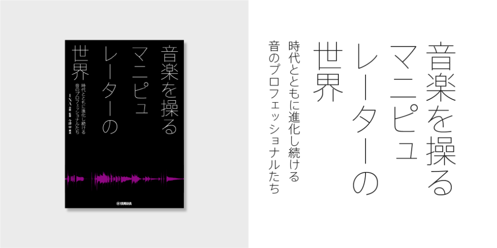
“The World of Manipulators Who Control Music: Sound Professionals Who Continuously Evolve Along with the Times”
Planning and Editing: INA
Interview and Composition: Koh Imazu
Publisher: Yamaha Music Entertainment Holdings
Book Information: https://www.ymm.co.jp/p/detail.php?code=GTB01097199
“Extremely Thin Japanese Font Flourishes in Large Size”
AXIS Font Basic is used for the title and subtitle of the book on manipulators in the field of music.
The extremely thin outline characters give a fresh impression to this intellectual and digital view of the world.
EL, developed as a weight to support the extremely thin UL, is used for the subtitle to match the weight impression well.
[Type Project Font Used]
Title: AXIS Font Basic UL
Subtitle: AXIS Font Basic EL
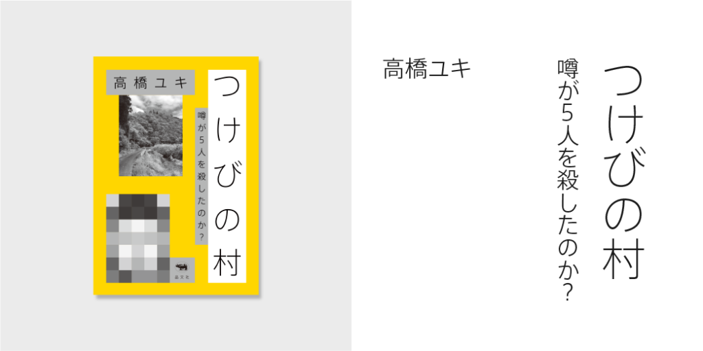
“The Village of Arson: Did a Rumor Killed Five People?”
Author: Yuki Takahashi
Publisher: Shobunsha
Book Information: https://www.shobunsha.co.jp/?p=5474
“Design That Makes Use of the White Background”
AXIS Font Basic is used for the title, subtitle, and name of author for this non-fiction book about a serial arson and murder case.
Typesetting making use of the white background in design looks like a collage of clues for solving the case, creating a modern and intellectual atmosphere.
[Type Project Font Used]
Title: AXIS Font Basic EL
Subtitle: AXIS Font Basic L
Name of Author: AXIS Font Basic L
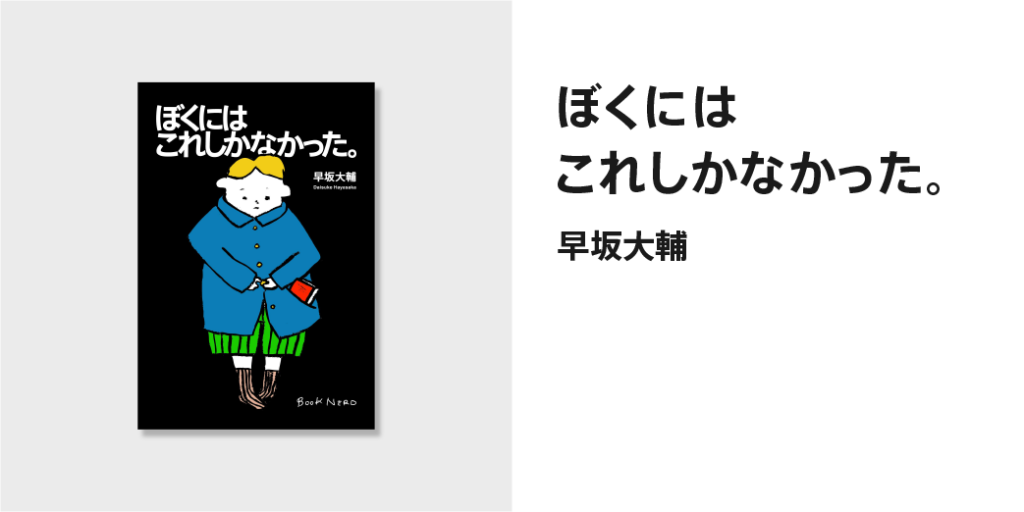
“This is All I Have.”
Author: Daisuke Hayasaka
Publisher: KIRAKUSHA
Book Information: http://www.kirakusha.com/book/b557952.html
“Neutral Sans-Serif Typeface”
AXIS Font Basic is used for the title and name of author of this essay collection written by a bookstore owner in a provincial city.
The hiragana-only title typeset using neutral characters with a handwritten nuance left in simple shape, and the gentle and simple illustration give us a feeling of familiarity, like an illustrated book.
[Type Project Font Used]
Title: AXIS Font Basic B
Name of Author: AXIS Font Basic B
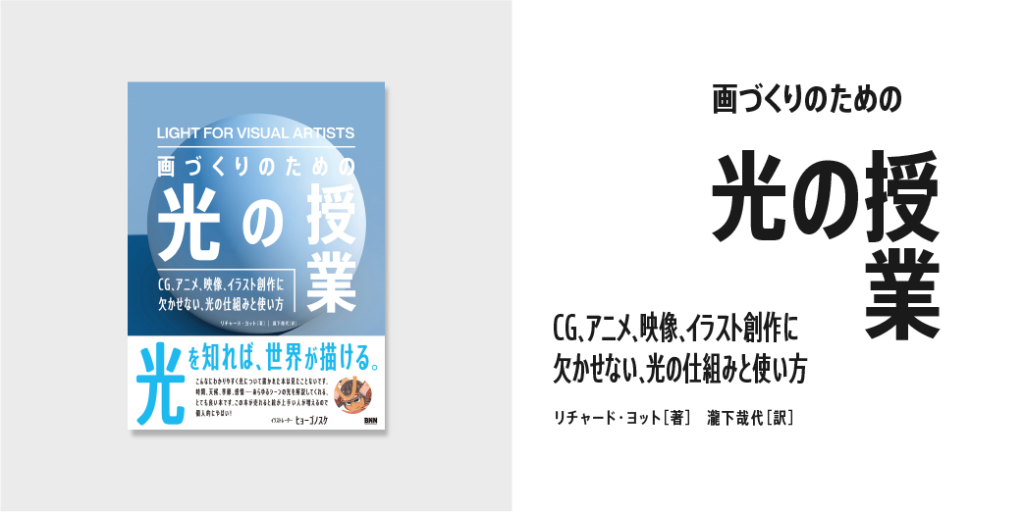
“Light for Visual Artists: Understanding & Using Light in Art & Design”
Author: Richard Yot
Translator: Kanayo Takishita
Publisher: BNN
Book Information: http://www.bnn.co.jp/books/10082/
“Typesetting with Beauty and Space Even in Limited Space”
AXIS Font Condensed and Compressed are used for the title, subtitle, name of author, etc. over the whole surface of the book explaining the basic knowledge and usage methods regarding light.
The narrow font flourishes to achieve modulation of information in a limited space.
The title: “Light for Visual Artists” very symbolically flows into the eyes.
By the way, AXIS Round 50 Compressed is used for the book band. Furthermore, it efficiently conveys the appeal of this book in limited space.
[Type Project Font Used]
Title: AXIS Font Condensed B
Subtitle: AXIS Font Compressed M
Name of Author: AXIS Font Condensed M
Book Band: AXIS Round 50 Compressed M
(KT)
Series archive Font in use / TP Font in use
- Introduction to Examples of TP Font Usage: “Advertisements Part 1”
- Introduction to Examples of TP Font Usage: “Book Titles Part 4”
- Introduction to Example of TP Font Usage: “Websites Part 2”
- Introduction to Example of TP Font Usage: “Websites Part 1”
- Introduction to Example of TP Font Usage: “Book Titles Part 3”
- Introduction to Example of TP Font Usage: “Book Titles Part 2”
- Introduction to Example of TP Font Usage: “Book Titles Part 1”
- Introduction to Example of TP Font Usage: “Iemon Jasmine”