Type Project’s fonts can be seen everywhere- posters displayed on trains, book covers, product packages, art museum signage, etc. There are also articles on example of usage in the staff blog; we report to each other in the company when we see them.
Shortly after joining the company, I consciously searched for Type Project’s fonts after seeing characters while commuting or out. In the beginning, I didn’t have the confidence to distinguish these fonts just by looking at them, so I took photographs and verified them later on.
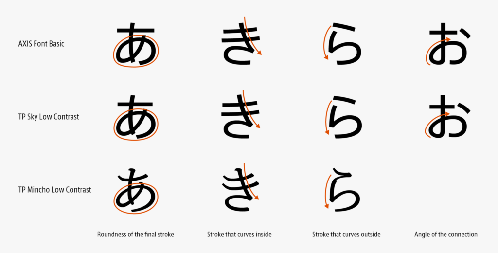
I want to list shapes that were easy to remember, in my case. For kana, “あ, お, き, and ら” in the AXIS Font, TP Sky, and TP Mincho were easy to remember. Even in other fonts apart from Type Project, when I see another typeface made by the same creator, I vaguely imagine what the feeling and characteristic of lines of the creator are reflected on certain brush movements, and how they were made into characteristic shapes.
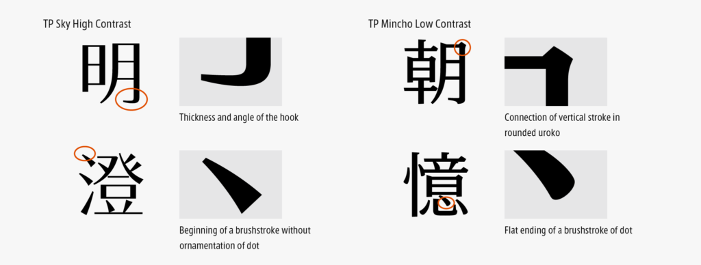
For kanji, the hook, the elegance of the shape of widening to the end of a dot, the right sweep, etc. in TP Sky High and Middle are distinguishable; for TP Mincho, a rounded uroko and roundness in the end of a brushstroke of dot in Low and Middle were easy to remember. In addition, detailed shapes and contrasts in each font were easy to remember.
After a while, I started to notice the shapes and atmosphere of TP fonts.
The above-mentioned points are my view. As I think it differs by person, I’m curious to know which parts are used by other people to distinguish these fonts.
(RK)
Series archive Other / Behind the Scenes in Typeface Creation
- Behind the Scenes in Typeface Creation: Checking Font with Red Pencil 04: “Raise, Lay Down, and OK”
- Behind the Scenes in Typeface Creation: Checking Font with Red Pencil 03: “<, and > <”
- Behind the Scenes in Typeface Creation: Visual Adjustment 02: “Thickness of Line”
- Behind the Scenes in Typeface Creation: Visual Adjustment 01: “Area of Space”
- Behind the Scenes in Typeface Creation: “Regarding TP’s Stack and Book Collection”
- Behind the Scenes in Typeface Creation: “When I See TP Typeface”
- Behind the Scenes in Typeface Creation: Checking Font with Red Pencil 02: “S-, S+, C-, and C+”
- Behind the Scenes in Typeface Creation: Checking Font with Red Pencil 01: “Check for Rookies, W- and W+”
- Behind the Scenes in Typeface Creation: “Various Dots Included in Font” from Instagram Posts
- Behind the Scenes in Typeface Creation: “Eyeball”
- Behind the Scenes in Typeface Creation: “Tofu”
- Behind the Scenes in Typeface Creation: “Creating Customized Emoji in Slack”