At Type Project, checking with red pencil and correction are repeated many times to improve the quality of font. In this new series, I would like to pick out some checking with red pencil from documents at the time of creating the TP Sky family, and introduce the instruction content.

The above photographs indicate checking with red pencil made by a senior colleague for kanji created by me in my first year at the company. The writing indicates: The space between hen and tsukuri is narrow in “紕,” so create more space by narrowing the width of ito-hen. For “稱,” narrow the top and widen the bottom of the counter of “冉.” As these are examples of checking with red pencil for rookies, the careful instruction includes guidance for basic creation method. As we get used to it, the simplified checking with red pencil increases.
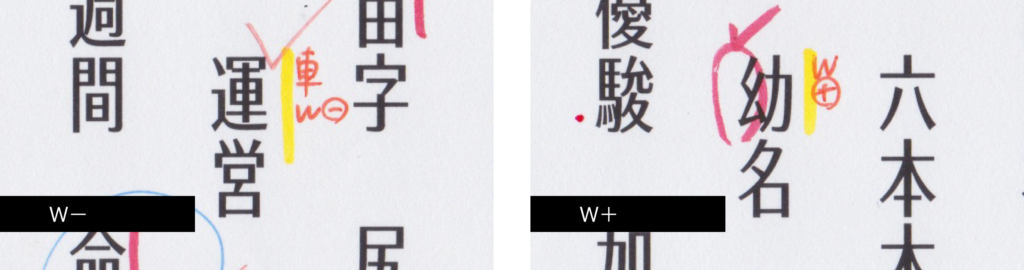
“W-” and “W+” appear frequently, for example. “W” means weight, and “W-” means “make the strokes thinner,” and “W+” means “make the strokes thicker.” In this case, the instruction indicates: “make only the ‘車’ of ‘運’ thinner, and make only the “⺓” of “幼” thicker.”
As hundreds and thousands of characters may be checked at once, the writing is simplified to speed up checking with red pencil.
(担当T)
Series archive Other / Behind the Scenes in Typeface Creation
- Behind the Scenes in Typeface Creation: Checking Font with Red Pencil 04: “Raise, Lay Down, and OK”
- Behind the Scenes in Typeface Creation: Checking Font with Red Pencil 03: “<, and > <”
- Behind the Scenes in Typeface Creation: Visual Adjustment 02: “Thickness of Line”
- Behind the Scenes in Typeface Creation: Visual Adjustment 01: “Area of Space”
- Behind the Scenes in Typeface Creation: “Regarding TP’s Stack and Book Collection”
- Behind the Scenes in Typeface Creation: “When I See TP Typeface”
- Behind the Scenes in Typeface Creation: Checking Font with Red Pencil 02: “S-, S+, C-, and C+”
- Behind the Scenes in Typeface Creation: Checking Font with Red Pencil 01: “Check for Rookies, W- and W+”
- Behind the Scenes in Typeface Creation: “Various Dots Included in Font” from Instagram Posts
- Behind the Scenes in Typeface Creation: “Eyeball”
- Behind the Scenes in Typeface Creation: “Tofu”
- Behind the Scenes in Typeface Creation: “Creating Customized Emoji in Slack”