Previously, I introduced “W-” and “W+” as simplified checking with red pencil. I would like to introduce checking with red pencil for alphabet characters at this time.
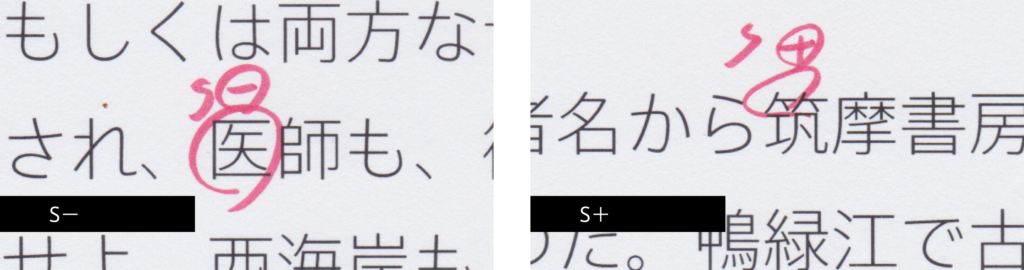
“S” means size, and the instruction of “S-” means “smaller,” and “S+” means “larger.” When simply magnified or reduced, thickness of the strokes changes together, so correction is made by making the structure smaller or larger without changing the thickness.
For “医,” the instruction is to make the entire character smaller. When the square character is created fully in type face, it tends to look larger than other characters. Because of this, I’m careful with the size adjustment. For “筑,” the instruction is given to make only the left part of take-kanmuri larger. For take-kanmuri, the balance between right and left is also checked.
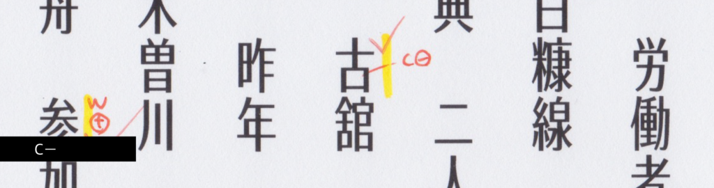
“C” means counter. “C-” means “make the counter narrower,” and “C+” means “make the counter wider.” Here, the instruction is given to make the counter of “口” part of “古” narrower. In checking with red pencil for the TP Sky series, I saw more “C-” than “C+.”
In addition, “G” is used for the instruction for raising or lowering the gravity.
(T.I)
term
Series archive Other / Behind the Scenes in Typeface Creation
- Behind the Scenes in Typeface Creation: Checking Font with Red Pencil 04: “Raise, Lay Down, and OK”
- Behind the Scenes in Typeface Creation: Checking Font with Red Pencil 03: “<, and > <”
- Behind the Scenes in Typeface Creation: Visual Adjustment 02: “Thickness of Line”
- Behind the Scenes in Typeface Creation: Visual Adjustment 01: “Area of Space”
- Behind the Scenes in Typeface Creation: “Regarding TP’s Stack and Book Collection”
- Behind the Scenes in Typeface Creation: “When I See TP Typeface”
- Behind the Scenes in Typeface Creation: Checking Font with Red Pencil 02: “S-, S+, C-, and C+”
- Behind the Scenes in Typeface Creation: Checking Font with Red Pencil 01: “Check for Rookies, W- and W+”
- Behind the Scenes in Typeface Creation: “Various Dots Included in Font” from Instagram Posts
- Behind the Scenes in Typeface Creation: “Eyeball”
- Behind the Scenes in Typeface Creation: “Tofu”
- Behind the Scenes in Typeface Creation: “Creating Customized Emoji in Slack”