In this series, I would like to introduce visual adjustments for typeface creation.
For this, I would like to introduce an example of the character “田.”
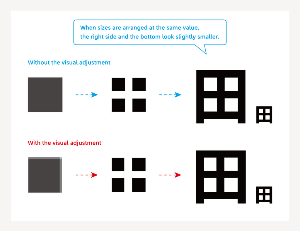
As a rough rule in typeface creation, adjustment is made to have a “wide bottom” and “wide right side.” This comes in consideration of the optical illusion that the human eye perceives expansion in the top part rather than the bottom part, and the left side rather than the right side.
I would like to explain this with the character “田,” which is simple in structure.

The kanji character “田” is bilaterally symmetrical. However, the bottom and the right side are created as intentionally larger, so that it looks like the same size when read. When the space inside the character is created at the completely same size, the right side and the bottom look a bit narrower – this is the reason.
Presence/absence of this adjustment is a difference of approximately 1% in the character size. However, this slight difference can change the impression when looking at the character.
There are other visual adjustment points in typeface creation, including the thickness and length of line. In this series, I would like to introduce these visual adjustment points.
(NM)
Series archive Other / Behind the Scenes in Typeface Creation
- Behind the Scenes in Typeface Creation: Checking Font with Red Pencil 04: “Raise, Lay Down, and OK”
- Behind the Scenes in Typeface Creation: Checking Font with Red Pencil 03: “<, and > <”
- Behind the Scenes in Typeface Creation: Visual Adjustment 02: “Thickness of Line”
- Behind the Scenes in Typeface Creation: Visual Adjustment 01: “Area of Space”
- Behind the Scenes in Typeface Creation: “Regarding TP’s Stack and Book Collection”
- Behind the Scenes in Typeface Creation: “When I See TP Typeface”
- Behind the Scenes in Typeface Creation: Checking Font with Red Pencil 02: “S-, S+, C-, and C+”
- Behind the Scenes in Typeface Creation: Checking Font with Red Pencil 01: “Check for Rookies, W- and W+”
- Behind the Scenes in Typeface Creation: “Various Dots Included in Font” from Instagram Posts
- Behind the Scenes in Typeface Creation: “Eyeball”
- Behind the Scenes in Typeface Creation: “Tofu”
- Behind the Scenes in Typeface Creation: “Creating Customized Emoji in Slack”