I would like to introduce a visual adjustment point related to the thickness of the vertical stroke and horizontal stroke.
The vertical stroke and horizontal stroke introduced in this article are examples in which the rules of “thicker on the bottom” and “thicker on the right” are followed for creation, as in many cases. Similar to the area of space in the previous article, this is because the top is perceived to expand to the human eye.
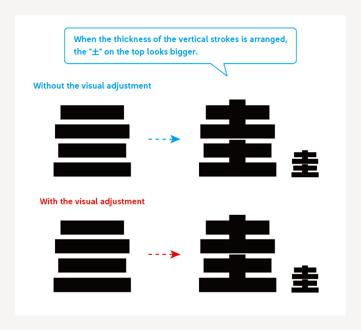
I would like to introduce this point with the example of the character “圭,” in which there are many horizontal strokes. When the thickness of the horizontal strokes and space between the horizontal strokes are even, the “土” on the top looks bigger.
As the characters “田” and “圭” are structured with only straight vertical strokes and horizontal strokes, the shapes are simple and symmetrical. However, the thickness of each line and arrangement are not mechanically determined. These characters are created in consideration of how they are seen to the human eye in accordance with the visual adjustment of “thicker and wider the right side and the bottom.”
(NM)
Series archive Other / Behind the Scenes in Typeface Creation
- Behind the Scenes in Typeface Creation: Checking Font with Red Pencil 04: “Raise, Lay Down, and OK”
- Behind the Scenes in Typeface Creation: Checking Font with Red Pencil 03: “<, and > <”
- Behind the Scenes in Typeface Creation: Visual Adjustment 02: “Thickness of Line”
- Behind the Scenes in Typeface Creation: Visual Adjustment 01: “Area of Space”
- Behind the Scenes in Typeface Creation: “Regarding TP’s Stack and Book Collection”
- Behind the Scenes in Typeface Creation: “When I See TP Typeface”
- Behind the Scenes in Typeface Creation: Checking Font with Red Pencil 02: “S-, S+, C-, and C+”
- Behind the Scenes in Typeface Creation: Checking Font with Red Pencil 01: “Check for Rookies, W- and W+”
- Behind the Scenes in Typeface Creation: “Various Dots Included in Font” from Instagram Posts
- Behind the Scenes in Typeface Creation: “Eyeball”
- Behind the Scenes in Typeface Creation: “Tofu”
- Behind the Scenes in Typeface Creation: “Creating Customized Emoji in Slack”