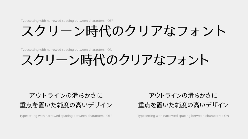
When the space between characters stands out due to large character size, such as in headings, leads, etc., or visual coherence is desired for sentences, typesetting with narrowed spacing between characters enables the users to show text more beautifully.
Not only the shape of characters, but also information on various functions related to character typesetting is included in OpenType fonts.
Of these, typesetting with narrowed spacing between characters is also possible in Web font by utilizing the OpenType functions palt and kern (vpal and vkrn in the case of vertical typesetting).
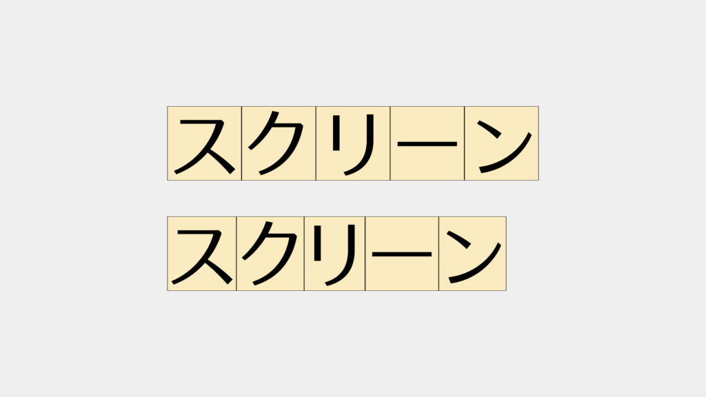
palt / vpal is a (proportional) function to set the character width of full-width glyph per character appropriately.
Nothing is applied in the top, and palt is applied in the bottom.
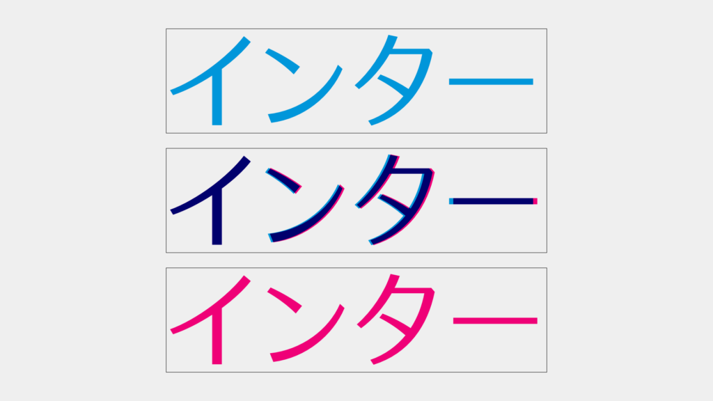
kern / vkrn is a (kerning) function to adjust the glyph position so as to make the spacing between glyphs even.
Only palt is applied in the blue characters in the top, both palt and kern are applied in the red characters in the bottom, and both of them are overlapped in the middle. You can see that the position is adjusted by kern.
• In the major browsers, kern is applied by default according to the auto value in the font-kerning property. However, the kern / vkrn information in Japanese OpenType fonts is set on the assumption that palt / vpal is already applied. Note that it is necessary to set two functions together.
To utilize these OpenType functions in Web font, the font-feature-settings property is utilized.
In the case of typesetting with narrowed spacing between characters in horizontal typesetting:
font-feature-settings: "palt", "kern";
In the case of typesetting with narrowed spacing between characters in vertical typesetting:
font-feature-settings: "vpal", "vkrn";
When the above is specified, typesetting with narrowed spacing between characters is achieved.
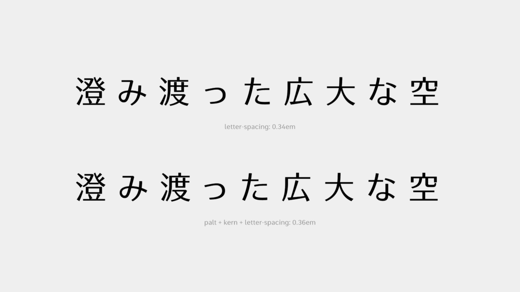
By the way, more even spacing can be achieved at the time of typesetting with space between characters in letter-spacing by utilizing these functions.
Although palt and kern are convenient functions, the rhythm of characters becomes uneven, causing difficulty in reading when applied to longer sentences. Therefore, it is not recommended to apply these functions to texts.
Depending on the font, these OpenType functions may not be implemented.
Reference:
・Font Typesetting Function 01: “What are the OpenType Features?”(TP Staff Blog)
・Font Typesetting Function 02: “GPOS and GSUB”(TP Staff Blog)
・palt specification
・Detailed explanation of font-feature-settings in Adobe
(LN)
term
Series archive Web Font / Web Font Design Technique
- Web Font Design Technique 05: “Use Mixed Typesetting”
- Web Font Design Technique 04: “Change the Character Shape”
- Web Font Design Technique 03: “Specify the Line Break Position”
- Web Font Design Technique 02: “Match the Character Size to the Screen Size”
- Web Font Design Technique 01: “Typesetting with Narrowed Spacing Between Characters for Headings and Leads”