


Fonts In Use
-
A Low Contrast
-
A Middle Contrast
-
A High Contrast
-
A Condensed Low Contrast
-
A Condensed Middle Contrast
-
A Condensed High Contrast
-
A Compressed Low Contrast
-
A Compressed Middle Contrast
-
A Compressed High Contrast
-
Buy
TP SkyLow Contrast
EL
スクリーン時代のクリアなフォント、TPスカイ アウトラインの滑らかさに重点を置いた純度の高いデザイン TPスカイは、明朝体ともゴシック体とも異なる「第三の書体」として開発しました。
-
Buy
TP SkyLow Contrast
L
スクリーン時代のクリアなフォント、TPスカイ アウトラインの滑らかさに重点を置いた純度の高いデザイン TPスカイは、明朝体ともゴシック体とも異なる「第三の書体」として開発しました。
-
Buy
TP SkyLow Contrast
R
スクリーン時代のクリアなフォント、TPスカイ アウトラインの滑らかさに重点を置いた純度の高いデザイン TPスカイは、明朝体ともゴシック体とも異なる「第三の書体」として開発しました。
-
Buy
TP SkyLow Contrast
M
スクリーン時代のクリアなフォント、TPスカイ アウトラインの滑らかさに重点を置いた純度の高いデザイン TPスカイは、明朝体ともゴシック体とも異なる「第三の書体」として開発しました。
-
Buy
TP SkyLow Contrast
B
スクリーン時代のクリアなフォント、TPスカイ アウトラインの滑らかさに重点を置いた純度の高いデザイン TPスカイは、明朝体ともゴシック体とも異なる「第三の書体」として開発しました。
-
Buy
TP SkyMiddle Contrast
EL
スクリーン時代のクリアなフォント、TPスカイ アウトラインの滑らかさに重点を置いた純度の高いデザイン TPスカイは、明朝体ともゴシック体とも異なる「第三の書体」として開発しました。
-
Buy
TP SkyMiddle Contrast
L
スクリーン時代のクリアなフォント、TPスカイ アウトラインの滑らかさに重点を置いた純度の高いデザイン TPスカイは、明朝体ともゴシック体とも異なる「第三の書体」として開発しました。
-
Buy
TP SkyMiddle Contrast
R
スクリーン時代のクリアなフォント、TPスカイ アウトラインの滑らかさに重点を置いた純度の高いデザイン TPスカイは、明朝体ともゴシック体とも異なる「第三の書体」として開発しました。
-
Buy
TP SkyMiddle Contrast
M
スクリーン時代のクリアなフォント、TPスカイ アウトラインの滑らかさに重点を置いた純度の高いデザイン TPスカイは、明朝体ともゴシック体とも異なる「第三の書体」として開発しました。
-
Buy
TP SkyMiddle Contrast
B
スクリーン時代のクリアなフォント、TPスカイ アウトラインの滑らかさに重点を置いた純度の高いデザイン TPスカイは、明朝体ともゴシック体とも異なる「第三の書体」として開発しました。
-
Buy
TP SkyHigh Contrast
EL
スクリーン時代のクリアなフォント、TPスカイ アウトラインの滑らかさに重点を置いた純度の高いデザイン TPスカイは、明朝体ともゴシック体とも異なる「第三の書体」として開発しました。
-
Buy
TP SkyHigh Contrast
L
スクリーン時代のクリアなフォント、TPスカイ アウトラインの滑らかさに重点を置いた純度の高いデザイン TPスカイは、明朝体ともゴシック体とも異なる「第三の書体」として開発しました。
-
Buy
TP SkyHigh Contrast
R
スクリーン時代のクリアなフォント、TPスカイ アウトラインの滑らかさに重点を置いた純度の高いデザイン TPスカイは、明朝体ともゴシック体とも異なる「第三の書体」として開発しました。
-
Buy
TP SkyHigh Contrast
M
スクリーン時代のクリアなフォント、TPスカイ アウトラインの滑らかさに重点を置いた純度の高いデザイン TPスカイは、明朝体ともゴシック体とも異なる「第三の書体」として開発しました。
-
Buy
TP SkyHigh Contrast
B
スクリーン時代のクリアなフォント、TPスカイ アウトラインの滑らかさに重点を置いた純度の高いデザイン TPスカイは、明朝体ともゴシック体とも異なる「第三の書体」として開発しました。
-
Buy
TP SkyCondensedLow Contrast
EL
スクリーン時代のクリアなフォント、TPスカイ アウトラインの滑らかさに重点を置いた純度の高いデザイン TPスカイは、明朝体ともゴシック体とも異なる「第三の書体」として開発しました。
-
Buy
TP SkyCondensedLow Contrast
L
スクリーン時代のクリアなフォント、TPスカイ アウトラインの滑らかさに重点を置いた純度の高いデザイン TPスカイは、明朝体ともゴシック体とも異なる「第三の書体」として開発しました。
-
Buy
TP SkyCondensedLow Contrast
R
スクリーン時代のクリアなフォント、TPスカイ アウトラインの滑らかさに重点を置いた純度の高いデザイン TPスカイは、明朝体ともゴシック体とも異なる「第三の書体」として開発しました。
-
Buy
TP SkyCondensedLow Contrast
M
スクリーン時代のクリアなフォント、TPスカイ アウトラインの滑らかさに重点を置いた純度の高いデザイン TPスカイは、明朝体ともゴシック体とも異なる「第三の書体」として開発しました。
-
Buy
TP SkyCondensedLow Contrast
B
スクリーン時代のクリアなフォント、TPスカイ アウトラインの滑らかさに重点を置いた純度の高いデザイン TPスカイは、明朝体ともゴシック体とも異なる「第三の書体」として開発しました。
-
Buy
TP SkyCondensedMiddle Contrast
EL
スクリーン時代のクリアなフォント、TPスカイ アウトラインの滑らかさに重点を置いた純度の高いデザイン TPスカイは、明朝体ともゴシック体とも異なる「第三の書体」として開発しました。
-
Buy
TP SkyCondensedMiddle Contrast
L
スクリーン時代のクリアなフォント、TPスカイ アウトラインの滑らかさに重点を置いた純度の高いデザイン TPスカイは、明朝体ともゴシック体とも異なる「第三の書体」として開発しました。
-
Buy
TP SkyCondensedMiddle Contrast
R
スクリーン時代のクリアなフォント、TPスカイ アウトラインの滑らかさに重点を置いた純度の高いデザイン TPスカイは、明朝体ともゴシック体とも異なる「第三の書体」として開発しました。
-
Buy
TP SkyCondensedMiddle Contrast
M
スクリーン時代のクリアなフォント、TPスカイ アウトラインの滑らかさに重点を置いた純度の高いデザイン TPスカイは、明朝体ともゴシック体とも異なる「第三の書体」として開発しました。
-
Buy
TP SkyCondensedMiddle Contrast
B
スクリーン時代のクリアなフォント、TPスカイ アウトラインの滑らかさに重点を置いた純度の高いデザイン TPスカイは、明朝体ともゴシック体とも異なる「第三の書体」として開発しました。
-
Buy
TP SkyCondensedHigh Contrast
EL
スクリーン時代のクリアなフォント、TPスカイ アウトラインの滑らかさに重点を置いた純度の高いデザイン TPスカイは、明朝体ともゴシック体とも異なる「第三の書体」として開発しました。
-
Buy
TP SkyCondensedHigh Contrast
L
スクリーン時代のクリアなフォント、TPスカイ アウトラインの滑らかさに重点を置いた純度の高いデザイン TPスカイは、明朝体ともゴシック体とも異なる「第三の書体」として開発しました。
-
Buy
TP SkyCondensedHigh Contrast
R
スクリーン時代のクリアなフォント、TPスカイ アウトラインの滑らかさに重点を置いた純度の高いデザイン TPスカイは、明朝体ともゴシック体とも異なる「第三の書体」として開発しました。
-
Buy
TP SkyCondensedHigh Contrast
M
スクリーン時代のクリアなフォント、TPスカイ アウトラインの滑らかさに重点を置いた純度の高いデザイン TPスカイは、明朝体ともゴシック体とも異なる「第三の書体」として開発しました。
-
Buy
TP SkyCondensedHigh Contrast
B
スクリーン時代のクリアなフォント、TPスカイ アウトラインの滑らかさに重点を置いた純度の高いデザイン TPスカイは、明朝体ともゴシック体とも異なる「第三の書体」として開発しました。
-
Buy
TP SkyCompressedLow Contrast
EL
スクリーン時代のクリアなフォント、TPスカイ アウトラインの滑らかさに重点を置いた純度の高いデザイン TPスカイは、明朝体ともゴシック体とも異なる「第三の書体」として開発しました。
-
Buy
TP SkyCompressedLow Contrast
L
スクリーン時代のクリアなフォント、TPスカイ アウトラインの滑らかさに重点を置いた純度の高いデザイン TPスカイは、明朝体ともゴシック体とも異なる「第三の書体」として開発しました。
-
Buy
TP SkyCompressedLow Contrast
R
スクリーン時代のクリアなフォント、TPスカイ アウトラインの滑らかさに重点を置いた純度の高いデザイン TPスカイは、明朝体ともゴシック体とも異なる「第三の書体」として開発しました。
-
Buy
TP SkyCompressedLow Contrast
M
スクリーン時代のクリアなフォント、TPスカイ アウトラインの滑らかさに重点を置いた純度の高いデザイン TPスカイは、明朝体ともゴシック体とも異なる「第三の書体」として開発しました。
-
Buy
TP SkyCompressedLow Contrast
B
スクリーン時代のクリアなフォント、TPスカイ アウトラインの滑らかさに重点を置いた純度の高いデザイン TPスカイは、明朝体ともゴシック体とも異なる「第三の書体」として開発しました。
-
Buy
TP SkyCompressedMiddle Contrast
EL
スクリーン時代のクリアなフォント、TPスカイ アウトラインの滑らかさに重点を置いた純度の高いデザイン TPスカイは、明朝体ともゴシック体とも異なる「第三の書体」として開発しました。
-
Buy
TP SkyCompressedMiddle Contrast
L
スクリーン時代のクリアなフォント、TPスカイ アウトラインの滑らかさに重点を置いた純度の高いデザイン TPスカイは、明朝体ともゴシック体とも異なる「第三の書体」として開発しました。
-
Buy
TP SkyCompressedMiddle Contrast
R
スクリーン時代のクリアなフォント、TPスカイ アウトラインの滑らかさに重点を置いた純度の高いデザイン TPスカイは、明朝体ともゴシック体とも異なる「第三の書体」として開発しました。
-
Buy
TP SkyCompressedMiddle Contrast
M
スクリーン時代のクリアなフォント、TPスカイ アウトラインの滑らかさに重点を置いた純度の高いデザイン TPスカイは、明朝体ともゴシック体とも異なる「第三の書体」として開発しました。
-
Buy
TP SkyCompressedMiddle Contrast
B
スクリーン時代のクリアなフォント、TPスカイ アウトラインの滑らかさに重点を置いた純度の高いデザイン TPスカイは、明朝体ともゴシック体とも異なる「第三の書体」として開発しました。
-
Buy
TP SkyCompressedHigh Contrast
EL
スクリーン時代のクリアなフォント、TPスカイ アウトラインの滑らかさに重点を置いた純度の高いデザイン TPスカイは、明朝体ともゴシック体とも異なる「第三の書体」として開発しました。
-
Buy
TP SkyCompressedHigh Contrast
L
スクリーン時代のクリアなフォント、TPスカイ アウトラインの滑らかさに重点を置いた純度の高いデザイン TPスカイは、明朝体ともゴシック体とも異なる「第三の書体」として開発しました。
-
Buy
TP SkyCompressedHigh Contrast
R
スクリーン時代のクリアなフォント、TPスカイ アウトラインの滑らかさに重点を置いた純度の高いデザイン TPスカイは、明朝体ともゴシック体とも異なる「第三の書体」として開発しました。
-
Buy
TP SkyCompressedHigh Contrast
M
スクリーン時代のクリアなフォント、TPスカイ アウトラインの滑らかさに重点を置いた純度の高いデザイン TPスカイは、明朝体ともゴシック体とも異なる「第三の書体」として開発しました。
-
Buy
TP SkyCompressedHigh Contrast
B
スクリーン時代のクリアなフォント、TPスカイ アウトラインの滑らかさに重点を置いた純度の高いデザイン TPスカイは、明朝体ともゴシック体とも異なる「第三の書体」として開発しました。
About Product
Overview
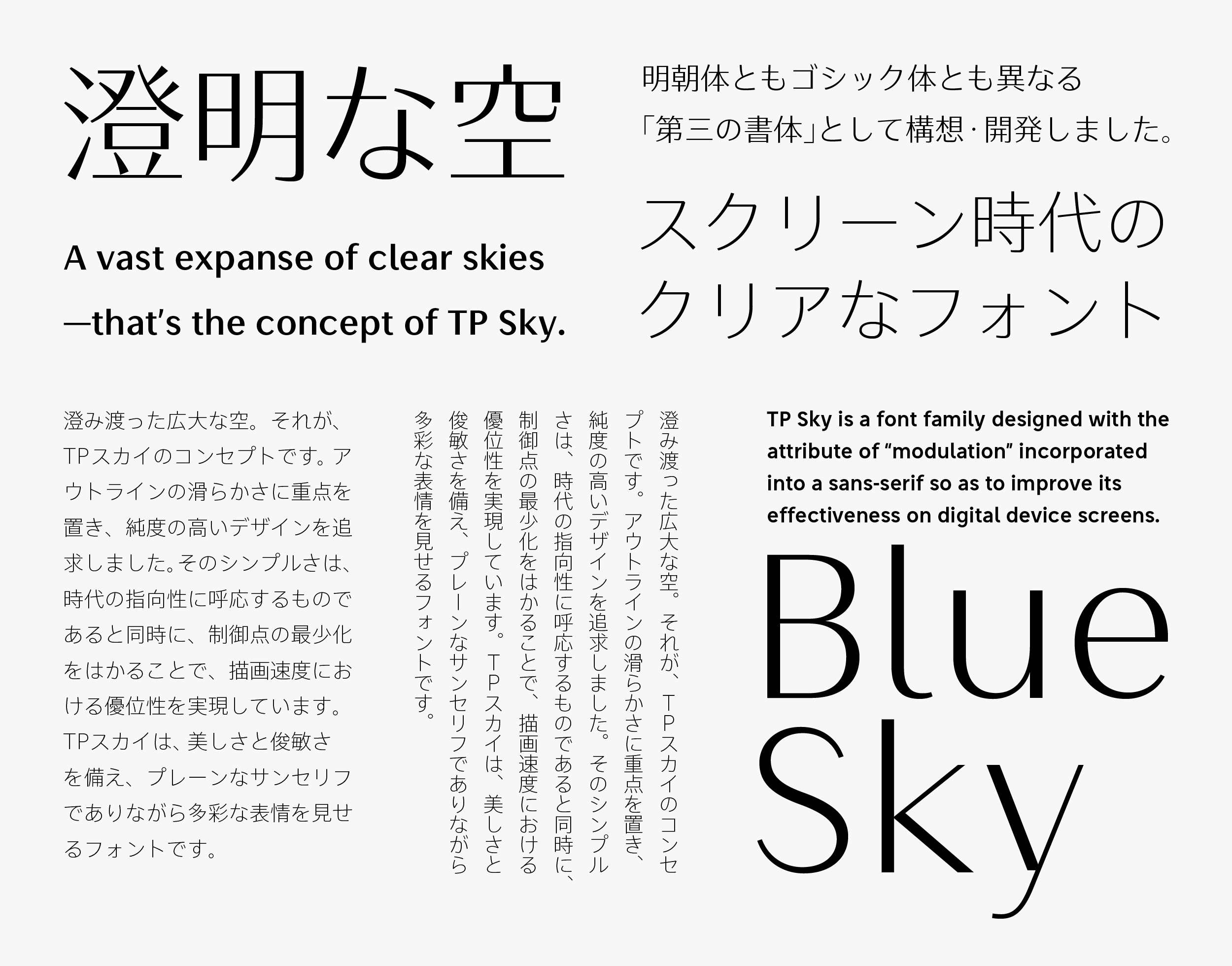
TP Sky is a font family designed with the attribute of “modulation” incorporated into a sans-serif typeface so as to improve its effectiveness on digital device screens. Today, with the ongoing shift in the main areas where type is used, the need for screen display-optimized fonts is greater than ever. With TP Sky, a Clean, Crisp character design has made it possible to lighten the amount of font data, and visibility and displayability have been enhanced as well.
As the main medium of communication has shifted away from paper, and screens have become the norm, the basic typeface seen in everyday life has changed from Mincho to Gothic. TP Sky was conceived and developed with an awareness of this trend, as a “third typeface” distinct from Mincho and Gothic that would be able to respond to the needs of the coming age. By modulating the sans-serif strokes, a traditional brushstroke style that cannot be expressed with single lines has been incorporated as an essential feature of the typeface.
TP Sky is the first Japanese font family to have the four attributes of weight, contrast, character width (basic/condensed/compressed), and inside space between strokes. With the lineup additions of “Modern,” in which the inside space between strokes is widened, and “Classic,” in which the inside space between strokes is narrowed, possible applications are furthermore expanded.
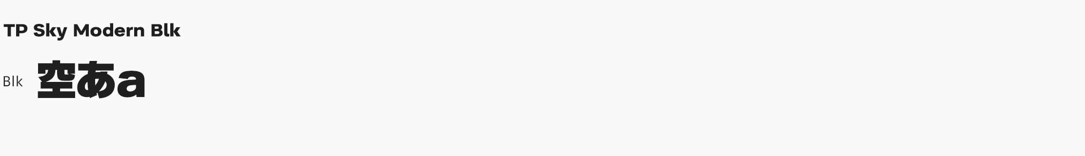
An extremely thick weight is achieved in TP Sky Modern Blk by widening the inside space between strokes. This manages both thickness and visibility by strengthening the contrast between straight lines and curved lines, and making strokes longer to allow a generous structure.
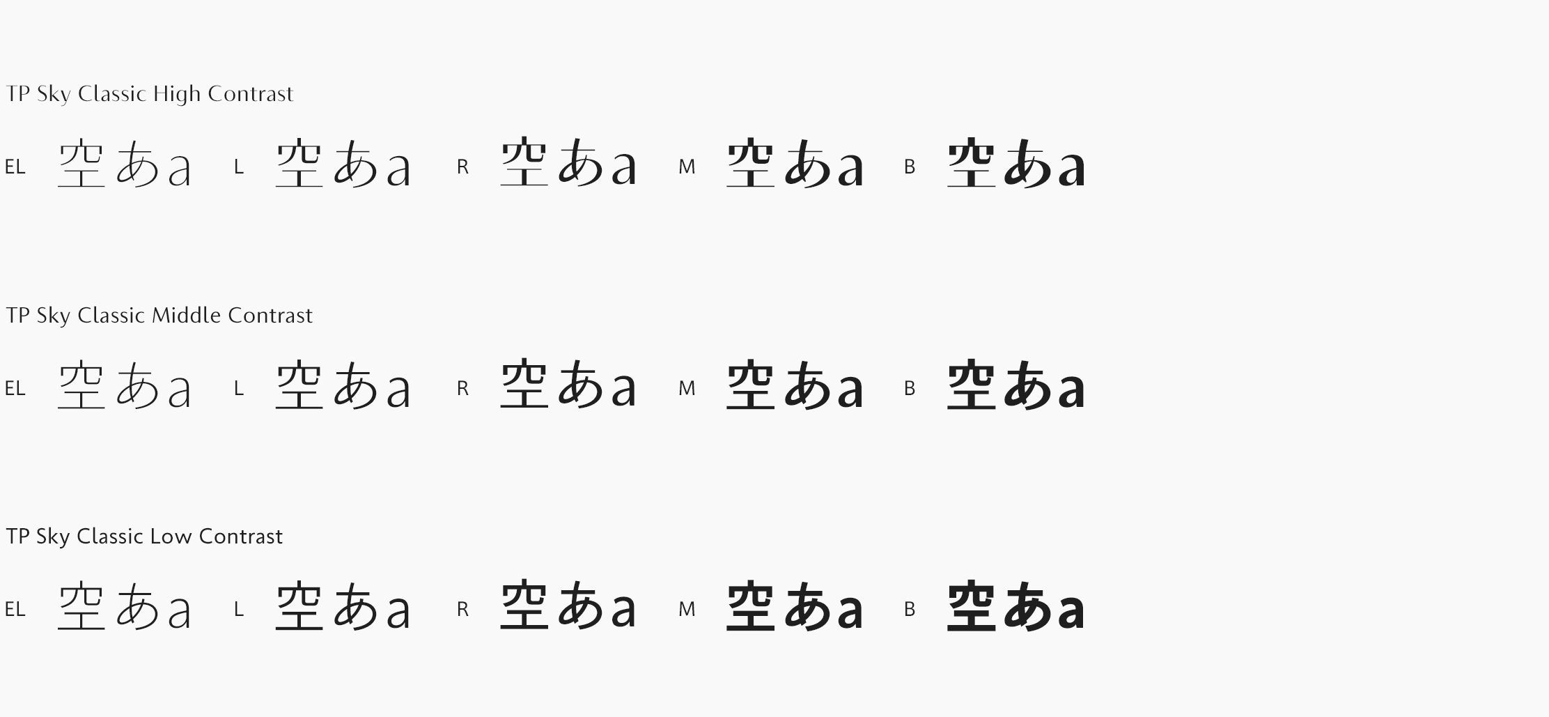
Although TP Sky Classic is a simple sans-serif typeface, it has a classical appearance. The well-balanced proportion carried out for kanji, kana, and Latin characters the screen. At the same time, it creates a relaxed atmosphere.
By using each TP Sky font properly, the relationship between headings and texts or titles and captions can be expressed more effectively, enabling a high level of unity on the screen.
Concept
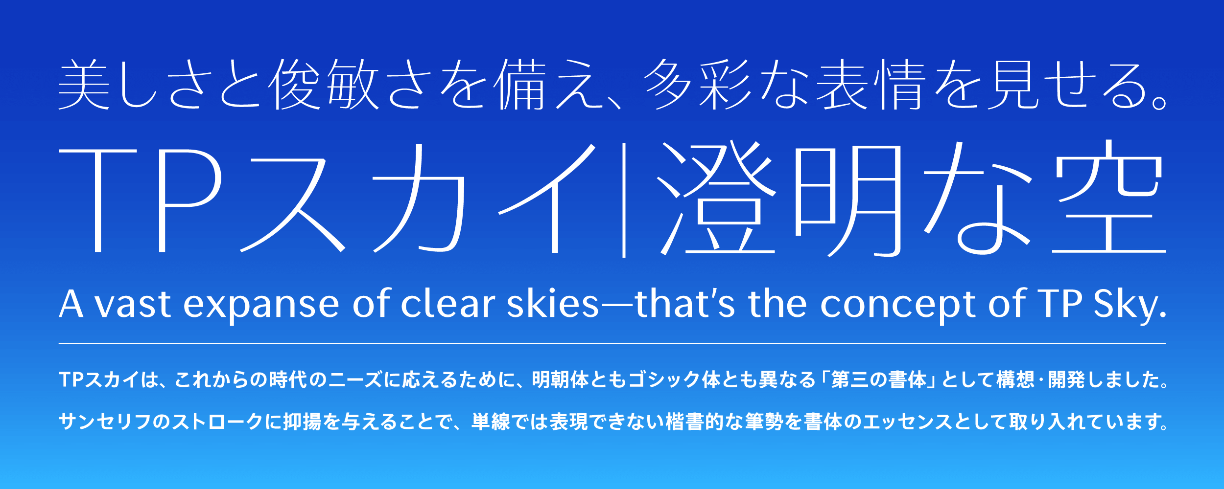
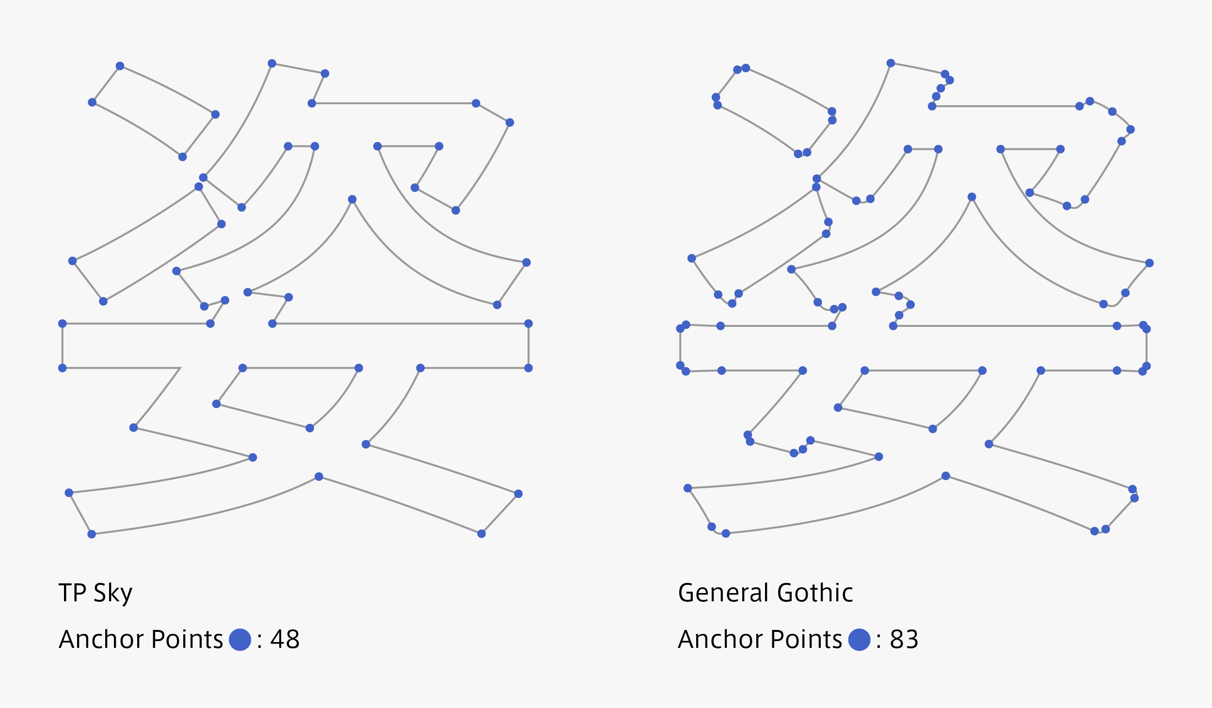
A vast expanse of clear skies above us – that’s the concept of TP Sky. Aspiring to a high degree of purity, its design lays emphasis on smoothness of outline. Due to its simplicity, which suits the orientation of society while also minimizing the number of control points, TP Sky demonstrates superior imaging speed. Endowed with exceptional beauty and agility, this is a font with a plain sans-serif base that nevertheless yields a great richness of expression.
Features
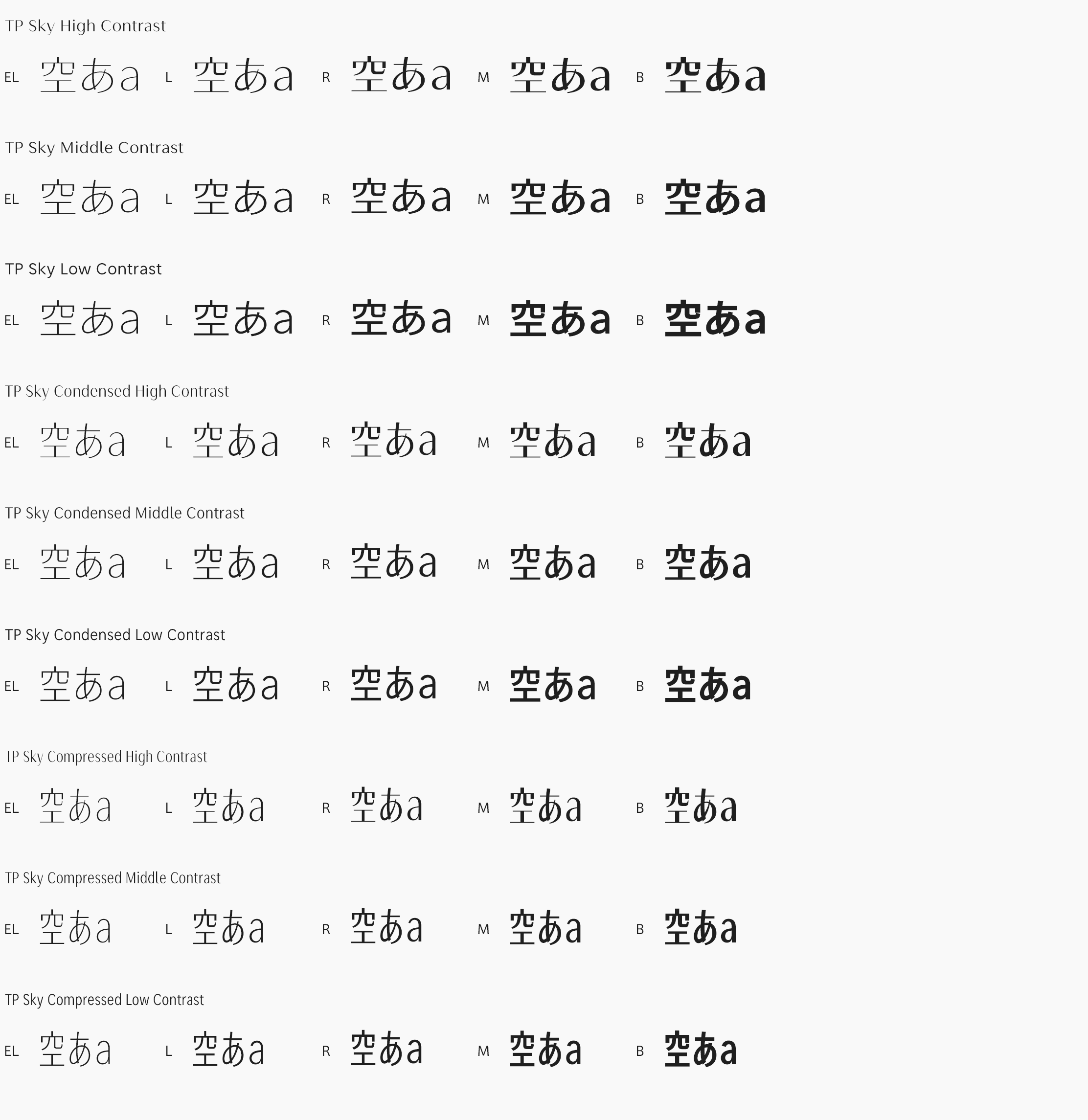
TP Sky High Contrast is a font that, while hinting of Mincho-like qualities, is more compact and transparent-feeling. Its clean, bright appearance translates well onto screens, and further demonstrates its effectiveness when text is placed on top of images and videos. Extra Light and Light are recommended when one wants to work with large characters or convey a message with a fresh look. These fonts also come in handy when a striking impression is desired for promotional work and the like, or when endeavoring to revitalize the atmosphere of a place.
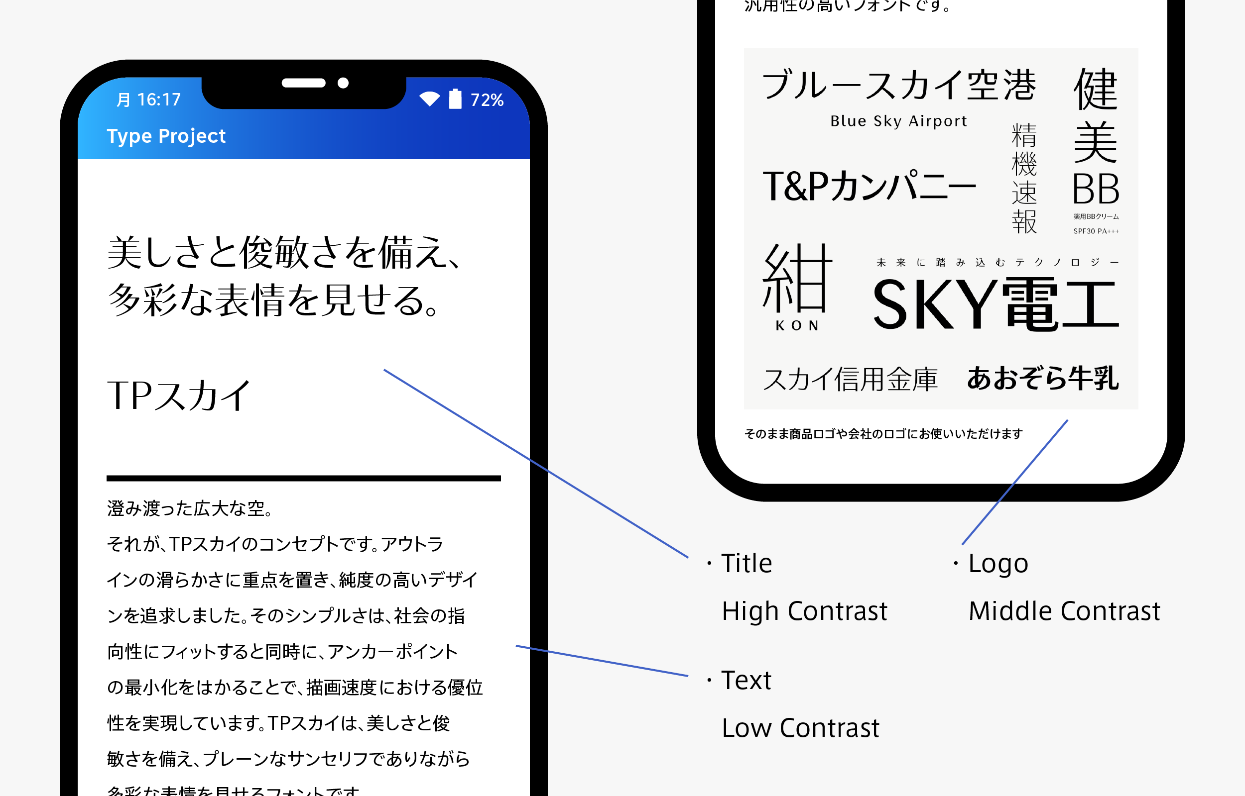
Middle Contrast allows for a higher degree of readability while also contributing to the vividness of the screen with the modulation of its forceful-feeling strokes. As modulated sans-serif typefaces are commonly used in logo design, special focus was given to the design of the katakana and Latin characters. Character size and alignment were adjusted with a high level of precision, making it possible to use the font as-is for product and company logos. With its modest yet undeniable appeal, TP Sky Middle Contrast is the most multipurpose of the three contrasts.
Low Contrast, which raises reading stability by making character blackness uniform, is an optimal font for flat and plain user interfaces. While inheriting attributes from AXIS Font, the design of all the kanji, kana and Latin characters was completely redone with the dual intention of realizing greater simplicity and emphasizing visibility. The katakana and Latin characters are endowed with a special rounded quality that is unique to TP Sky. From a universal design viewpoint, TP Sky Low Contrast is positioned as a standard font, while Light and Regular in particular maintain high levels of readability even when used at very small sizes. Please feel free to experiment with new, screen-age combinations, for example, using High Contrast in a Mincho-like role for headings, or Low Contrast in a Gothic-like role, for main body text and captions.
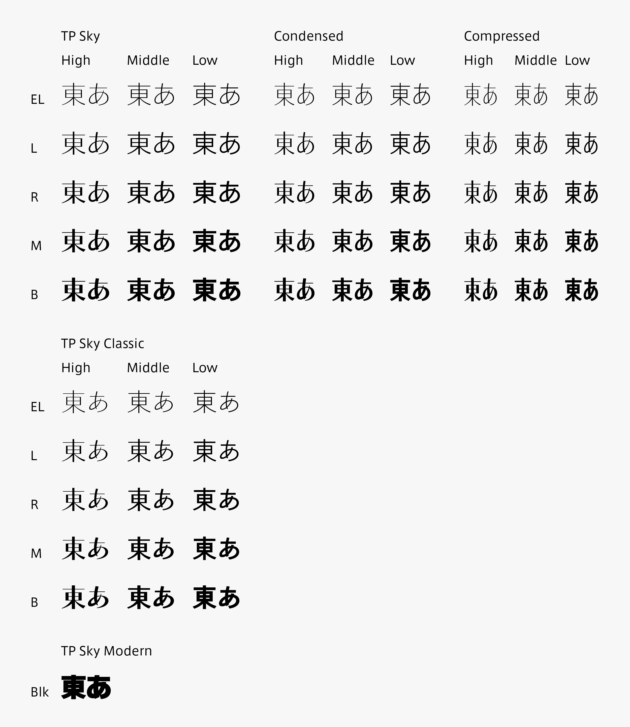
TP Sky Condensed has been designed as a genuine sans-serif with a flat feel, with its kanji and kana characters set at 85% narrowness, while the design of Compressed is set at 70% narrowness. We have succeeded in creating a true condensed typeface with an inherently narrow design, and by maintaining a careful balance of forms and counters, and meticulously arranging the thickness of the stroke lines and the blackness of the characters, we have realized to a high degree the sense of flatness that is expected of sans-serif fonts. Special attention has been given to refining the quality of the katakana, which is used frequently in modern Japanese, and the font is now being employed as-is for product and company logotypes. Enhance the consistency of your brand image by applying TP Sky as the standard font for all your logos, business cards, catalogs, websites and in-store signage. Five weights, three contrasts, and now, three character widths.
Family
TP Sky provides five important weights (Extra Light, Light, Regular, Medium, and Bold) for handling character information, and three contrasts (High, Middle, and Low) useful for improving legibility, to help select a font appropriate for display size and resolution. The narrow series of condensed and compressed increases space efficiency on the screen with beauty. Depending on the screen size and purpose of use, an appropriate weight, appropriate contrast, and appropriate character width are selected to correspond to various applications smoothly from user interface menu to digital signage. In the lineup of forty-five TP Sky fonts (five weights × three contrasts × three character widths), TP Sky Classic (five weights × three contrasts) and TP Sky Modern Blk have been added. Now, a family of sixty-one fonts is available.
Specification
| Main feature |
OpenType font Cross platform Extractable outlines PDF embedded Kerning information Dynamic download No resolution restrictions |
| Supported operating system |
macOS Windows 10/11 |
| Font set |
Standard(StdN) 9,498 characters (Adobe-Japan1-3) *9,499 Characters (TP Sky Modern Blk) |
| Languages | Japanese font (Std/StdN) almost fully covers 30 languages shown below. Japanese font based on Adobe Japan 1.3 covers all ISO-8859-1 proportional characters and Š, š, Ž, ž, Œ, œ, Ÿ. Then AXIS Font Japanese version can be used as multilingual font when you compose text using proportional characters. However, not all corresponding half-width characters are included, only Latin font is covered by half-width characters. Japanese (main script and covers JIS X 0208:1997) / English/ Icelandic (íslenska) / Irish (Gaelige) / Afrikaans (Afrikaans) / Albanian (Gjuha Shqipe) / Italian (Italiano) / Indonesian (Bahasa Indonesia) / Estonian (Eesti keel) / Occitan (lenga d’òc) / Dutch (Nederlands : U+0132 “IJ” and U+0133 “ij” shall be divided into I/i and J/j) / Oromo (Oromiffa) / Galician (Galego) / Swedish (Svenska) / Scottish Gaelic (Gàidhlig) / Spanish (Español) / Swahili (Kiswahili) / Danish (Dansk) / German (Deutsch) / Norwegian (Bokmål) / Norwegian (Nynorsk) / Finnish (Suomi) / Faroese (Føroyskt) / French (Française) / Brasilian Portuguese (Português Brasileiro) / Breton (Brezhoneg) / Portuguese (Português) / Latin (Latina : Classical orthography, without vowels with macron) / Luxembourg (Lëtzebuergesch) / Rhaeto-Romance languages (Rhaetian) / Walon (Walloon) *Full width version of Greek uppercase/lowercase (24 characters for each, excluding ending form of sigma) and Cyrillic (Russian) uppercase/lowercase (33 characters for each) are included as JIS Row6 and Row 7 (These characters are defined as full width in JIS spec) |