Based on the experience in providing fonts using the FitFont Service to this point, Type Project continues its technological development to strengthen the service further.
TP Sky, which is the first Japanese font family to have three axes of weight, contrast, and character width, was introduced in the previous article. As the next step, TP Sky added with a fourth axis has been developed, and released as TP Sky Classic in June 2021.
The newly added fourth axes is the axis of inside space between strokes. Inside space between strokes indicates space between strokes(called futokoro in Japanese) that constitute a character. Looking at the structure of Japanese font, design close to classic tends to have an impression of smaller and tightened inside space between strokes, while modern design tends to have wider inside space between strokes.
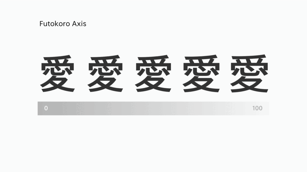
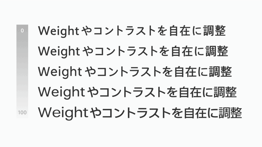
The concept of continuously changing the width of inside space between strokes is believed to be the first among Japanese fonts at least. The width of inside space between strokes significantly influences the design features and atmosphere. For that reason, changes in expression obtained by changing the axis of inside space between strokes is very interesting. We believe that its pursuit can enrich the Type Project library and technology further. In terms of matching with Latin font, FitFont with various axes such as these can increase the extent of fitting, and provides various combinations between different fonts.
(XYZ)
Series archive FitFont / Introduction to FitFont Service
- Introduction to FitFont Service 09: “Axis of Futokoro (Inside Space Between Strokes)”
- Introduction to FitFont Service 08: “Example 3”
- Introduction to FitFont Service 07: “Example 2”
- Introduction to FitFont Service 06: “Example 1”
- Introduction to FitFont Service 05: “Feature Merge Tool”
- Introduction to FitFont Service 04: “Automatic Fitting Tool”
- Introduction to FitFont Service 03: “Combination Between Kanji, Kana, and Latin”
- Introduction to FitFont Service 02: “Adjustment of Various Parameters”
- Introduction to FitFont Service 01: “What is FitFont?”