The most important feature of FitFont is to provide Japanese font that perfectly fits the Latin font. Of course, a variable font can be utilized in such usage. However, a variable font cannot be an alternative to FitFont, because FitFont has been developed with the focus on the purpose of fitting.
Combining the font in a different language is called “fitting” in Type Project. The colorful parameters with the font library of Type Project are the foundation of an ideal fitting between Latin font and Japanese font.
AXIS Font has carried the character width variations of condensed and compressed in Japanese font. TP Mincho has implemented the concept of contrast to Mincho typeface. TP Sky is the first font family in Japan to have a character width axis, contrast axis and futokoro (inside space between strokes) axis in addition to the weight axis.


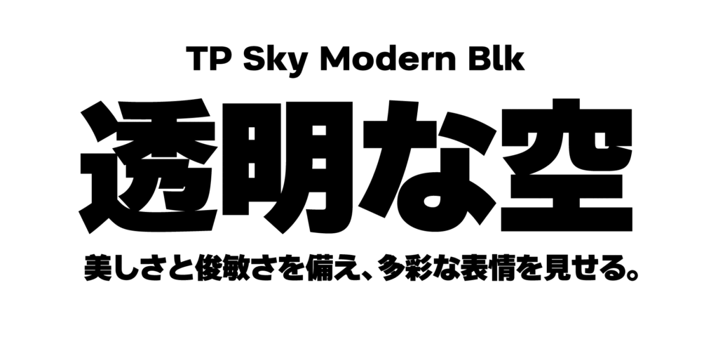
Additionally, Type Project released an extremely thick font called TP Sky Modern Blk in 2020. Japanese fonts that include complex characters with a large number of strokes have the problem in which designing with extremely thick weights is difficult, like those used in Latin fonts. Most of the extremely thick weights of Latin fonts are thicker and stronger in the black than the thickest weight of Japanese fonts. The difference in weight variations has been a big issue in fitting between Japanese and Latin fonts. However, an extremely thick weight is achieved in TP Sky Modern Blk by widening the space between strokes. It is a strategic product. Due to this extremely thick weight, the fitting width with Latin font families has widened furthermore.
(XYZ)
term
Series archive FitFont / Introduction to FitFont Service
- Introduction to FitFont Service 09: “Axis of Futokoro (Inside Space Between Strokes)”
- Introduction to FitFont Service 08: “Example 3”
- Introduction to FitFont Service 07: “Example 2”
- Introduction to FitFont Service 06: “Example 1”
- Introduction to FitFont Service 05: “Feature Merge Tool”
- Introduction to FitFont Service 04: “Automatic Fitting Tool”
- Introduction to FitFont Service 03: “Combination Between Kanji, Kana, and Latin”
- Introduction to FitFont Service 02: “Adjustment of Various Parameters”
- Introduction to FitFont Service 01: “What is FitFont?”