Here, we discuss the macron and iteration mark.
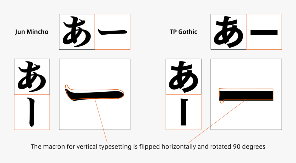
Although the macron (“ー”) looks like a simple straight line, it must be designed in accordance with each font. As there are differences in creation between usage for vertical typesetting and horizontal typesetting, the shape is not just rotated, but the shape of the beginning and ending of the brushstroke are changed, the line angle is adjusted, and detailed adjustments are added to give uniformity to the thickness. For creation of a macron, I often want to start with it after deciding the kana design, but when I want to typeset words when creating katakana, there are many words that include a prolonged sound, so I want to have a macron at an early stage.
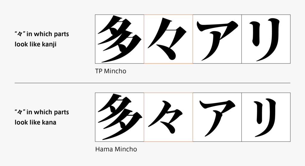
An iteration mark is a generic term for a yakumono that indicates repetition of the same characters, such as “ゝ, 々, 〃,” etc. “ゝ” is called “ichinojiten” and “々” is called “nomaten” – each iteration mark has a name. Looking at “々” in Mincho typeface, there are two types of parts: those that look like kanji and others that look like kana.
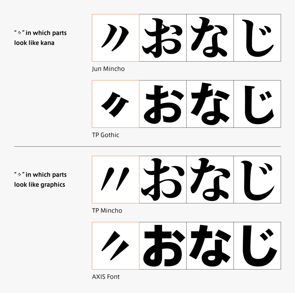
Similarly, “〃” (nonojiten) is an iteration mark in which the design is divided. There are two types of parts: those that look like kana and others that look like graphics – the difference can be seen in sans-serif typeface and Gothic typeface.
(T.I)
Series archive Japanese Type Design / Japanese Yakumono (Punctuation Marks and Symbols)
- Japanese Yakumono (Punctuation Marks and Symbols) 05: “Symbols”
- Japanese Yakumono (Punctuation Marks and Symbols) 04: “Arrow”
- Japanese Yakumono (Punctuation Marks and Symbols) 03: “Parentheses”
- Japanese Yakumono (Punctuation Marks and Symbols) 02: “Macron and Iteration Mark”
- Japanese Yakumono (Punctuation Marks and Symbols) 01: “Punctuation Mark”