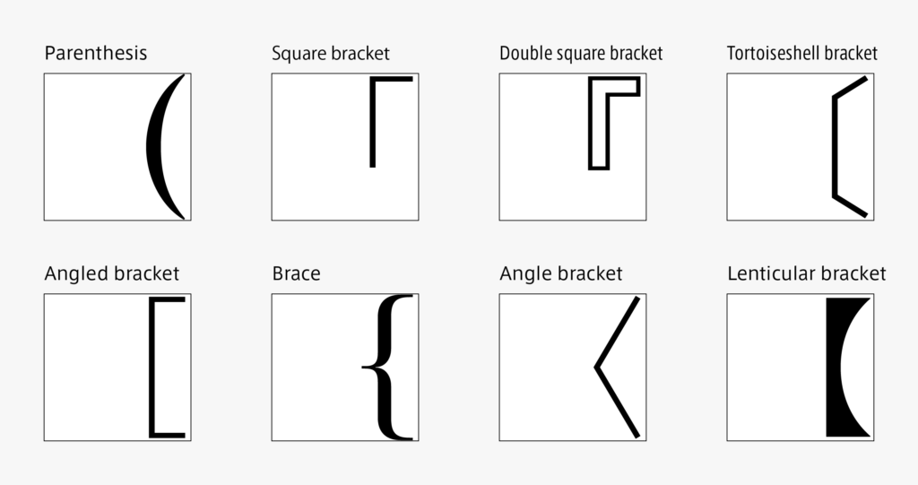
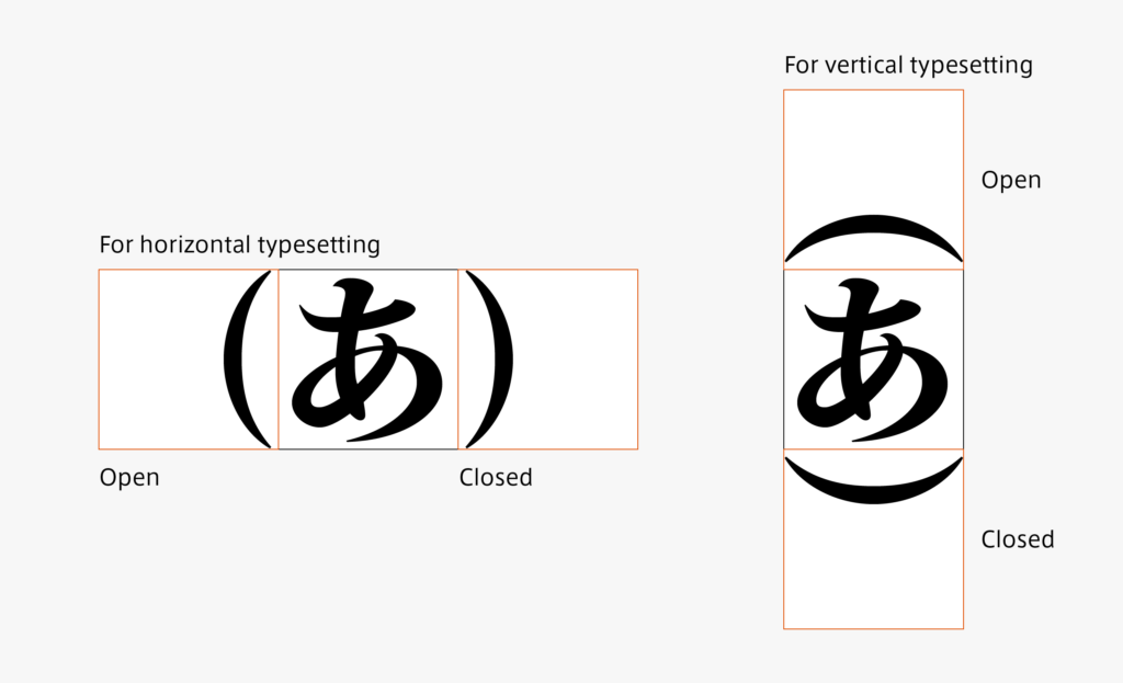
I would like to talk about convoluted parentheses this time. In addition to having several types, such as parentheses “()” and square brackets “「」,” there are open and closed versions of each, for horizontal typesetting and vertical typesetting, and full-width and half-width – it is convoluted just to think about the required glyphs.
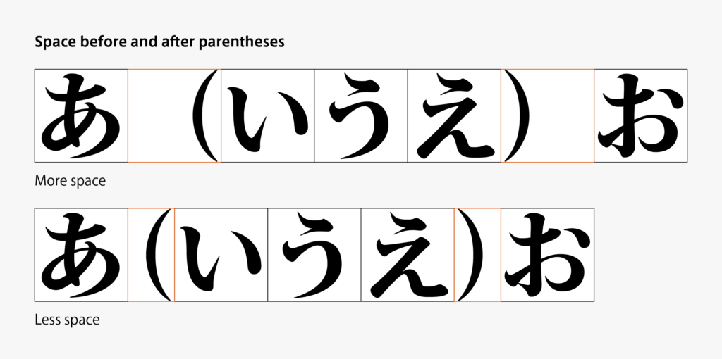
Care must be taken in designing parentheses that even full-width parentheses are designed at half-width. As there are a variety of settings for the space before and after parentheses in typesetting, when the design of a parenthesis exceeds half-width, it may stick to the next character. Half-width parentheses exist apart from full-width parentheses. However, glyphs used in typesetting are basically full-width.
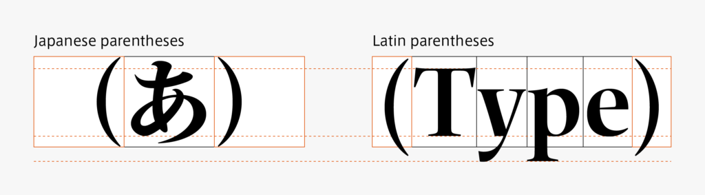
For some parentheses, both parentheses for Japanese and Latin are available, respectively. Japanese characters are created one character by one character within the square frame; the height of Latin is set above and below the base line – parentheses must be adjusted in accordance with each character group. It is often said that Latin parentheses look a bit lower compared to Japanese, which is because Latin parentheses are adjusted in accordance with the Latin containing descender.
Generally, half-width parentheses indicate the above-mentioned Latin parentheses. Latin parentheses, however, are not half-width, but proportional in terms of the character width category in creation – it is complicated.
(T.I)
Series archive Japanese Type Design / Japanese Yakumono (Punctuation Marks and Symbols)
- Japanese Yakumono (Punctuation Marks and Symbols) 05: “Symbols”
- Japanese Yakumono (Punctuation Marks and Symbols) 04: “Arrow”
- Japanese Yakumono (Punctuation Marks and Symbols) 03: “Parentheses”
- Japanese Yakumono (Punctuation Marks and Symbols) 02: “Macron and Iteration Mark”
- Japanese Yakumono (Punctuation Marks and Symbols) 01: “Punctuation Mark”