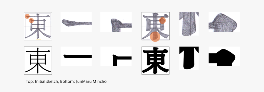
The kanji creation of JunMaru Mincho started from a sketch. Looking back and reviewing the sketch drawn quite a while ago, I notice many things, but the shape is significantly different. Kana created ahead of kanji had a bit more contrast in the initial stage. Therefore, the horizontal stroke and the tip of the left sweep are thinner in the sketch. Further details of strokes include a fat and heavy brushstroke beginning for the vertical stroke and uroko, with a particularly large size.
Comparing the sketch and JunMaru Mincho, the modulation at the beginning of a brushstroke for the horizontal stroke remains just a little, and the degree of widening at the ending of a brushstroke for the vertical stroke is minimized considerably. Parts with too much modulation were corrected to give a new impression without becoming stale while maintaining roundness in the details of the strokes.
What is a good degree for the details regarding roundness, which is a feature of JunMaru Mincho? I tried with extreme shapes and interpolation, and sketched structures with wide inside spaces between strokes. Looking back at the changes in these shapes and records of the correction process, it has been a very long journey.
(RK)
Series archive Development Story / Jun Mincho Development Story
- JunMaru Mincho Development Story 2: “Details of Strokes”
- JunMaru Mincho Development Story 1: “Thread of Kana Connection”
- Jun Mincho Development Story 3: “Consideration of Contrasts: Jun Mincho Headline and Jun Mincho Hairline”
- Jun Mincho Development Story 2: “Features of Structure Part 2”
- Jun Mincho Development Story 1: “Features of Structure Part 1”