As I was in charge of kanji for Jun Mincho, Jun Mincho Headline, and Jun Mincho Hairline, I started creating kanji exploring their relationship with kana, what kind of typeface to aim for, the positioning of typeface, and what kind of shape the new typeface is going to take. I had to work hard for the details of the strokes of kanji to be certain. I had to work even harder for the structure, however.
From the initial phase of creation, I focused on horizontal typesetting with practicality and with vertical typesetting also on my mind. As features, the kana has graceful structure with loose stroke movements. They are also smallish and tight. Kanji does not overpower with its strong personality in the details and structure, and it is tight in the vertical direction.
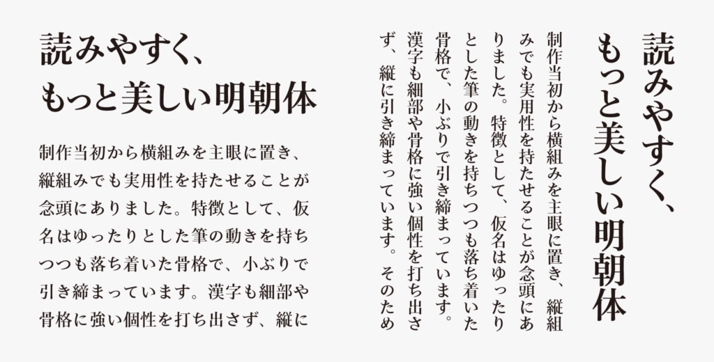
Due to the above features and ratio of the size, expression specific to kanji and kana, the outline of kana, and stroke movement are easy to see in horizontal typesetting; both kana and kanji are tight, so the line is arranged flatly to the eye in the vertical direction in vertical typesetting, giving a impression different from Mincho typeface with its kanji in full-scale type face. I would like to introduce how I created the tight kanji structure with that impression in the next article.
(RK)
Series archive Development Story / Jun Mincho Development Story
- JunMaru Mincho Development Story 2: “Details of Strokes”
- JunMaru Mincho Development Story 1: “Thread of Kana Connection”
- Jun Mincho Development Story 3: “Consideration of Contrasts: Jun Mincho Headline and Jun Mincho Hairline”
- Jun Mincho Development Story 2: “Features of Structure Part 2”
- Jun Mincho Development Story 1: “Features of Structure Part 1”