I wrote in the previous article that Jun Mincho kanji is tight in the vertical direction. It is not correct to simply tighten the inside space between strokes to the same direction. Each method of creation is different. I would like to list some examples of this distinctive way of creation and difficult examples from Jun Mincho.
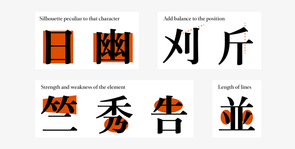
Characters like “日,” and “幽,” etc. become simply long and narrow when created similarly to tight characters in the vertical direction without being aware of the balance with the other characters, size, and silhouettes peculiar to each character.
For “刈,” the difference in the height at the beginning of the brushstroke for “刂” is slightly emphasized. For “斤,” the position of the beginning of the first stroke is brought to the left to add balance to the positional relationship with the horizontal stroke that comes underneath.
For the take-kanmuri of “竺,” the thickness and size from right to left are distinguished to show movement. The image is pushed out slightly to the right. The element of “乃” that comes below “秀” is quite minimized, and the position of horizontal stroke that comes on the top in “告” is lowered to tighten the head part. These are the methods of creation for strengthening and weakening the elements.
The element of dots and left sweep in “並” are slightly short, being conscious of the speed of rapidly drawing a line.
There is no correct answer in the method of creation, and the above examples do not always apply to all kanji characters. At the time of creation, the peculiarity to a certain kanji can be lost due to being too conscious of the degree of the inside space between strokes, and characters that are too small appeared at the time of adjustment as a result of overlooking the kanji as a whole. Balancing between avoiding excessive structure and tightening was also very difficult.
(RK)
Series archive Development Story / Jun Mincho Development Story
- JunMaru Mincho Development Story 2: “Details of Strokes”
- JunMaru Mincho Development Story 1: “Thread of Kana Connection”
- Jun Mincho Development Story 3: “Consideration of Contrasts: Jun Mincho Headline and Jun Mincho Hairline”
- Jun Mincho Development Story 2: “Features of Structure Part 2”
- Jun Mincho Development Story 1: “Features of Structure Part 1”