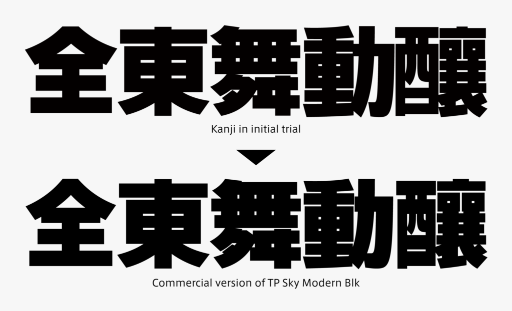
The creation of TP Sky Modern Blk was to thicken strokes by widening the structure of TP Sky Low Contrast B. Kanji characters with fewer strokes have room to widen structure, but kanji characters with a large number of strokes have limited space to move strokes, as thick lines crowd each other. Repeating trials to arrange both types of kanji look complete even mixed in one typesetting, the widening degree of the structure was adjusted.
Among standard Japanese typefaces, we aimed towards a particularly thick weight. Assuming utilization in FitFont, etc., samples were made not only in trials of Latin for Modern Blk, but also with other Latin typefaces in combination. It was confirmed that the font can be matched with weights several levels thicker than TP Sky Low Contrast B.
When thickening the glyph with a large number of strokes, there is a method to avoid congestion by making only the major strokes thicker and other strokes thinner. However, Modern Blk was created to look as flat as possible with a modest difference between thickness and thinness. This is a design policy for the TP Sky family (low contrast series in particular). Even in other points, it is important to maintain this as a “part of the TP Sky series.”

(担当T)