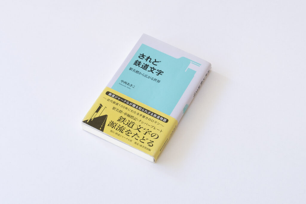
Today, I would like to introduce “It’s Still Railroad Letters: An Expanding World from Station Name Signs,” written by Akiko Nakanishi.

I was curious to know how typefaces used in information and station name indication essential to daily train use are selected. As Type Project’s AXIS Font is used in the sign system for Seibu Railway, I was interested in the connection between old letters and the current letters used in railroads as mentioned in this book. This led me to select the book.
The typeface “Rounded Corner Gothic” used in station name signs for the Japanese National Railways started handwritten by craftsmen. The parties concerned who knew of those days and situations were discussed in the book. The author carefully pursues how typeface was written and shaped, and the transition of railroad letters to the present day.
Each craftsman energetically worked on writing letters to help people use railways pleasantly; the attitude is conveyed of those who maintained and kept them to “always improve” while the situation around railways changed and time changed. This book makes us think of the letters used continuously for a prolonged time from the attractive railroad letters.
Related to “It’s Still Railroad Letters,” here’s a comment from Mr. Suzuki of our company regarding the selected book.
I agree with what Ms. Nakanishi pointed out in the final chapter: “Hint for the long life of one typeface is probably in re-design.” I was genuinely impressed by an example of the London underground typeface Johnston Sans, which I always thought of as a role model for CityFont. For those who would like to investigate further on the subject of railroad letters and re-design, I recommend “Johnston’s Underground Type.” As the aspect of continuity has increasingly become important in recent years, I recommend it together with “It’s Still Railroad Letters.”
Book information:
“It’s Still Railroad Letters: An Expanding World from Station Name Signs”
Author: Akiko Nakanishi
Publisher: Railway Journal
Purchase information:
The book is currently out of stock. The used book can be purchased on Amazon.
https://www.amazon.co.jp/されど鉄道文字―駅名標から広がる世界-中西-あきこ/dp/4415320899
Book information:
“Johnston’s Underground Type”
Author: Justin Howes
Translator: Yoshio Goto
Publisher: Uyu Shorin
Purchase information:
https://www.amazon.co.jp/ジョンストンのロンドン地下鉄書体-―-Johnstons-Underground-type/dp/4904596013
(RK)
Series archive Recommended Book / From TP’s Stack
- From TP’s Stack: “Creation of Typefaces That Open a New Era”
- From TP’s Stack: “The Kawaraban of Edo – Identity of Media That Enfevered the Common People”
- From TP’s Stack: “Creation of Typefaces”
- From TP’s Stack: “Cultural History of the Character”
- From TP’s Stack: “The History of Mincho Typeface”
- From TP’s Stack: “Characters of Prayers” and “Characters of Cities”
- From TP’s Stack: “The World of Edo Books: Publishing Situation in Edo Read by Kibyōshi”
- From TP’s Stack: “Portrait of 34 Great Craftsmen”
- From TP’s Stack: “The History of Japanese Lettering”
- From TP’s Stack: “Johnston’s Underground Type”
- From TP’s Stack: “The Beauty of Characters and the Power of Characters”
- From TP’s Stack: “It’s Still Railroad Letters”