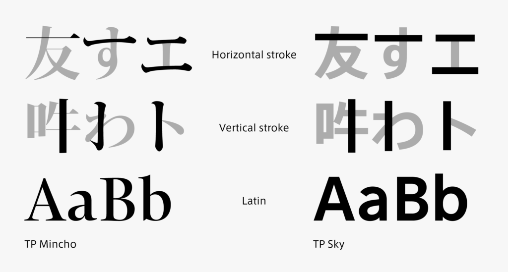
Mincho typeface is a standard typeface in Japanese typesetting often used in texts, etc. in books. Comparing kanji and kana in Mincho typeface, the elements are quite different. Originating in China, Mincho typeface is a typeface exclusive for kanji. The prototype is that characters written using brushes are adjusted to engrave effectively in woodblock printing. Kana separately prepared after being imported to Japan is adjusted for type based on the block style written in brush.
Furthermore, Roman typeface is matched for Latin. This difference has become established as it is. However, design of a unified font, including kanji, kana, and Latin, has been realized from the development stage at present.
Contrary to such Mincho typeface, the same elements are applied to all kanji, kana, Latin, and other symbols in sans-serif typeface, such as AXIS Font and TP Sky.
The approaches of combining different elements and arranging consistent elements both coexist in current Japanese typesetting.
(T.I)
Series archive Japanese Type Design / Designing Kanji, Hiragana, and Katakana
- Designing Kanji, Hiragana, and Katakana 06: “Kerning Information”
- Designing Kanji, Hiragana, and Katakana 05: “Consistency”
- Designing Kanji, Hiragana, and Katakana 04: “Elements”
- Designing Kanji, Hiragana, and Katakana 03: “Thickness”
- Designing Kanji, Hiragana, and Katakana 02: “Type Face”
- Designing Kanji, Hiragana, and Katakana 01: “Structure”