I introduced the story of the number of glyphs in the previous article of this series. Today, I would like to introduce points on creating them.
Kana with voiced dots and semi-voiced dots
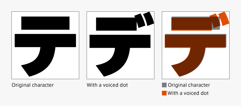
It may not go well by only adding a voiced dot or semi-voiced dot to the original character as it is. The entire character may be reduced a little so that the dot can be seen as blackish, similar to the original character, and some part of the character may be shortened so that dot and stroke do not overlap – adjustments are made in accordance with each character.

Apart from the original character adjustment, the arrangement and size of a voiced dot and semi-voiced dot are also adjusted by character. It is also a point to be noticed that a voiced dot and semi-voiced dot are seen as more or less the same at the time of typesetting a character.

Kana in small script
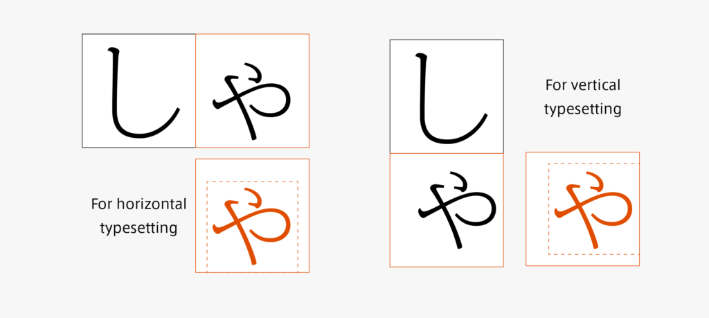
When it is only reduced, the lines become thin, so the lines must be thickened together. While arranging the black wash with the other characters at the time of typesetting, if there is narrowed part due to reduction, it is also adjusted. Although it may differ depending on the actual creation, output of the original character in a slightly thicker weight, reduction, and adjustment are performed for creation in order.

Do not forget to prepare kana in small scripts for vertical typesetting and horizontal typesetting, respectively.

(T.I)
Series archive Japanese Type Design / Surprisingly Many Kana System Glyphs
- Surprisingly Many Kana System Glyphs 04: “There are Many More”
- Surprisingly Many Kana System Glyphs 03: “Half-Width, and Block of Multiple Characters Arranged in a Space Equivalent to That of a Single Character”
- Surprisingly Many Kana System Glyphs 02: “With Voiced Dots, Semi-Voiced Dots, and Small Scripts”
- Surprisingly Many Kana System Glyphs 01: “Hiragana: Not Enough with 50 Characters”