As introduced in the first article of the series, some forms of “木 (Ki)” incorporate a stop brush on the forth stroke. Adjustment of this stop brush may be bold compared to the other strokes, depending on the character. In ki-hen, etc., it tends to collide with the element that comes on the right, so it is either minimized or its location at the beginning of the brushstroke is lowered to avoid collision. It is not sufficient to only unify the character elements in smaller sizes. When there is enough space, adjustment is made in the ideal size and location. The stop brush effect may be small in terms of looking at the entire character, but without it the character may possibly become a different character. In fonts used for texts in particular, the stop brush is never omitted.
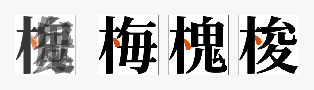
Additionally, when the forth stroke is sweeping, there are many cases in which it is desirable for both right and left sweeping to look like the same length. Instead of sweeping at exactly the same height, adjustment is often made by raising the right sweeping slightly to look more natural.
(T.I)