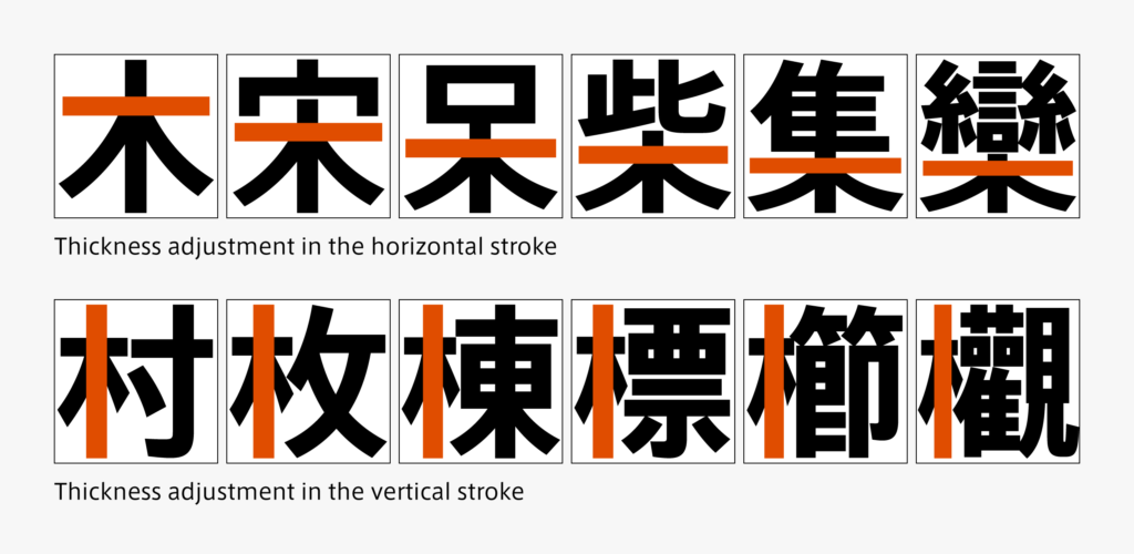
Adjustment of thickness is essential to creating a sense of unity in the character. For “木 (Ki)” that comes in the center, there are more adjustments in the horizontal stroke. Thickness is adjusted while remaining aware of the number of horizontal strokes in the entire character and the strokes that should look strong. On the other hand, the thickness of the vertical strokes is mainly adjusted to correspond to various widths in vertically long “木 (Ki),” such as ki-hen, etc. Regarding sweeping, the horizontal stroke is used as an indication for horizontally long sweeping, and the vertical stroke is used as an indication for vertically long sweeping. In the case of kanji characters with a lot of strokes, sweeping may be intentionally made thinner to avoid congestion. For “木 (Ki),” blackness in the part where lines are concentrated tends to become strong, so the strokes are made thinner than the other elements to match blackness in the entire character – this method of adjustment is often used.

Creating kanji with the inclusion of “木 (Ki)” is introduced in this article. There are other points that can be applied to the other radicals. However, there are particularly important points specific to each constituent of kanji. Therefore, various other adjustments are made to create a brief glyph in fonts.
(T.I)