Even in one character, several patterns, such as “connecting/separating strokes,” may be allowed. When the difference is neither superior nor inferior from a wide perspective, it is required to have consistency of the close element upon considering the optimum solution that matches the concept in the font development.
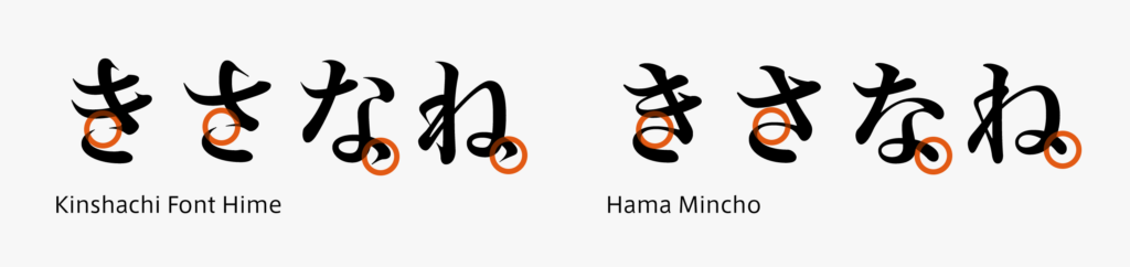
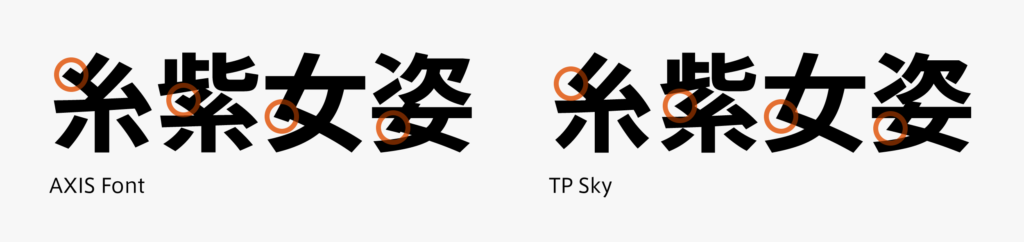
Kana in Hama Mincho and Kinshachi Font Hime are depicted in the illustration. Both designs look like they are written using brush, but there is a difference in the expression of brush connection, and the close element is processed similarly within the font. The kanji is also similar, but it is noted that the same radical appears repeatedly in kanji as a feature. In addition to checking each element, checking by radical is elaborately performed during development.
(T.I)
Series archive Japanese Type Design / Designing Kanji, Hiragana, and Katakana
- Designing Kanji, Hiragana, and Katakana 06: “Kerning Information”
- Designing Kanji, Hiragana, and Katakana 05: “Consistency”
- Designing Kanji, Hiragana, and Katakana 04: “Elements”
- Designing Kanji, Hiragana, and Katakana 03: “Thickness”
- Designing Kanji, Hiragana, and Katakana 02: “Type Face”
- Designing Kanji, Hiragana, and Katakana 01: “Structure”