Each glyph of a font is designed in the square frame called “imaginary body.” Furthermore, a frame one size smaller than imaginary body called “type face” is set in Japanese glyphs to use as an indication for the character size arrangement. This “type face” has also differences between kanji and kana. As kana is originally made up by the omission of kanji, the number of strokes is fewer, and the inner space tends to be wider. When kana is created by matching the same type face as kanji, the character looks larger. Therefore, the type face of kana is set smaller than kanji in general, so as to make them look complete at the time of typesetting text written in kanji and kana.
Type face settings may also change depending on the desired image of font. For example, comparing the Type Project fonts, the type face of kana in TP Sky Classic is smaller overall than the kanji, and there is a clear difference. On the other hand, the type face of both kanji and kana in TP Sky Modern Blk is large overall, and there is not much difference.
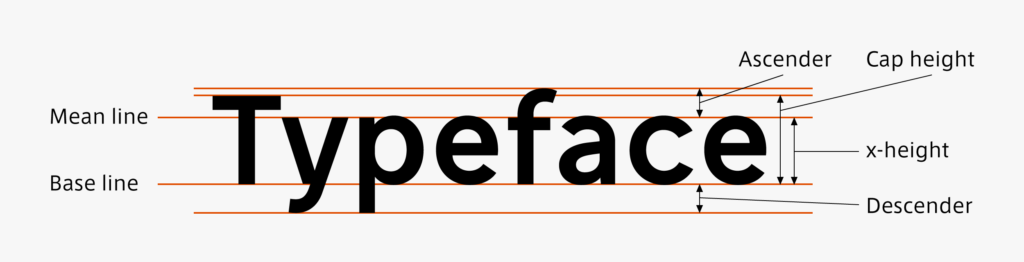
In terms of arranging the character size and influence on the typesetting image, the Japanese type face plays the role similar to the ascender line, mean line, and descender line in Latin.

(T.I)
Series archive Japanese Type Design / Designing Kanji, Hiragana, and Katakana
- Designing Kanji, Hiragana, and Katakana 06: “Kerning Information”
- Designing Kanji, Hiragana, and Katakana 05: “Consistency”
- Designing Kanji, Hiragana, and Katakana 04: “Elements”
- Designing Kanji, Hiragana, and Katakana 03: “Thickness”
- Designing Kanji, Hiragana, and Katakana 02: “Type Face”
- Designing Kanji, Hiragana, and Katakana 01: “Structure”