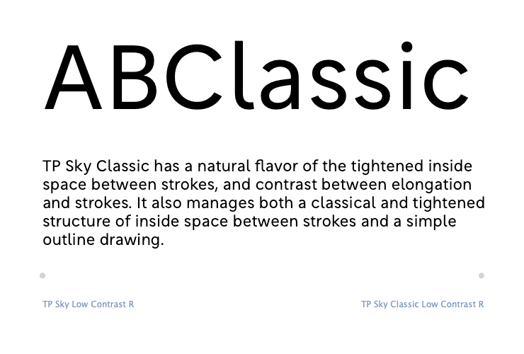
TP Sky Latin has a relatively even character width. On the other hand, TP Sky Classic has classical structure as a base. There are, therefore, differences in character width. The design is tight for B, etc., and spacious for C, etc. Also, by lowering the x-height of lower case letters, the font creates a classical atmosphere with an effect similar to tightening inside space between strokes in Japanese. As changes are seen in words, it also conveys a calmness when tightened at the time of typesetting sentences.
(KY)