Today, I would like to introduce points on creating a kanji that consists of the top and bottom division as the horizontal division system. The part on the top of kanji is called “kanmuri (crown),” and the part on the bottom of kanji is called “ashi (feet).”
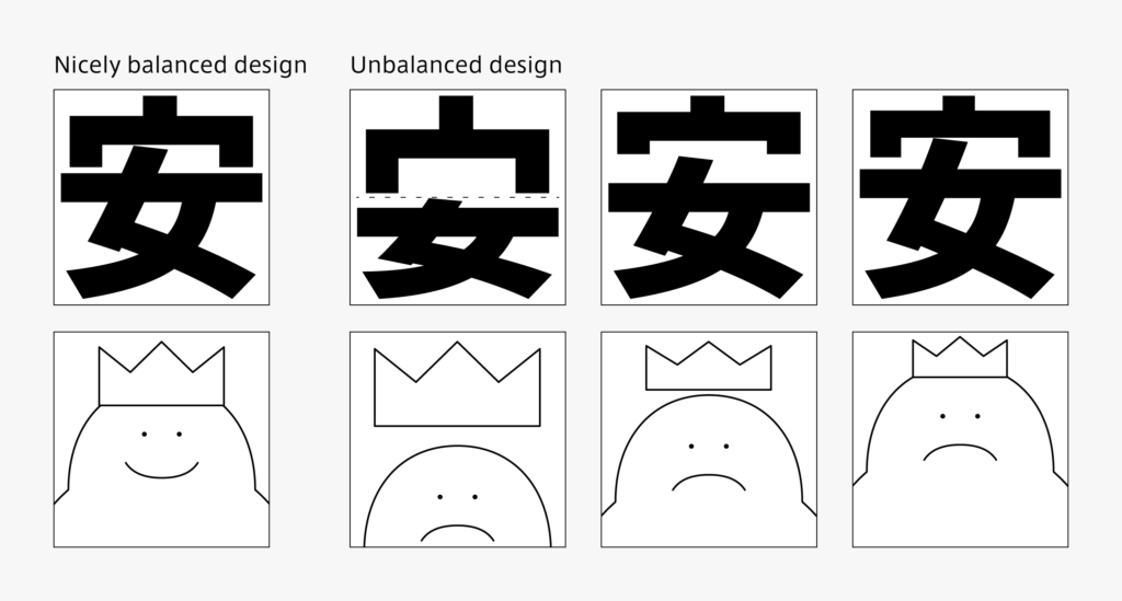
“Kanmuri” is not just aligned onto the top of the bottom part. In some cases, it is used in the images to cover or put something in, etc. For example, the kanji “安” is created with the head of “女,” intruding into the inside space of “宀.” For appearance, adjustment is made so that kanmuri does not lose to the inside element. The number of horizontal strokes tends to be large in the horizontal division system. For typefaces with thick horizontal strokes, such as in sans-serif typefaces, I try to stay aware of the principle: “gradually thicken the horizontal stroke from the top to the bottom for kanji creation.” In the case of Mincho typeface, the horizontal strokes may be created with even thickness. Also, characters with concern for a symmetrical balance, such as “吉, 責, and 菫,” are somewhat larger in this group, compared to different groups.
(T.I)
Series archive Japanese Type Design / Constituent of Kanji and Creation Points
- Constituent of Kanji and Creation Points 05: “Consistency”
- Constituent of Kanji and Creation Points 04: “Enclosed System”
- Constituent of Kanji and Creation Points 03: “Horizontal Division System”
- Constituent of Kanji and Creation Points 02: “Vertical Division System”
- Constituent of Kanji and Creation Points 01: “Radical”