The part on the left of kanji is “hen,” and the part on the right of a kanji is “tsukuri.” Today, I would like to introduce hen, tsukuri, and points on creating constituents of kanji with vertical divisions.
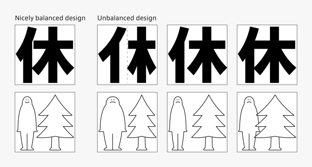
When aligning two elements horizontally, creating the width of 50:50 doesn’t achieve a beautiful balance for most characters. The horizontal width of constituents on the right and left are adjusted in such a way as to smoothen the density of strokes over the character as a whole. The degree of free space is also important. The degree to which each part is visible in one single kanji is important to take into consideration when creating typeface. At a boundary of elements, the shape of each element may interfere with another. For example, when the horizontal stroke of “木” is about to collide with “イ” in the kanji “休,” the correction is made to shorten the horizontal stroke a little. Regarding thickness of the strokes, adjustment is made to match the number of vertical strokes in the vertical division system in many cases. The outline is adjusted sometimes when checking the general principle, etc., such as “gradually thicken the vertical stroke from left to right.”
(T.I)
Series archive Japanese Type Design / Constituent of Kanji and Creation Points
- Constituent of Kanji and Creation Points 05: “Consistency”
- Constituent of Kanji and Creation Points 04: “Enclosed System”
- Constituent of Kanji and Creation Points 03: “Horizontal Division System”
- Constituent of Kanji and Creation Points 02: “Vertical Division System”
- Constituent of Kanji and Creation Points 01: “Radical”