For TP Sky Modern, I first participated in creating the extremely thick weight “Black” and then, created “UL.” I find the difference in the height of the weight to be the most intense transition.
At the time of my participation in making Black, the creation of kanji had already proceeded to a considerable degree, and the overall design rules were already prepared. I approached the creation as coming to understand the atmosphere of TP Sky Modern and fighting the limitations peculiar to Black.
As there is another TP Sky Modern Black development story written by a senior designer who had been involved in Black since the initial development, so please also read that article.
As mentioned in the above article, the creation of Black involved thickening strokes by widening the structure of TP Sky Low Contrast B. From the character used as a base, a firm difference is necessary to obtain features specific to Modern.
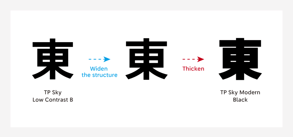
First, widen the structure to obtain quality specific to Modern. From here, thicken as much as possible.
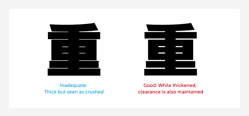
Just thickening strokes, however, or widening the structure too much to fill the clearance between each stroke must be prevented. The numerical values for the clearance between each stroke and the thickness of stroke are set to some extent.
Furthermore, the difference between the thickness and thinness of each stroke is adjusted to as modest a degree as possible. Then, whether or not the character matches the design policy as a TP Sky family is observed. Whether or not the overall black color is aligned at the time of typesetting is checked in advance.
When the clearance between each stroke is maintained, there is a limit to the method of widening the structure; when correspondence is made by thickening the character, its thickness becomes uneven with the other characters – when newly participating in the creation process, I often fell in the situation of being unable to “satisfy both sides.”
In creating many kanji characters, I began understanding how to arrange characters in accordance with the thickness of other characters. The senior designers taught me how to thicken the line effectively by telling me: “when this part is prioritized in thickening, the overall character can be seen as firmly thick,” and I was able to smoothly transition myself into dedicated creation.
(NM)