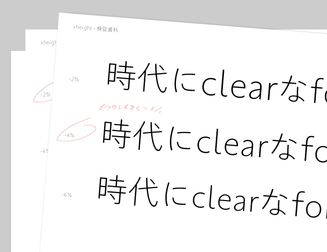
The committed point of TP Sky Classic as Latin is the harmony of its appearance with Japanese. At this time, blending with Japanese is adjusted by weight, and the x-height is decided. This is to tighten the inside space between strokes to avoid showing Latin in dispersion compared with the Japanese, which would look a little smaller. Verifications were made at various ratios to investigate the best appearance, and this led to the commercial version. With a classical structure, TP Sky Classic has an atmosphere of calmness and familiarity. I look forward to seeing the font somewhere in the future.
(KY)