%20--%3e%3cpolygon%20points='24.7%201%200%201%200%207.6%208.5%207.6%208.5%2039.4%2016.1%2039.4%2016.1%207.6%2024.7%207.6%2024.7%201'/%3e%3cpath%20d='M34.1,32.4l-4.9-22.7h-7.9l9.1,33.1c-.4,1.7-1.1,2.9-3.7,2.9h-2.6l1.9,6.6h1.5c4,0,8-1.2,10.3-9.2,1.8-6.4,8.9-33.3,8.9-33.3h-8l-4.6,22.7Z'/%3e%3cpath%20d='M91.7,8.7c-8.7,0-12.7,6.5-12.7,16.1s3.6,15.3,13.8,15.3,7.2-.9,9-1.6l-1.2-6c-2.4.8-4.9,1.2-7,1.2-4.3,0-7-2-7.2-7.3h16v-4.8c0-7.5-2.9-13-10.7-13ZM86.5,21c0-3.3,1.7-6.4,4.7-6.4s4.1,2.7,4.1,6.4h-8.8Z'/%3e%3cpath%20d='M218,8.7c-8.7,0-12.7,6.5-12.7,16.1s3.6,15.3,13.8,15.3,7.2-.9,9-1.6l-1.2-6c-2.5.8-4.9,1.2-7,1.2-4.3,0-7-2-7.2-7.3h16v-4.8c0-7.5-2.9-13-10.7-13ZM212.9,21c0-3.3,1.7-6.4,4.7-6.4s4.1,2.7,4.1,6.4h-8.8Z'/%3e%3cpath%20d='M126,1h-10.7v38.4h7.6v-11.8h5c6,0,11.3-3.8,11.3-14.1s-5.5-12.5-13.1-12.5ZM125.9,20.9h-3.1V7.6h3c3.7,0,5.4,1.8,5.4,6.3s-1.5,7.1-5.3,7.1Z'/%3e%3cpath%20d='M150,12.9c-.2-1-.5-2.4-.8-3.2h-6.9c.5,1.9.7,4.6.7,7.9v21.8h7.4v-20.3c1.1-2.2,4.5-3,7.4-3v-6.8c-3.5,0-6.5,1.7-7.7,3.6Z'/%3e%3cpath%20d='M192.6,40.6c0,3.5-1.6,4-4.7,4h-1.5l1.9,6.6h2.3c6.3,0,9.3-3.2,9.3-9.8V9.7h-7.4v30.9Z'/%3e%3crect%20x='192.2'%20width='8.4'%20height='6.4'/%3e%3cpath%20d='M247.4,33.7c-4.8,0-6.6-2.8-6.6-9.6s1.9-8.9,6.2-8.9,3.4.4,4.9,1l1-6.4c-1.3-.5-3.7-.9-6.2-.9-10.6,0-13.4,6.7-13.4,15.9h0c0,10.7,4.6,15.3,12.4,15.3s5.9-.5,7.4-1l-.9-6.1c-2,.4-3.7.6-4.7.6Z'/%3e%3cpath%20d='M264.7,30.2v-14.2h5.4l1.4-5.8h-6.9V2.1l-7.3,1.9v26.8c0,5.3,2.4,9,8.2,9s4.9-.2,4.9-.2v-5.7h-2c-3,0-3.8-1.3-3.8-3.7Z'/%3e%3cpath%20d='M64.3,8.8c-3.3,0-5.8,1.6-7.3,3.4-.2-1.1-.5-2.1-.8-2.6h-6.6c.5,1.9.6,4.4.6,7.4v34.4h7.3v-13.8c1.5,1.5,3.8,2.4,6.2,2.4,8,0,11.2-6.6,11.2-16s-3.1-15.2-10.4-15.2ZM62.1,33.8c-1.6,0-3.1-.6-4.6-1.8-.3-1.6-.4-3.7-.4-6v-3.3c0-1.8.1-3.8.4-5.1,1.4-1.4,3-2.5,5-2.5,3.2,0,4.6,3.2,4.6,9s-.9,9.6-5,9.6Z'/%3e%3cpath%20d='M173.6,8.6c-9.5,0-13,6.7-13,15.7s3.5,16.1,13,16.1,13-6.8,13-16.2-3.3-15.7-13-15.7ZM173.6,34.2c-3.6,0-5.5-2.9-5.5-9.9s2.2-9.5,5.5-9.5,5.5,2.2,5.5,9.5-1.9,9.9-5.5,9.9Z'/%3e%3c/svg%3e)
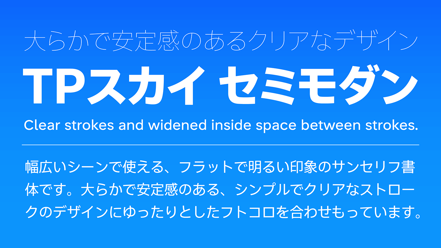
The generous and stable TP Sky SemiModern is designed with both simple and clear strokes and widened inside space between strokes. With a development of 7 weights, it is a sans-serif typeface capable of giving a bright and light impression to a clear and strong image.
Features
Widened Inside Space Between Strokes and Plane Design
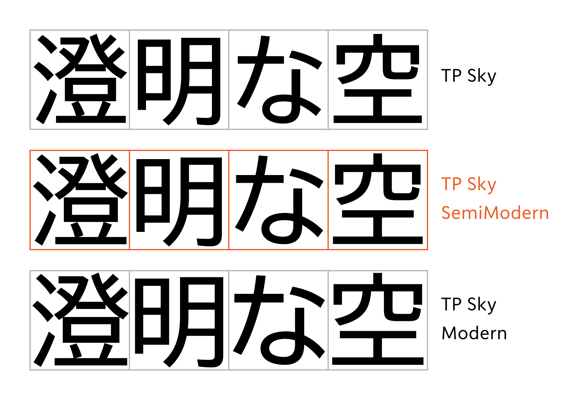
TP Sky SemiModern has both a widened width of inside space between strokes and a design in pursuit of simplicity common to the TP Sky family; the large characters create a gentle and stable atmosphere. The inside space between strokes are set in between the moderate TP Sky and the extremely wide TP Sky Modern.
Similar to TP Sky Modern, due to the design that fills up the square space of the full-width character evenly, it achieves orderly and flat typesetting in solid typesetting without narrowing spacing between characters. Widened inside space between strokes can be effective when you want to handle characters larger in a small space. With its generous and spacious structure, due to the strokes designed with extreme simplicity, the characters are not likely to appear crushed, maintaining high visibility.
Orthodox Latin with an Individuality Common to Japanese and Latin
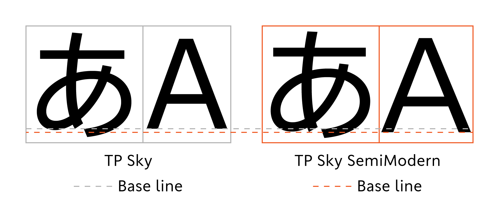
The Latin in TP Sky SemiModern is also designed with wide inside space between strokes that provide a relaxed impression. To make the characters larger, the setting for the x-height is slightly higher. Also, the baseline for the Latin is set slightly lower compared to the Japanese, so that the sizes of Japanese and Latin look complete; it is a widened and generous typeface with the widened character width and large usage of the space. As the consistent design is achieved throughout the font, it is well-balanced and natural when typesetting in Japanese and Latin. Because it is based on an orthodox design as an extremely simple sans-serif typeface, it also has an ease of reading in Latin alone.

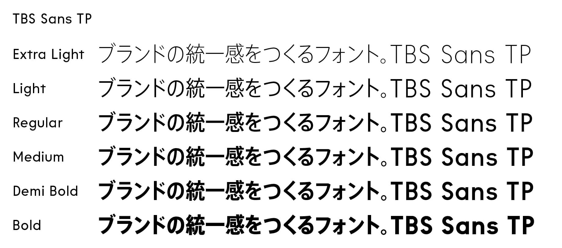
The Development of 7 Weights and the Harmony of the Family
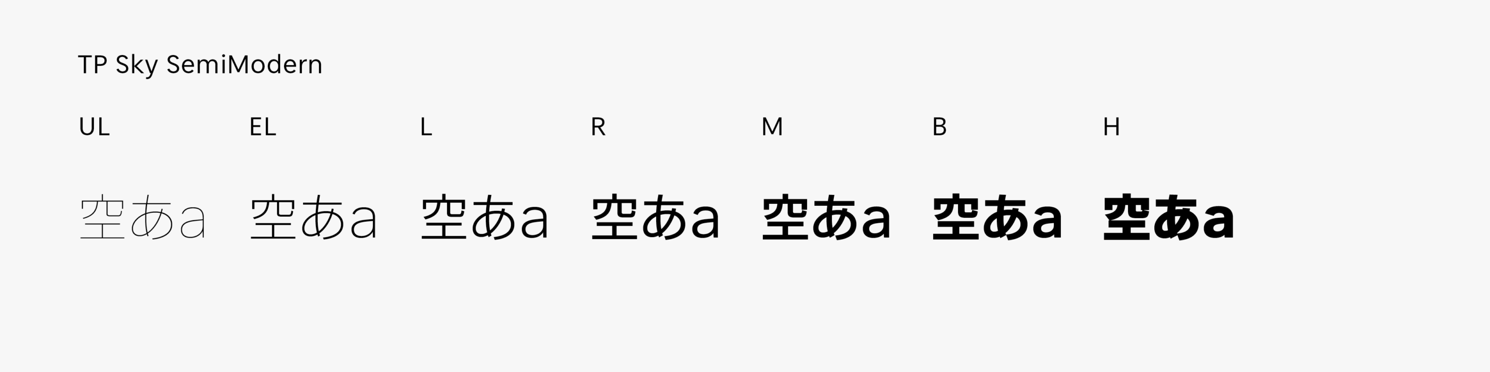
With the development of 7 weights, TP Sky SemiModern can satisfy needs in various applications from the extremely thin UL (Ultra Light) to H (Heavy), with a solid thickness. In the thin weight, it creates a light and bright impression with its airy atmosphere due to the width of the inside space between strokes. At a thick weight, it delivers texts with the dignified large characters like a voice that carries well. The combination of the TP Sky family that shares the simple and plane design is excellent, such as giving an impact in the title with TP Sky Modern, and using TP Sky SemiModern in text where visibility is required. Even richer development in the axes of inside space between strokes, axes of character width, etc. can be harmonized in the design of strokes, with a free and unified design made possible.
- WHITE MODE
- BLACK MODE
- A
Family・Specification
Font set
Standard(StdN)
9,499 characters (Adobe-Japan1-3)
Buy
TP Connect
Subscription service that enables
the use of all of Type Project fonts.
TP Connect is only available in Japanese.